A free link in bio without ads sounds simple, but many creators and small businesses only notice the problem after their page starts looking messy. At first, the tool feels useful. You add your Instagram link, TikTok link, booking page, product page, WhatsApp contact, or newsletter. Then over time, the page starts showing branding, upgrade prompts, banners, recommendations, or visual clutter that does not belong to your business.
That matters because your bio link is not just a list of links. It is often the first serious step between someone discovering you and taking action. A person may watch your Reel, visit your Instagram profile, tap your bio link, and decide within seconds whether to book, buy, message, subscribe, or leave.
If that page feels crowded, cheap, or distracted by someone else’s promotion, it can damage trust. A clean bio page should keep the attention on your business, not on ads, platform branding, or upgrade messages. This guide explains how to think about an ad-free link in bio page in a practical way, especially if you use Instagram, TikTok, LINE, WhatsApp, YouTube, or offline QR codes to get visitors.
Your Bio Link Should Promote Your Business, Not Someone Else’s Ads
The main job of your bio link is to move people from interest to action. When someone taps your link, they are already giving you attention. That moment is valuable. You should not waste it by showing distractions that do not help the visitor.
For example, if you are a Pilates studio promoting a free trial class, the visitor should immediately see where to claim the trial, check the schedule, or contact the studio. They should not have to scroll past unrelated messages, platform banners, or links that compete with your offer.
The same is true for creators. If you recommend a product in a TikTok video, your audience expects the bio link to help them find that product quickly. If the page feels overloaded, some people will leave before they click anything.
An ad-free page protects the visitor’s focus. It makes the page feel more like your own official landing page, even if it is simple. The cleaner the page feels, the easier it is for people to trust the next step.
Why Many “Free” Bio Link Pages Stop Feeling Free
Many tools start with a free plan, but the experience may come with trade-offs. Some show platform branding. Some limit customization. Some push upgrade banners. Some place extra elements on the page. Some make the free page feel less professional so users feel pressure to upgrade.
This is not always a problem for casual users. If someone only wants to share a few personal links, small branding may not matter. But for business use, it matters more.
A small business bio page is not only about sharing links. It is part of the sales journey. If your page is connected to paid ads, influencer campaigns, QR codes, event posters, or product launches, every distraction can reduce performance.
A “free” tool becomes less useful when the page no longer feels fully focused on your brand. The real cost is not only money. The cost may be lost clicks, lower trust, and visitors who never reach your booking form, product page, or contact button.
The Moment Ads Start Costing You Clicks
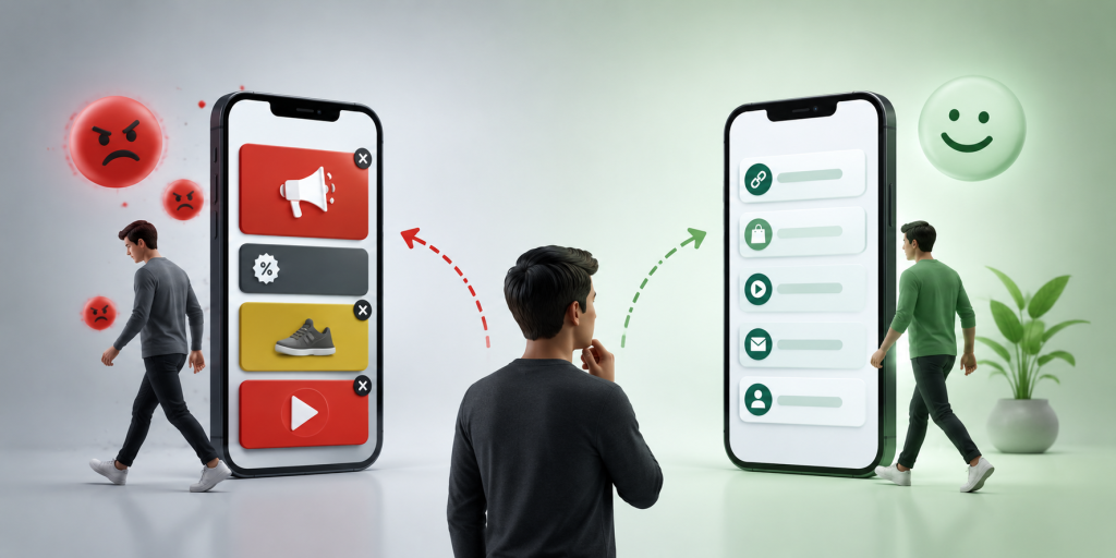
Ads on a bio page may seem harmless, but the timing is the issue. People usually tap a bio link because they want something specific. They want the product from the video. They want the booking form. They want the restaurant menu. They want the class schedule. They want the app download. They want your contact link.
If the page adds another message at that moment, it creates friction. The visitor has to decide what to ignore before they decide what to click.
This is especially risky on mobile. Most people open bio links on a phone. The screen is small. Attention is short. A banner, logo, or unrelated promotion can take up space that should belong to your main call to action.
For businesses, the question is not only “Does the page work?” The better question is “Does the page make the next action obvious?” If the answer is no, the page may be costing you clicks even if it technically loads correctly.
When reviewing your bio page, do not look at it like the owner. Look at it like a visitor who knows very little about you. They may be seeing your business for the first time.
Ask yourself:
- Is the most important action visible immediately?
- Does the page feel like my brand or someone else’s platform?
- Are old campaigns, unused links, or weak buttons still there?
- Is there anything on the page that could distract from booking, buying, or contacting?
- Would a new visitor understand what to do in less than five seconds?
This is where many bio pages fail. The owner keeps adding links, but rarely removes old ones. After a few months, the page becomes a pile of buttons instead of a useful path.
A strong link in bio page should feel intentional. The top link should match your current priority. The rest of the page should support that priority, not compete with it.
The Hidden Problem With Upgrade Banners and Platform Branding
Even when a page does not show traditional ads, it may still include platform branding or upgrade messages. These can create a similar problem because they shift attention away from your business.
A visitor may not consciously think, “This page has too much branding.” But they can feel that the page is less professional. That feeling matters. Trust is often built through small details: clean layout, clear labels, consistent branding, and no unnecessary noise.
For example, a beauty salon using a bio link for appointment bookings should look polished. A coach selling a paid program should look credible. A creator sharing affiliate links should make the product path easy. A local studio running a free trial campaign should make the offer feel official.
When the page looks like a free tool first and your business second, the visitor experience becomes weaker.
Real Example: A Pilates Studio Free Trial Campaign
Imagine a boutique Pilates studio running a free trial campaign on Instagram and TikTok. The owner posts short videos of reformer classes, beginner exercises, studio tours, and client transformations. At the end of each post, the caption says, “Tap the link in bio to claim your free trial.”
A weak bio page might include too many links: old promotions, every social profile, a generic website link, outdated class packages, a random YouTube video, and a contact form nobody checks. If ads or branding appear on top of that, the page feels even more crowded.
A better page would be direct. The first button says “Claim Free Trial Class.” The second button says “View Weekly Schedule.” The third button says “Chat With Us on LINE.” The fourth button says “Find Studio Location.” The fifth button says “See Class Packages.”
This page works because it matches the visitor’s intent. Someone who came from a Pilates video probably wants to know how to try a class, when classes are available, where the studio is, and how to ask questions.
No ads are needed. No extra banners are needed. The page should help the visitor move from curiosity to action.
What to Remove Before Adding More Links
Many people try to improve their bio page by adding more. In reality, the fastest improvement is often removing what no longer helps.
Remove links to expired campaigns. Remove buttons that are too vague. Remove duplicate contact options if one is clearly better. Remove old product pages that are no longer active. Remove links that exist only because you added them months ago and forgot about them.
A good link in bio page is not a storage space. It is a decision page. Every button should help the visitor make progress.
For example, if your main campaign this month is a free trial, do not bury it under general links. If your main goal is WhatsApp messages, do not make visitors choose between five different contact buttons. If your main offer is a course, do not distract people with unrelated content before they see the course link.
The cleaner the page, the easier the decision.
What to Look For in a Linktree Alternative With No Ads
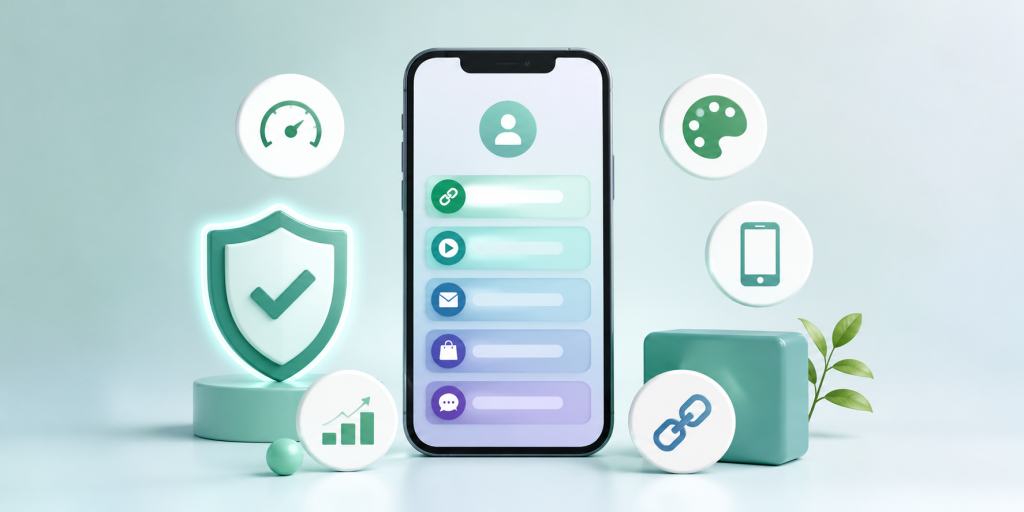
If you are comparing tools, do not only look at whether the page can hold multiple links. Most tools can do that. Look at whether the final page feels clean enough for real business use.
A good linktree alternative no ads should help you create a page that feels simple, direct, and easy to update. You should be able to use it across Instagram, TikTok, WhatsApp, LINE, YouTube, Facebook, QR codes, and printed materials without feeling like the page is fighting your brand.
It should also be easy to manage. If your campaign changes, you should be able to update the destination quickly. If a link is no longer useful, you should remove it. If your main offer changes, the first button should change with it.
This is where a simple hub link can be useful. With itlink.to, you can create a free bio link page for your important destinations and use one clean URL across your profiles and campaigns: https://itlink.to/#hub-link
The goal is not to make a complicated mini website. The goal is to give people one clear place to choose the right next step.
Build a Free Link in Bio Without Ads Around One Clear Action
A free link in bio without ads works best when it is built around one main action. Before you create the page, decide what you want most visitors to do.
For a creator, that action may be viewing a product list, subscribing to a channel, joining a newsletter, or contacting for collaboration. For a small business, it may be booking an appointment, claiming a free trial, viewing a menu, downloading an app, or sending a message.
Once you know the main action, make it the first button. Then add only the links that support it. Think of the page as a simple path, not a collection of everything you own.
This approach makes your page easier to understand and more professional. It also helps you avoid the common mistake of turning a bio link into a messy directory.
If your current page has ads, branding, upgrade banners, outdated buttons, or too many choices, rebuild it with a cleaner structure. Keep the focus on your visitor, your offer, and the next action.
Create your free link in bio without ads and give your audience one clean path from discovery to action.
References
- Instagram Help Center: Adding links to your profile and using your bio for discovery Official steps for adding external links to an Instagram profile, enabling creators and businesses to maximize traffic from their bios.
- TikTok Help Center: Profile setup and website link usage Official requirements and step-by-step instructions for adding website links and connecting external social profiles to a TikTok account.
- Google Search Central: Creating helpful, people-first content Core documentation outlining Google’s automated ranking systems and offering a framework to evaluate content value, expertise, and user satisfaction.