Blog

  • Free URL Shortener With Click Analytics

    Free URL Shortener With Click Analytics

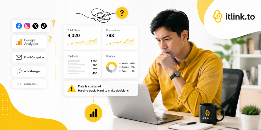
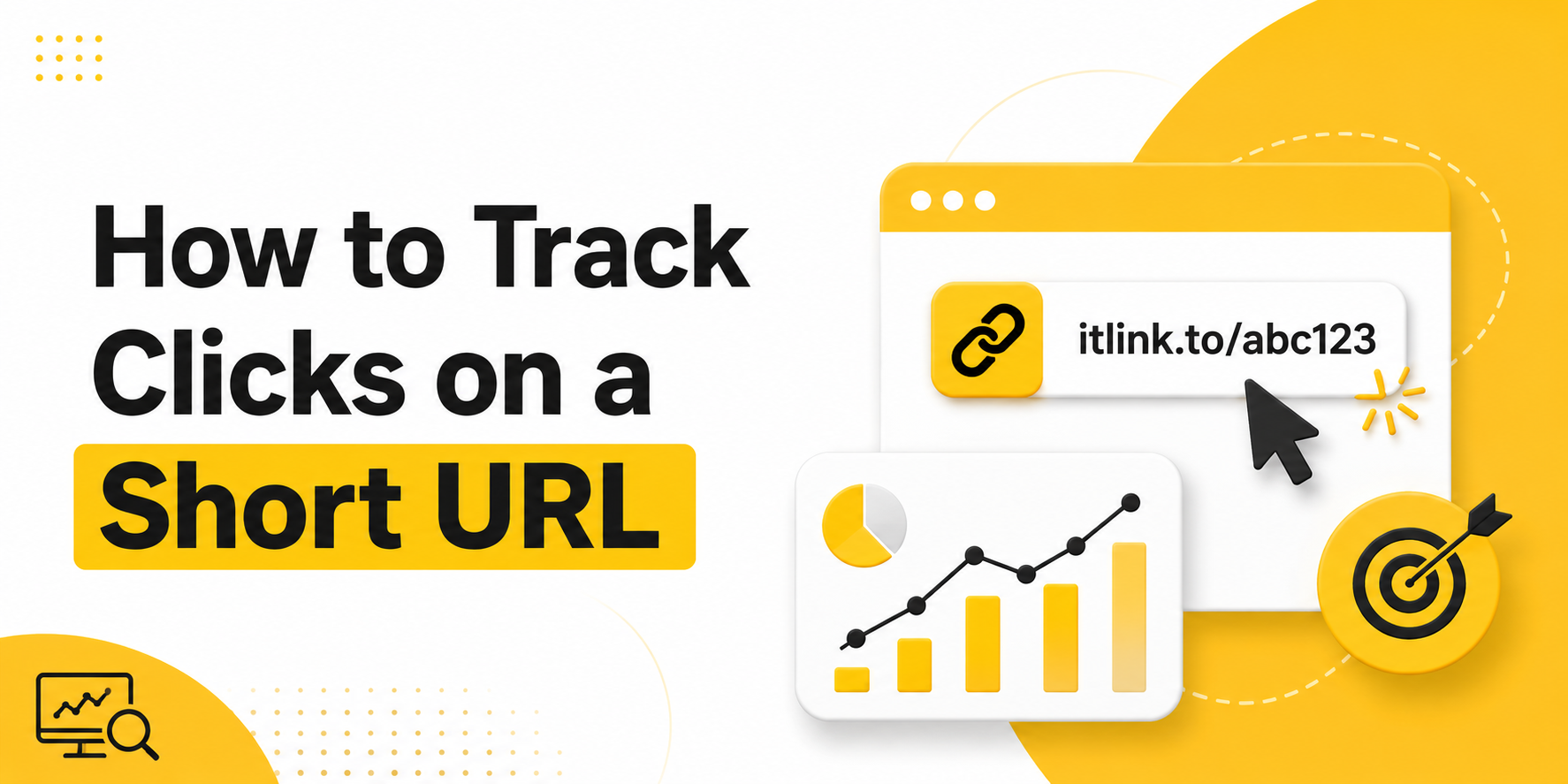
    A free URL shortener is useful when you need a clean link that is easy to share, easy to remember, and easy to track. Long URLs can look messy in WhatsApp, LINE, Instagram, TikTok, email, flyers, and QR codes. But a short link should do more than simply look nicer. It should also help you understand whether people are actually clicking.

    That is where click analytics becomes important. If you are sharing a product page, booking link, app download page, campaign landing page, or social profile, you should not have to guess whether the link is working. You need a simple way to see activity, compare channels, and improve your next campaign.

    Why a Short Link Alone Is Not Enough

    A short link is useful, but it becomes much more valuable when you can see how people interact with it. Without analytics, you only know that you shared a link. You do not know whether people clicked, where the link performed best, or whether a campaign failed because of the offer, the placement, or the link itself.

    For example, a small business might share the same promotion on Instagram, LINE, and printed flyers. If there is no tracking, the owner may only see final sales or booking numbers. That creates a blind spot. If sales are low, maybe nobody clicked. Maybe people clicked but did not convert. Maybe the link was placed in the wrong channel. Click analytics helps separate these problems.

    This matters because marketing decisions should not be based only on feelings. Even simple click data can show whether a link is getting attention. Once you know that, you can improve the message, design, placement, or destination page.

    Free URL Shortener With Analytics: What to Look For

    A good free URL shortener with analytics should help you create clean short links and understand link performance without making the process complicated. You do not always need an enterprise marketing platform. For many creators, small businesses, startups, and solo marketers, the most important thing is being able to create a short link quickly and check if people clicked.

    The best setup is simple. Paste your long URL, create a short version, share it, then review basic click data. This is enough for everyday campaigns such as social posts, bio links, QR codes, influencer promotions, event materials, and customer messages.

    The key is to choose a shortener that supports real usage, not just link decoration. A pretty short link is helpful, but a trackable short link is more useful because it gives you feedback.

    Practical Places to Use Free Short Links

    Free short links are most useful in places where space, trust, and clarity matter. A long link can break across lines, look suspicious, or distract from the main message. A clean short link is easier to place and easier for people to understand.

    Good places to use short links include:

    • Social media bios, especially Instagram, TikTok, YouTube, and X
    • WhatsApp, LINE, Messenger, and SMS messages
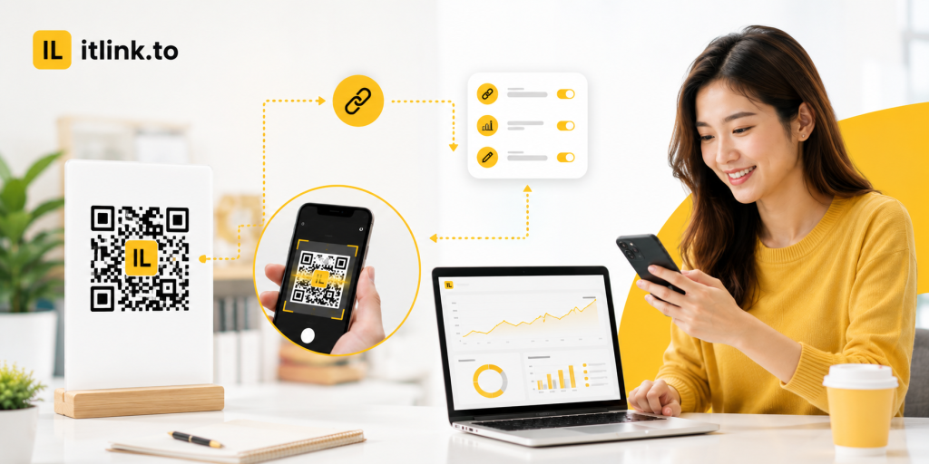
    • QR codes on posters, flyers, packaging, menus, and event booths
    • Email campaigns and newsletters
    • Product launches, booking pages, and app download campaigns
    • Influencer captions, story links, and affiliate-style promotions
    • Offline materials where users need to type or scan a simple URL

    The goal is not just to make the URL shorter. The goal is to make the user journey cleaner. A short link reduces friction before the click, while analytics helps you learn what happens after you share it.

    Example: Tracking Clicks From Instagram, LINE, and QR Codes

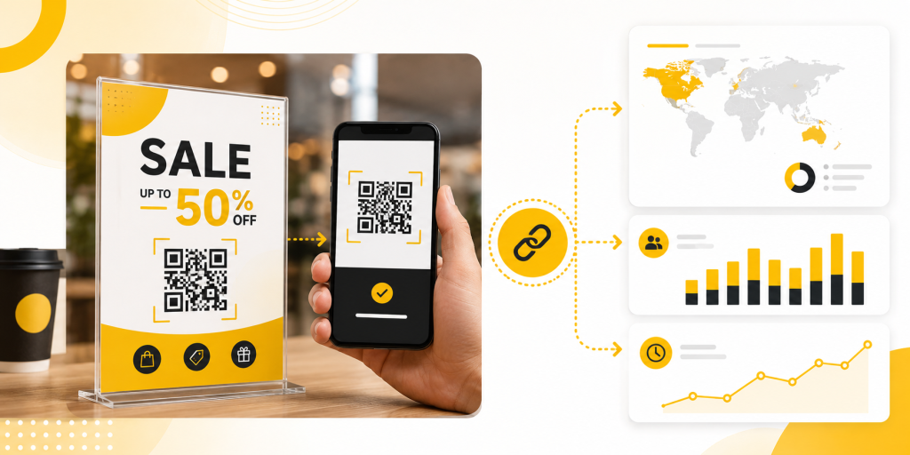
    Imagine you run a small fitness studio. You are promoting a free trial class. You share the booking page in your Instagram bio, send it to leads on LINE, and print a QR code for the front desk.

    If all three channels use the same long booking URL with no tracking, you may only see total bookings. But if you create separate short links for each channel, you can compare performance more clearly.

    For example, one short link can be used for Instagram, one for LINE, and one for the QR code. After a few days, you may notice that LINE gets fewer clicks but more bookings, while Instagram gets many clicks but fewer completed forms. That tells you something useful. Instagram may need a better landing page or stronger offer, while LINE may already have warmer leads.

    This is how simple URL analytics can help you make better decisions without needing a complicated dashboard.

    Common Mistakes When Using Short Links

    Many people create short links quickly but forget to use them strategically. This can make the data confusing or less useful.

    Common mistakes include:

    • Using the same short link everywhere and not knowing which channel drove the clicks
    • Changing the destination too often without noting what changed
    • Sharing a short link without testing it first
    • Using unclear link names that are hard to manage later
    • Looking only at clicks and ignoring whether people actually take action
    • Creating too many links without a simple naming system

    The biggest mistake is treating click analytics as the final answer. Clicks tell you whether people were interested enough to open the link. They do not automatically prove that your offer, landing page, or checkout flow is working. Use clicks as the first signal, then compare them with signups, purchases, bookings, or replies.

    Clicks vs Conversions: Know the Difference

    A click means someone opened your link. A conversion means someone completed the action you wanted, such as booking a call, buying a product, joining a waitlist, downloading an app, or submitting a form.

    This difference is important. If your short link gets many clicks but no conversions, the problem may not be the short link. The problem may be the destination page, the price, the offer, the loading speed, the form length, or a mismatch between your message and the page.

    For example, if your TikTok video says “download the free guide” but the landing page asks people to create an account first, many users may leave. The link did its job by bringing people to the page. The page failed to finish the job.

    A free URL shortener with analytics helps you find the first part of the problem: are people clicking or not? From there, you can investigate the rest of the funnel.

    How to Name and Organize Your Short Links

    Good organization makes URL analytics easier to understand. If every short link has a random name, you may forget what each link was used for. A simple naming habit can save time later.

    Use names that describe the campaign, channel, and purpose. For example, a link for an Instagram bio campaign can use a clear slug related to the offer. A QR code for a fitness event can use a name connected to the event. A link sent through LINE can use a separate version so you can compare it later.

    You do not need a complex system. You only need enough structure to answer simple questions: where did this link appear, what was it promoting, and what result did it create?

    This also helps when you reuse campaigns. If you run monthly promotions, organized short links make it easier to compare this month’s performance with last month’s performance.

    When You Should Use UTM Parameters Too

    Short link analytics is useful, but you may also want UTM parameters when you use tools like Google Analytics. UTM parameters help identify campaign traffic by source, medium, and campaign name. Google’s own Analytics documentation explains that UTM parameters can help show which campaigns referred traffic in acquisition reports.

    A practical workflow is to add UTM parameters to your final destination URL, then shorten that full URL. This gives you a clean link for users while still preserving campaign tracking for your analytics tools.

    For example, you can create a campaign URL for an Instagram promotion, then turn it into a short link before placing it in your bio. Users see a clean link, while your analytics setup can still recognize the campaign source.

    This is especially helpful when you want both simple link-level click analytics and deeper website analytics.

    Why itlink.to Is Useful for Simple Link Tracking

    For many small businesses and creators, the best tool is the one that is simple enough to use consistently. You should not need a complicated setup just to create a clean short link and see whether people clicked.

    With itlink.to, you can create a free short link for everyday campaigns and use it when sharing links across social media, messaging apps, QR codes, and marketing materials. It is a practical option when you want a cleaner URL and basic visibility into link activity without overcomplicating the process.

    This makes it especially useful for creators, local businesses, coaches, salons, online sellers, app teams, and marketers who need fast, trackable links for real campaigns.

    Conclusion: Start With One Trackable Short Link

    A free URL shortener is not just about making a long URL look cleaner. It helps you share links more confidently and understand whether people are actually clicking. That feedback is useful because it tells you where attention is coming from and where your marketing may need improvement.

    Start with one important link. Create a short version, share it in one or two key places, and check the click analytics. Then compare the results with your real business goal, such as bookings, signups, sales, downloads, or replies.

    Create your free short link with itlink.to and start tracking your clicks today: https://itlink.to/#short-link

    References

  • Best Free Linktree Alternative for Creators Who Need Analytics

    Best Free Linktree Alternative for Creators Who Need Analytics

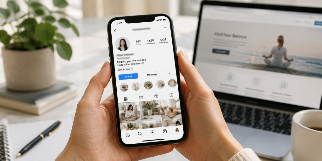
    Your bio link is the most valuable piece of digital real estate you control. Every platform, Instagram, TikTok, YouTube, even your email signature, funnels attention toward that single URL. It’s the one place where a curious follower can become a subscriber, a customer, or a fan of something beyond the algorithm’s reach. Which makes it genuinely strange that most creators treat the analytics behind it as an afterthought.

    The problem isn’t a shortage of tools. Link-in-bio platforms have multiplied for years. The problem is that the most important data, who clicked what, where they came from, what device they used, is consistently buried behind a monthly paywall. You get a visitor count on the free plan. Everything that would actually help you make a decision costs extra.

    For creators building real businesses, that’s not a minor inconvenience. It’s a structural blind spot that compounds quietly over time.

    Why a Visitor Count Tells You Almost Nothing

    Picture a realistic scenario: you publish a post on the same day you launch a digital product, release a podcast episode, and promote an affiliate deal. Your bio link pulls in 4,000 visits over 48 hours. That number looks good in a screenshot. It tells you almost nothing useful.

    Did visitors click your product page, or did they go straight to the podcast and skip the sale entirely? Was the affiliate link completely ignored? If you drove that traffic through three different platforms, which one actually converted? Without button-level click data, you cannot answer any of these questions with confidence. You’re left making your next content decision based on feel rather than evidence.

    This is the core failure of surface-level analytics. A single vanity metric gives you the illusion of insight while hiding every data point that would actually change your behavior. Creators who fix this problem improve faster because every piece of content becomes a feedback loop. Creators who don’t keep running the same experiments, hoping something eventually sticks.

    What Paywalled Analytics Actually Cost You

    The pricing model most link-in-bio platforms use is straightforward: get you in for free, then lock the useful features behind a subscription once you’re dependent on the tool. Entry-level paid tiers typically run between $18 and $36 per month. That might sound manageable in isolation, but creators rarely use just one platform. Stack a bio link subscription on top of an email tool, a scheduling app, and a course platform and you’re looking at several hundred dollars a month in software overhead before you’ve earned a dollar.

    More importantly, the features being paywalled aren’t advanced enterprise capabilities. Knowing which button your audience clicked is not a sophisticated request. Seeing a geographic breakdown of your traffic is not a premium insight. These are basic operational data points that any creator making decisions about their business should have access to by default. When platforms treat them as upsells, they’re not offering a premium experience. They’re charging you to see information about your own audience that you already earned.

    The Five Analytics That Actually Drive Decisions

    When evaluating any free Linktree alternative, most creators focus on design flexibility or the number of links allowed. Both are largely irrelevant if the tracking underneath is weak. These are the five data points that materially change how you run your creator business.

    • Button-level click tracking. Aggregate page views are decorative. What you need is a per-link breakdown showing exactly which buttons are being clicked and which are being ignored. This tells you which offers resonate, which calls to action are failing, and where to focus your next promotion.
    • Unique versus total clicks. Total click counts can be inflated by a small number of people clicking repeatedly. Unique click counts show you how many individual people engaged with a specific link, which is the number that actually reflects genuine audience interest.
    • Traffic source attribution. There is a meaningful difference between a click that originated inside the Instagram app and one that came from a YouTube comment, a newsletter, or an external blog post. Source data tells you which platforms are earning their time investment and which ones are producing impressions without conversions.
    • Geographic data. City and country level breakdowns affect pricing decisions, event planning, brand partnership pitches, and publish timing. If a significant portion of your audience is concentrated in a specific region, that information should be actively shaping your strategy.
    • Device and browser reporting. If 80% of your clicks are coming from mobile in-app browsers, your external pages need to load instantly on a small screen. Device data lets you stop designing for how you browse and start designing for how your audience actually behaves.

    The Technical Mistakes That Break Your Tracking

    Choosing the wrong platform doesn’t just limit your visibility. It can actively corrupt the data you’re collecting elsewhere.

    The first issue is redirect stripping. Some bio link platforms mask outbound URLs or strip tracking headers when they forward a user to your destination. The result is that your website analytics logs that visit as direct traffic rather than attributing it to social media. Your social channels look less effective than they are, your attribution model breaks, and any return on investment calculation you run becomes unreliable.

    The second is link shortener chaining. Routing a bio tool redirect through an additional URL shortener creates two sequential redirects before a user reaches your page. Beyond the delay in load time, this frequently breaks UTM parameters and can trigger security warnings in mobile browsers, particularly on iOS. Always link directly to your final destination URL without intermediary shorteners.

    How to Use Your Data Once You Have It

    Access to analytics is only the first step. The creators who pull ahead are the ones who build a consistent habit around reviewing and acting on that data.

    Every two weeks, pull your click data and remove any link that hasn’t generated meaningful engagement in the past 30 days. A focused page with four strong links consistently outperforms a crowded page with twelve because too many options produce decision paralysis. Your audience is more likely to click something when the choice is clear.

    After each significant post or campaign, trace where the traffic spike originated before you lose the context. If a specific platform drove a disproportionate share of clicks, weight your next content batch accordingly. If a traffic source you invested heavily in produced nothing, that’s equally useful information.

    Reorder your links based on performance data, not instinct. Most visitors won’t scroll far, so your highest-converting link belongs at the top. If your second link is consistently outperforming your first, swap them and monitor the change. Small structural adjustments validated by data produce compounding improvements over time.

    What to Look for in a Free Platform

    The market for link-in-bio tools has expanded considerably, which means the quality range is wide.

    Data retention is the most underrated factor. Some platforms on free tiers delete or hide historical data after seven days. Others give you full access going back to the day you created your account. Comparing your current month against the same period last quarter is only possible if that data still exists.

    UTM parameter integrity is non-negotiable if you run any external analytics. Confirm that the platform passes your tracking tags through cleanly on redirect rather than dropping them. Most won’t tell you they strip parameters so you have to test it yourself by clicking a tagged link and checking whether the parameters appear in your destination analytics.

    Transparency around redirects is worth checking as well. Platforms that use masked redirects sometimes create issues with browser security warnings and can affect how link previews render when shared.

    Why Creators Are Switching to itlink.to

    Most creators who move to a platform with real analytics describe the same first week: the data is disorienting because it reveals how much guesswork was previously involved. Links you assumed were performing well turn out to have single-digit click rates. Traffic sources you deprioritized turn out to be driving the majority of your conversions. The picture that emerges rarely matches the assumptions you were working from.

    That recalibration is valuable precisely because it’s uncomfortable. It means your next decisions are grounded in what your audience actually does rather than what you assumed they would do.

    itlink.to gives you button-level click tracking, geographic breakdowns, traffic source attribution, and device reporting on its free plan without requiring a credit card. If you’re currently making content and business decisions without that visibility, setting up a page takes a few minutes and the difference in clarity is immediate.

    Start tracking what your audience actually clicks. Build your free page at itlink.to.

    References

  • How to Share Many Links With One Simple URL

    How to Share Many Links With One Simple URL

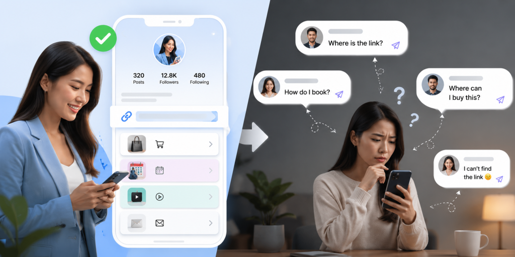
    When you need to share multiple links, sending them one by one can quickly look messy. A customer may need your booking page, price list, WhatsApp contact, Instagram profile, latest offer, and website. A follower may want your product link, YouTube video, newsletter, and course page. If you send every URL separately, the message becomes hard to read and easy to ignore.

    A better way is to use one simple URL that opens a clean page containing all your important links. Instead of asking people to choose from a long list of raw URLs, you give them one easy link and let them pick the next step from a simple menu.

    This is useful for small businesses, creators, coaches, salons, restaurants, freelancers, app owners, and anyone who promotes different links across social media, chat apps, QR codes, or printed materials.

    Why Too Many Separate Links Create Friction

    Every extra link adds a small decision for the reader. If you send five different URLs in one message, people must stop and think: Which one should I open first? Is this the booking link or the product link? Is this the latest offer or an old page?

    That small confusion can reduce clicks. It can also make your brand look less organized, even if your service is good. People are busy, especially on mobile. They often open links while scrolling, chatting, walking, or comparing options quickly.

    A long block of links also looks less trustworthy. Raw URLs can feel random, especially if they are long or come from different platforms. One clean URL feels easier to understand and easier to share.

    How to Share Multiple Links With One Simple URL

    The easiest way to share multiple links is to create a link hub. A link hub is a simple page that contains your most important destinations in one place. You share one URL, and visitors can choose where they want to go next.

    For example, instead of sharing your website, booking form, LINE contact, Instagram, and promotion link separately, you place them all on one page. Then you use that one page in your Instagram bio, TikTok bio, WhatsApp messages, QR code, email signature, and printed flyer.

    The main benefit is control. You can keep the same main URL while updating the links behind it. If your promotion changes, you update the link hub. If your booking page changes, you update the button. Your public URL can stay the same.

    Practical Examples for Small Businesses and Creators

    A beauty salon can use one URL to show appointment booking, service prices, Google Maps location, customer reviews, and LINE contact. Instead of putting all of these links in a social caption, the salon can simply say, “Book or contact us here,” followed by one clean URL.

    A fitness coach can use one URL for class booking, personal training packages, free workout guides, Instagram, and WhatsApp. This is easier than sending a different link every time someone asks for information.

    A restaurant can place one QR code on a table or poster. That one URL can include the menu, delivery app links, reservation page, location, and social media profile.

    A creator can use one URL in their bio to share product recommendations, affiliate links, latest videos, paid resources, and newsletter signup. When a new campaign starts, they only need to update the link hub, not every old post.

    What Your One URL Should Include

    A good link hub should not contain every link you have. It should contain the links that help people take action. The goal is not to create a storage page. The goal is to guide visitors clearly.

    Useful links may include:

    • Booking or appointment page
    • Product or service page
    • WhatsApp, LINE, or contact link
    • Current promotion or campaign
    • Website or landing page
    • App Store or Google Play link
    • Social media profiles
    • Newsletter signup
    • Customer reviews or portfolio

    Put the most important action near the top. If your goal is bookings, make booking the first button. If your goal is sales, place your product or offer first. If people usually ask questions before buying, make your contact link easy to find.

    Common Mistakes When Sharing Multiple Links

    One common mistake is adding too many buttons. When visitors see too many choices, they may not click anything. A simple page with five strong links is often better than a crowded page with twenty weak links.

    Another mistake is using unclear labels. “Click here” does not tell people what will happen. Use direct labels such as “Book an Appointment,” “View Menu,” “Contact on WhatsApp,” “Download the App,” or “See Pricing.”

    Some people also forget to remove old campaign links. If visitors click an expired offer, broken page, or outdated promotion, trust drops quickly. Your link hub should stay current.

    A final mistake is treating the page like a technical dashboard. Most visitors do not care about the tool behind the link. They only care whether they can quickly find what they need.

    Where to Use Your Simple URL

    Once you create one clean URL, use it across the places where people already discover you. This makes your marketing easier to manage and more consistent.

    Good places to use it include:

    • Instagram bio
    • TikTok bio
    • Facebook page
    • YouTube description
    • WhatsApp messages
    • LINE profile
    • Email signature
    • QR code
    • Business card
    • Event poster
    • Product packaging
    • Printed flyer

    Using the same URL across channels also reduces maintenance. You do not need to change every old post, poster, or message when one destination changes. You only update the links inside the hub.

    Why This Works Better Than Sending a Long Message

    Long messages often fail because people scan instead of reading carefully. When someone receives a message full of links, they may postpone the decision or ignore it completely.

    One simple URL reduces that problem. It gives the reader a clear first step. They do not need to understand everything immediately. They only need to click one link.

    After they open the page, the options are easier to read because each destination has a clear label. This creates a better mobile experience, especially for people coming from Instagram, TikTok, WhatsApp, LINE, or a QR code scan.

    It also helps your brand look more professional. A clean link hub feels intentional. It shows that you have organized the customer journey instead of pushing random links at people.

    How to Keep Your Link Hub Simple and Effective

    Start with your main goal. Do you want more bookings, more sales, more downloads, more followers, or more messages? Your first button should support that goal.

    Then think about what people need before taking action. If they need trust, add reviews or examples. If they need details, add pricing or service information. If they need quick help, add a chat link.

    Keep the page short. Use clear wording. Review it regularly. Remove links that no longer matter. Move seasonal campaigns up when they are active, then replace them when the campaign ends.

    You can also use different versions for different use cases. For example, one page for your main profile, one page for an event campaign, and one page for a product launch. But each page should still feel focused.

    Start With a Free Link Hub

    If you want to share multiple links without making your audience deal with a messy list of URLs, a simple link hub is the easiest place to start. You can use it for social media bios, QR codes, WhatsApp messages, LINE, email signatures, posters, and small business campaigns.

    itlink.to lets you create a free link hub so you can place your important links behind one clean URL. Add your booking page, product link, contact link, social profiles, or campaign links, then share one simple URL everywhere.

    The goal is simple: make it easier for people to find the right next step. When your links are organized, your audience does not need to guess. They can click once, choose what they need, and move forward.

    Create your free link hub today and start sharing multiple links with one simple URL.

    References

  • How to Create a Free Link in Bio Page for Your Small Business

    How to Create a Free Link in Bio Page for Your Small Business

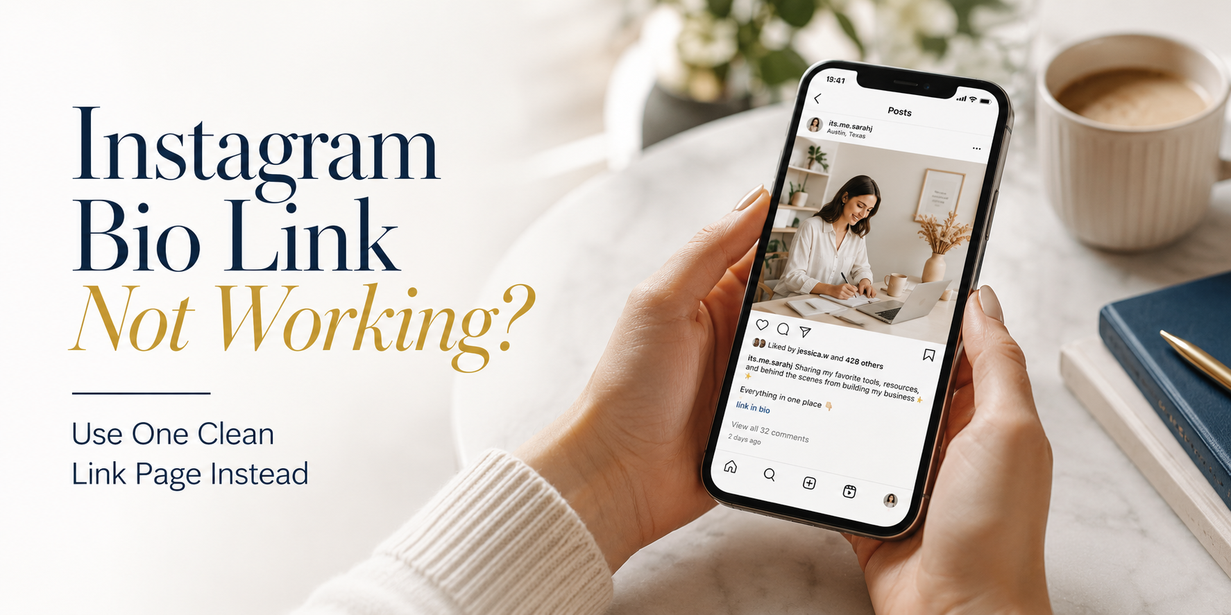
    A free link in bio page is one of the simplest ways for a small business to turn social media attention into real action. Instead of changing your Instagram, TikTok, Facebook, or Google Business Profile link every time you have a new offer, you can send customers to one clean page that contains your most important links.

    For small businesses, this matters because customers rarely follow a perfect path. One person may want to book an appointment. Another may want to see your menu. Someone else may want WhatsApp, LINE, a product catalog, directions, or a discount page. If your bio only points to one destination, you may lose people who were ready to take the next step.

    A good link in bio page does not need to be complicated. It should help people quickly understand what to do, where to click, and how to contact your business.

    Why Small Businesses Need One Clear Bio Link

    Most small businesses promote more than one thing at the same time. A café may want to share its menu, delivery link, location, and seasonal promotion. A beauty salon may need booking, price list, Instagram portfolio, and WhatsApp contact. A coach may want to share a course, consultation form, YouTube channel, and testimonials.

    The problem is that many social profiles give you limited space for links. Even when a platform allows multiple links, the experience can still feel messy if the customer has to guess which link matters most.

    One clear bio link gives your business a small landing page that works like a front desk. It does not replace your website. It organizes the most useful actions in one place. When someone taps your bio, they should immediately know whether to buy, book, message, visit, or learn more.

    This is especially useful for businesses that do not have a full website yet. Instead of waiting until everything is perfect, you can create a simple page today and update it whenever your offers change.

    Choose the Right Focus Before You Add Links

    Before creating your page, decide what the page is supposed to help people do. Many small businesses make the mistake of adding every possible link because the tool allows it. More links do not always mean better results.

    Your link in bio page should support your main business goal. If your goal is bookings, the booking button should be near the top. If your goal is product sales, your shop or best-selling product should be easy to find. If your goal is local visits, your map, opening hours, and contact button should be obvious.

    Think of your page like a shop window. You do not need to show every item you have. You need to show the right next step for the person who just discovered you.

    A simple rule is to start with one primary action, then add a few supporting links. For example, a bakery may put “Order Cakes” first, then add “View Menu,” “Find Us on Maps,” and “Message Us.” A fitness coach may put “Book Free Consultation” first, then add “Programs,” “Client Results,” and “Instagram.”

    What to Include on a Free Link in Bio Page

    Your page should be short enough to scan, but complete enough to answer the customer’s next question. The best structure depends on your business, but most small businesses can start with these essentials:

    • Your main offer, such as booking, ordering, signup, or product catalog
    • A direct contact link, such as WhatsApp, LINE, Messenger, or email
    • Your location or Google Business Profile if you serve local customers
    • Your latest promotion, campaign, menu, event, or limited-time offer
    • Social proof, such as reviews, testimonials, portfolio, or before-and-after examples
    • Your main social channels if customers may want to follow you elsewhere

    Do not treat every link as equally important. Put the highest-value action first. Customers are often distracted when they tap your bio link. They may be standing in a store, watching a Reel, checking your profile after an ad, or comparing you with another business. The faster they find the right action, the better.

    How to Create a Free Link in Bio Page

    Start by collecting the links your customers actually need. Do not begin with design. Begin with customer intent. Ask yourself: “If someone discovers my business today, what are the top three things they may want to do?”

    Next, create your link in bio page and add those links in order of importance. Use clear button labels. Instead of “Click Here,” write “Book a Table,” “View Price List,” “Order on LINE,” “See Cake Menu,” or “Get a Quote.” Clear labels reduce confusion and make the page feel more trustworthy.

    Then add your page URL to your social profiles. Instagram lets users add links through the profile editing flow, and TikTok Business Accounts can add a website link to the profile. For local businesses, you can also add your website or main customer link to your Google Business Profile.

    After publishing, test the page on your phone. Open it from Instagram, TikTok, and any other platform where customers will find you. Check that the buttons are easy to tap, the order makes sense, and the page loads correctly.

    Practical Small Business Examples

    A link in bio page becomes more useful when it is built around a real business situation, not just a generic list of links.

    For a restaurant, the page may include menu, reservation, delivery app, Google Maps, opening hours, and private event inquiry. The most important link may change depending on the season. During lunch hours, the delivery link may be most important. During holidays, the reservation or catering link may deserve the top position.

    For a salon, the page may include appointment booking, service menu, stylist portfolio, location, WhatsApp, and current promotion. The top link should usually be booking, because people who visit a salon’s profile often want to check availability or prices.

    For a coach, consultant, or service provider, the page may include a consultation form, service packages, client results, free resource, calendar booking, and contact link. Here, the page should build trust before asking for a commitment.

    For a small online shop, the page may include best sellers, new arrivals, shipping policy, customer reviews, size guide, and support contact. Instead of sending people to a large homepage, the page can guide them toward the products they are most likely to buy.

    Common Mistakes That Make Bio Links Perform Poorly

    A free link in bio page can work well, but only if it is easy for customers to use. Many pages fail because they feel like a random collection of links rather than a clear path.

    Common mistakes include:

    • Adding too many buttons with no priority
    • Using vague labels like “Website,” “More,” or “Info”
    • Sending people to outdated promotions or broken pages
    • Placing the most important action too low on the page
    • Forgetting mobile users and making links hard to tap
    • Using inconsistent branding that makes customers wonder if they are in the right place
    • Not checking whether people are clicking the page after you publish it

    The biggest mistake is thinking the page is finished after you create it. A link in bio page should change as your business changes. If your promotion ends, remove it. If a new service becomes your priority, move it higher. If customers keep asking the same question, add a link that answers it.

    Make the Page Feel Trustworthy

    Customers are careful before they click, buy, book, or send a message. Your link in bio page should feel like it belongs to your business.

    Use the same business name, tone, and visual style that people already see on your social profiles. If your Instagram is clean and premium, your page should not feel messy. If your business is friendly and casual, your labels can sound warm and direct.

    Trust also comes from clarity. A button that says “Book a Free Consultation” is stronger than “Learn More.” A button that says “Message Us on WhatsApp” is stronger than “Contact.” The clearer the action, the easier it is for customers to feel confident.

    For local businesses, location details are important. People may want to know whether you are nearby before they contact you. For service businesses, proof matters. Add reviews, case studies, client examples, or portfolio links when they help customers make a decision.

    Where to Share Your Link in Bio Page

    Your bio link should not live only on Instagram. Once you have one clean page, you can use it across many customer touchpoints.

    Add it to Instagram, TikTok, Facebook, YouTube, Threads, Google Business Profile, email signature, WhatsApp auto-reply, LINE profile, business cards, flyers, QR codes, and event materials. This makes your marketing easier because you do not need to promote different links everywhere.

    This is also why a free linktree alternative can be useful for small businesses. The goal is not just to copy Linktree. The goal is to have one simple page that you control, update, and use across campaigns.

    For example, if you run a weekend pop-up event, you can update your page with event location, menu, booking form, and promotion. After the event, you can replace those links with your regular ordering or contact links without changing the link on every social profile.

    Why a Free Link in Bio Page Is a Smart First Step

    A free link in bio page is not just a convenience. It is a practical marketing tool for small businesses that need to move faster.

    You may not have time to build a full website, write many landing pages, or manage complex campaigns. But you still need one place where customers can find what matters. A good bio link page helps you organize your offers, reduce customer confusion, and make your social traffic more useful.

    This is where HubLink by itlink.to can help. You can create a simple link in bio page for your business, add your important links, and share one clean URL across your social profiles and campaigns. It is a practical option if you want a free linktree alternative without making the setup feel complicated.

    Start simple. Add the links customers need most. Put your strongest action first. Test everything on mobile. Then improve the page over time based on what your customers actually click.

    Create your free link in bio page with itlink.to HubLink and give your small business one clean place to send customers from every social profile.

    References

  • How to Create One QR Code for App Store and Google Play

    How to Create One QR Code for App Store and Google Play

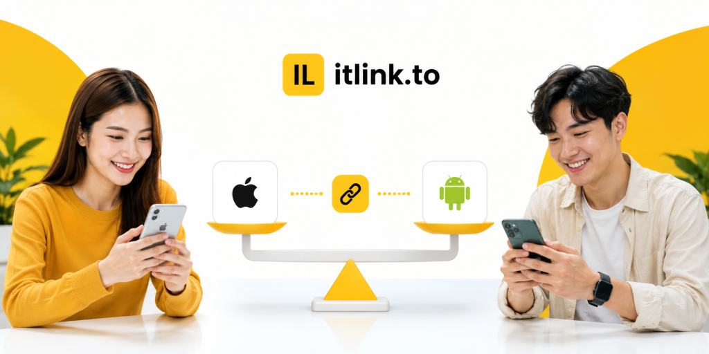
    If you are promoting a mobile app, using one app QR code for both the App Store and Google Play is much cleaner than printing two separate QR codes. The problem is simple: iPhone users need one destination, Android users need another, and desktop users may need a landing page instead. A normal QR code cannot make that decision by itself. It only opens one link.

    That is why many app campaigns fail before users even reach the download page. A QR code on a poster, product package, event booth, restaurant table, or social media graphic may look simple, but behind that code you need a link that understands the user’s device. When someone scans from an iPhone, they should go to the App Store. When someone scans from Android, they should go to Google Play. When someone opens it from a laptop, they should see a useful web page instead of a broken mobile store link.

    This guide explains how to create one QR code for App Store and Google Play without confusing users, wasting printed materials, or sending people to the wrong place.

    Why One QR Code Is Better Than Two Store QR Codes

    Two QR codes may seem like the easiest solution at first. One says “Download on the App Store” and the other says “Get it on Google Play.” That works on a clean landing page, but it becomes messy in real-world marketing.

    On a poster, flyer, booth banner, table tent, event screen, or product insert, users do not want to study two codes. They want to scan once and get the app. If they scan the wrong QR code, they may land on a store page that does not work for their device. That creates friction at the exact moment they were interested.

    One QR code also makes your design cleaner. You have more space for your headline, app benefit, product image, or call to action. Instead of explaining which code to scan, you can simply say “Scan to download the app.”

    The real advantage is control. When one QR code points to a smart routing link, you can update destinations later without reprinting the QR code. If your App Store URL changes, your Play Store URL changes, or you want desktop users to visit a campaign landing page, you can update the routing behind the link.

    The Problem With a Normal QR Code

    A normal QR code only stores one destination URL. It does not know whether the person scanning it uses iPhone, Android, tablet, or desktop. If you create a QR code directly from your App Store URL, Android users will not get the right experience. If you create it from your Google Play URL, iPhone users will not get the right experience.

    This is not a QR code design problem. It is a destination problem. The QR code is only the doorway. The link behind it decides where people go.

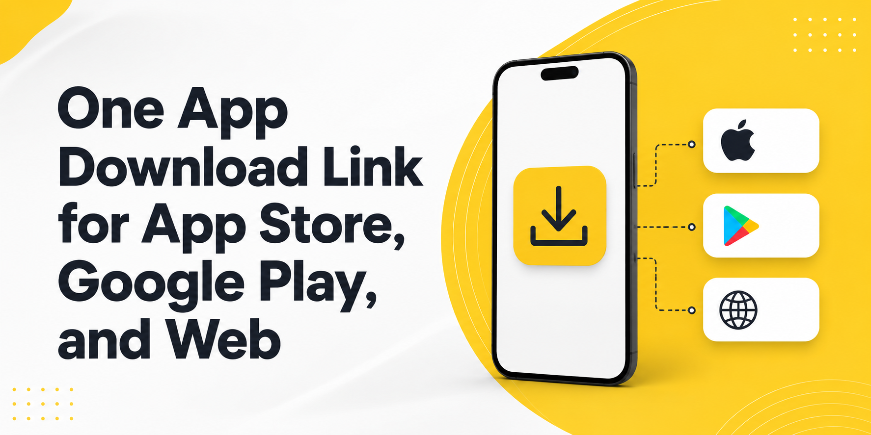
    For a mobile app campaign, the best setup is not “QR code to App Store” or “QR code to Google Play.” The better setup is “QR code to one smart link.” That smart link then routes users based on their device.

    This matters most for offline marketing. Once you print a QR code on a poster, packaging, business card, brochure, or event banner, changing it is expensive. If the QR code points directly to the wrong store URL, you cannot fix it without replacing the printed material.

    How an App QR Code Should Work

    A proper app QR code should feel simple to the user, even if the routing logic behind it is smarter. The user scans the code, opens the link, and lands in the correct place.

    The best flow usually looks like this:

    • iPhone users scan the QR code and go to the App Store.
    • Android users scan the QR code and go to Google Play.
    • Desktop users scan or open the same link and go to a website, landing page, or app download page.
    • The marketing team uses one QR code across posters, events, packaging, social media, and ads.
    • The link owner can update destinations later without changing the printed QR code.

    This is what makes a mobile app QR code different from a basic QR code. The QR code itself is not the smart part. The smart part is the link behind it.

    How to Create One QR Code for App Store and Google Play

    To create one QR code for App Store and Google Play, start by creating one routing link instead of creating a QR code directly from either store URL. The routing link becomes the single destination behind your QR code.

    First, prepare your App Store URL and Google Play URL. These should be the final public store listing links, not temporary testing links or internal developer links. Then choose a desktop fallback URL. This can be your app website, pricing page, product page, campaign landing page, or a simple page that explains how to download the app.

    Next, create a smart routing link that sends iOS users to the App Store, Android users to Google Play, and desktop users to your fallback page. After that, generate a QR code from the smart routing link.

    This is the key idea: do not generate the QR code from the App Store link or the Google Play link directly. Generate it from the one link that controls both destinations.

    Common Mistakes That Break App Download QR Codes

    Many app QR code campaigns fail because the setup looks correct on paper but is not tested across real devices. The QR code scans, but the user experience is still broken.

    A common mistake is testing only on the device used by the marketing team. If the person creating the campaign uses an iPhone, they may scan the QR code, see that it opens the App Store, and assume everything works. But Android users may still be sent to the wrong place.

    Another mistake is using a generic website page as the only destination. This may work, but it adds extra steps. If the user scans from iPhone, they should not have to tap another App Store button unless there is a strong reason for that intermediate page.

    A third mistake is printing the QR code before testing it in real conditions. Test it from iPhone, Android, desktop, mobile data, Wi-Fi, Instagram in-app browser, and camera app scanning. Small differences in browser behavior can affect the user journey.

    The biggest mistake is treating the QR code as permanent while treating the destination as fixed. In reality, the printed QR code may stay in the world for months. Your store URLs, app campaign, or landing page may change before then.

    Practical Examples for Real App Campaigns

    Imagine a fitness app promoting downloads inside a gym. A poster near the front desk says “Scan to start your training plan.” If the poster has two QR codes, users must stop and choose. If it has one QR code, the action is obvious. iPhone users go to the App Store, Android users go to Google Play, and desktop visitors can land on the fitness app website.

    The same applies to restaurant apps, loyalty apps, event apps, travel apps, booking apps, and community apps. A single QR code works better when the user is in a hurry or scanning in a physical environment.

    For influencer campaigns, one QR code is also easier to share in visual content. A creator can show one code on screen or include one short link in the caption. The same route can support different devices without making the creator explain which store link to use.

    For paid ads and offline campaigns, one smart app QR code also makes reporting cleaner. Instead of splitting attention across multiple links, you can focus on one campaign entry point and understand how people interact with it.

    What to Check Before You Publish the QR Code

    Before you place your QR code on a poster, package, flyer, event booth, or social media creative, test the full user journey. Do not only check whether the QR code scans. Check whether it sends each user to the right destination.

    Use this checklist before publishing:

    • Scan the QR code with an iPhone and confirm it opens the App Store listing.
    • Scan the QR code with an Android phone and confirm it opens the Google Play listing.
    • Open the same link on desktop and confirm it shows a useful fallback page.
    • Test from different QR scanners, including the default camera app.
    • Make sure the QR code has enough contrast and quiet space around it.
    • Print a small test version before printing a large batch.
    • Confirm the call to action is clear, such as “Scan to download the app.”

    The goal is to remove doubt. A user should not need to think about their device, choose between two codes, or understand how routing works. They should only scan and continue.

    Where itlink.to Fits Into This Setup

    itlink.to can help you create one smart app download route for this exact use case. With One Route, you can set one link that sends iPhone users to the App Store, Android users to Google Play, and desktop users to a website or landing page.

    That one route can then be used behind your QR code, in your Instagram bio, on event banners, in influencer campaigns, on packaging, or in paid ads. Instead of managing separate links for every device, you manage one link and let the route handle the destination.

    This is especially useful when your campaign is already printed or shared publicly. If you need to update the store link or fallback page later, you can adjust the route instead of replacing the QR code everywhere.

    For app marketers, founders, creators, and small teams, this keeps the campaign simple without forcing users through the wrong store.

    Conclusion: Build One App QR Code That Works Everywhere

    The best app QR code is not just a code that scans. It is a code that sends every user to the right place. If your app is available on both the App Store and Google Play, one QR code should handle both paths automatically.

    Use a smart routing link as the destination behind your QR code. Send iPhone users to the App Store, Android users to Google Play, and desktop users to a useful landing page. Test the full flow before printing or publishing, and avoid locking your campaign into one store URL.

    If you want to create one app QR code for App Store and Google Play, use One Route by itlink.to to build a clean cross-device app download link, then turn that link into a QR code for your campaign.

    Create your One Route link here

    References

  • App Download Link Not Working on iPhone: Common Causes and Fixes

    App Download Link Not Working on iPhone: Common Causes and Fixes

    When your iPhone app download link does not work, the problem can be frustrating because the same campaign link may work perfectly on Android, desktop, or even another iPhone. One user taps the link and reaches the App Store correctly. Another user gets stuck in an in-app browser, lands on the wrong page, sees a blank screen, or never reaches the install page at all.

    This is a serious problem for app marketers, founders, creators, and product teams. A broken app download experience can waste ad spend, reduce installs, hurt QR code campaigns, and make users lose trust before they even try your app.

    Most iPhone app download link problems are not random. They usually come from a few clear issues: the App Store URL is wrong, the redirect path is too complicated, Universal Links are taking over unexpectedly, the link behaves differently inside social media apps, or the campaign does not route iPhone, Android, and desktop users to different destinations.

    This guide explains the most common causes and practical fixes so you can find where the link is breaking and make your download campaign work more reliably.

    Why Your App Download Link Works on Android but Fails on iPhone

    One of the most confusing situations is when your download link works on Android but fails on iPhone. This usually happens because Android and iOS do not handle app store links, redirects, and in-app browsers in exactly the same way.

    For example, an Android user may tap your campaign link and go straight to Google Play. An iPhone user may tap the same link from Instagram, but instead of opening the App Store, the link stays inside Instagram’s browser or opens a blank redirect page. From the user’s point of view, the link is broken.

    In many cases, the link itself is not fully broken. The problem happens somewhere between the click and the final destination. The issue might be a URL shortener adding an extra redirect, a tracking tool sending the user through several URLs, a Universal Link opening the website instead of the App Store, or an App Store link copied from the wrong place.

    A simple way to think about the journey is this: the user taps or scans the link, the link redirects, the system detects the device, and the user reaches the App Store page. If any step fails, the whole experience feels broken.

    How to Tell Whether the Problem Is the Link, the App Store, or iOS

    Before changing your whole campaign setup, identify where the issue is actually happening. Many teams blame Apple or the App Store too early when the real problem is the link path.

    Start by opening the final App Store URL directly on an iPhone in Safari. Do not test the short link first. Use the direct iOS App Store link that should open your app listing. If the direct App Store link fails, the problem is probably the destination URL, app availability, country setting, or App Store listing itself.

    If the direct App Store link works, test the short link or campaign link in Safari. If it fails there, the problem is likely your redirect setup, tracking parameters, short link tool, or landing page logic.

    If the campaign link works in Safari but fails inside Instagram, TikTok, Facebook, LinkedIn, email, SMS, or another app, the issue is likely related to in-app browser behavior. Some apps open links inside their own browser first, and that can affect redirects, Universal Links, and the handoff to the App Store.

    This step-by-step testing saves time because it separates the final destination problem from the campaign link problem.

    The First Thing to Check Before Blaming Apple

    The first thing to check is the App Store URL format. A surprising number of iPhone download issues come from using the wrong kind of App Store link.

    A direct App Store listing link is usually more reliable than a search result link, a preview link, or a link copied from an internal tool. If your URL sends users to a search page instead of the app listing, the result may vary depending on country, language, device, and App Store availability.

    Another common mistake is copying a link with too many extra parameters. Tracking parameters are useful, but they can sometimes make troubleshooting harder. When testing, use the cleanest version of the App Store URL first. Confirm that it opens the correct app listing on a real iPhone.

    Also check whether the app is available in the country where the user is testing. If your app is not available in that App Store region, the link may look broken even when the URL format is technically correct.

    Do this before reviewing Universal Links, short links, QR codes, or campaign tools. If the final App Store URL is wrong, every link built on top of it will also fail.

    Why Universal Link Not Working Issues Can Break Download Campaigns

    Universal Links are useful when you want an iOS link to open your app if it is already installed. But they can create confusion when your main goal is to send new users to download the app.

    A Universal Link may open the installed app, open a webpage, or fail to open the expected destination depending on the app configuration, domain association, user device, and previous user behavior. If the Apple App Site Association file is missing, invalid, blocked, or configured incorrectly, the Universal Link may not behave as expected.

    The problem becomes more obvious in download campaigns. A new user who does not have the app installed needs to reach the App Store. But if the link is designed mainly as a Universal Link, the fallback experience may send that user to a website instead of the install page.

    This is why “universal link not working” is often not just a developer issue. It can become a marketing issue when paid ads, QR codes, influencer links, and social media bios depend on that link to drive installs.

    If your campaign goal is app downloads, make sure your link has a clear path for new iPhone users. Opening the app for existing users is useful, but new users still need a reliable App Store destination.

    Real Examples of iPhone Download Links Breaking

    In a social media bio campaign, a creator may place one short link in an Instagram profile. Android users tap the link and reach Google Play correctly, but iPhone users stay inside Instagram’s browser and never reach the App Store. The team may think the short link is broken, but the real issue may be how the redirect behaves inside the in-app browser.

    In a QR code campaign, a restaurant, event booth, or retail store may print one QR code on physical materials. If that QR code points directly to Google Play, Android users can install the app, but iPhone users land on the wrong store. If the QR code points only to the App Store, Android users have the same problem in reverse.

    In a paid ads campaign, a Facebook or TikTok ad may receive mixed traffic from iPhone, Android, and desktop users. If the ad uses only an iOS App Store link, iPhone users may be fine, but Android and desktop visitors will have a poor experience. If the ad uses only a homepage link, mobile users may need extra taps before they can install.

    In an email campaign, the link may work on desktop but fail on mobile because the email client opens the link through a tracking redirect first. By the time the user reaches the final destination, the device detection or App Store handoff may not work as expected.

    These examples show why testing only the final URL is not enough. You need to test the full user journey from the exact place where users will click.

    Fix Redirect and Short Link Problems

    Redirects are often necessary for tracking and analytics, but too many redirects can make an iPhone app download link unreliable. Every extra step increases the chance that Safari, an in-app browser, or a tracking system will interrupt the flow.

    A weak redirect path may look like this: short link, tracking URL, campaign URL, landing page redirect, device detection redirect, then App Store. That may still work on desktop, but it can become slow or unpredictable on iPhone.

    A better path is much simpler. The user taps one campaign link, the link detects the device, and iPhone users go directly to the App Store. Android users go to Google Play. Desktop users go to a useful landing page.

    Do not stack multiple tools unless you really need to. If your short link tool, analytics tool, landing page builder, and app routing logic all add their own redirects, the user experience becomes harder to control.

    When troubleshooting, remove unnecessary redirect steps and test again. If the link starts working after simplifying the path, the problem was not the App Store. It was the route to the App Store.

    Make Sure Each Device Has the Right Destination

    Many app download links fail because the campaign uses one destination for every visitor. That sounds simple, but it does not match how users actually behave.

    A good app campaign needs different destinations:

    • iPhone users should go to the Apple App Store.
    • Android users should go to Google Play.
    • Desktop users should go to a landing page with app information.
    • QR code users should follow the same device-based routing.
    • Unsupported devices should reach a fallback page instead of an error.
    • Campaign clicks should still be tracked for analytics.

    This matters because your audience is usually mixed. A QR code at an event may be scanned by iPhone and Android users. A social media bio may be opened from mobile and desktop. A paid ad may receive traffic from multiple devices in the same campaign.

    This is where smart routing becomes useful. Instead of creating separate links for each device, you can use one link that sends each visitor to the correct destination. For example, itlink.to One Route helps you create a single campaign link that can send iPhone users to the App Store, Android users to Google Play, and desktop users to a landing page.

    Test the Full Journey Before Launching

    Testing should happen before your link appears in ads, social profiles, printed QR codes, packaging, event materials, or influencer posts. Once a broken link is published, you may lose installs before you notice the problem.

    Test your direct App Store URL first. Then test your short link or campaign link on a real iPhone in Safari. After that, test the same link from the real channels where users will click it, such as Instagram, TikTok, Facebook, LinkedIn, email, SMS, and QR code scans.

    Also test Android and desktop behavior. Android users should not be sent to the Apple App Store. Desktop users should not be left on a mobile-only store page with no explanation. They should land on a page that explains the app and gives them a clear next step.

    After testing the destinations, check your analytics. Look at device data, browser data, locations, and click logs. If you see iPhone clicks but very few installs, review the redirect path and final App Store URL again.

    Good testing does not need to be complicated. It just needs to match the real user journey.

    How to Prevent This Problem in Future Campaigns

    The best way to prevent iPhone app download link problems is to avoid building fragile campaign flows. A link should not depend on too many redirects, unclear fallbacks, or manual device instructions.

    Create one clean campaign link for each major campaign. Define the iPhone destination, Android destination, desktop destination, and fallback destination before publishing. Then use that same link in your QR code, social bio, paid ads, email campaign, and printed materials.

    This reduces copy-paste mistakes and makes performance easier to track. Instead of checking several different links, you only need to monitor one campaign link and its analytics.

    It also makes your campaign easier to update. If your App Store URL changes or your landing page needs improvement, you can update the destination behind the link instead of replacing every QR code, ad URL, or social media bio link manually.

    For app download campaigns, reliability is part of conversion optimization. The fewer steps users need to take, the more likely they are to reach the correct install page.

    If your app download link is not working on iPhone, do not assume Apple is the problem. Most issues come from incorrect App Store URLs, Universal Link behavior, in-app browser limitations, unnecessary redirects, missing fallbacks, or campaigns that send every device to the same destination.

    The fix is to simplify the route. iPhone users should reach the App Store quickly. Android users should reach Google Play. Desktop users should reach a helpful landing page. QR code and social media users should get the same reliable experience.

    Before launching your next app campaign, test the full journey on real devices and real channels. If you want one link that automatically sends users to the right destination by device, create your One Route link with itlink.to here

    References

  • Best Branch.io Alternative for Startups (No Enterprise Pricing)

    Best Branch.io Alternative for Startups (No Enterprise Pricing)

    Finding the right branch.io alternative is not always about replacing every advanced feature Branch.io offers. For many startups, the real problem is much simpler: you need one link that works correctly when someone clicks from an iPhone, Android device, desktop browser, social media app, email campaign, or QR code.

    Imagine you are launching a new mobile app. You add your App Store link to Instagram, but Android users cannot download the app from that link. Then you add a Google Play link too, but now your profile looks messy. You print a QR code for an event, but you are not sure whether it should point to the App Store, Google Play, or your website. This is the moment many teams start searching for Branch.io, deep links, smart links, and app routing tools.

    Branch.io is powerful, especially for larger companies that need deep linking, attribution, and enterprise-level mobile growth infrastructure. But if your startup mainly needs clean app download routing, you may not need a full enterprise platform yet. You may need a simpler, free tool that helps you send the right user to the right destination.

    Why Startups Search for a Branch.io Alternative

    Startups usually search for a Branch.io alternative when their marketing becomes more serious than a single app store link. At first, a founder may simply share the App Store URL with friends, early users, or beta testers. That works until the audience becomes mixed.

    A creator campaign may send traffic from both iPhone and Android users. A paid ad may be opened inside Instagram, TikTok, or a mobile browser. A QR code at a booth may be scanned by hundreds of people using different devices. A desktop visitor may click the same link from an email newsletter and expect to see a proper landing page instead of a mobile-only app store screen.

    The problem is not just link shortening. The problem is routing. A normal short link can make a long URL cleaner, but it does not automatically know whether the visitor should go to the App Store, Google Play, or a desktop page. That is why startups begin looking for smart routing tools.

    The best solution depends on the stage of the business. A funded growth team running advanced attribution may need an enterprise platform. A small startup trying to launch faster may need something simpler, easier, and more affordable.

    The Real Question: Do You Need Deep Linking or Smart Routing?

    Many startups use the word “deep linking” when they actually mean “send users to the correct download page.” These are related, but they are not the same problem.

    Deep linking is useful when the user already has your app installed and you want to open a specific place inside the app. For example, a travel app might open a hotel detail page, a fitness app might open a workout program, or a shopping app might open a product page.

    Smart routing is different. It is mainly about deciding where a visitor should go based on their device. If the visitor is on iPhone, send them to the Apple App Store. If they are on Android, send them to Google Play. If they are on desktop, send them to your website or landing page.

    For many startups, smart routing is the first real need. They are not yet trying to build complex in-app journeys. They are trying to stop wasting clicks. If someone is ready to download your app, the link should not send them to the wrong store.

    Choosing a full enterprise deep linking platform before you need it can slow down the team. It can create extra setup, extra technical decisions, and extra cost before the campaign has even proven itself.

    When Branch.io Makes Sense

    Branch.io can make sense for companies that need more than simple app download routing. If your team is running large paid acquisition campaigns, managing complex attribution, working across multiple product flows, or sending users into specific in-app screens, Branch.io may be a strong option.

    It is especially relevant when mobile attribution is a major part of your growth operation. Larger teams may need advanced analytics, integrations, campaign measurement, deferred deep linking, and more technical control over user journeys.

    That level of functionality is valuable, but it is not always necessary for a startup’s first app launch campaign. A small team may not have a dedicated growth engineer. The marketing owner may simply need to create one clean link for Instagram, QR codes, influencer campaigns, and ads.

    This is where the decision becomes practical. The question is not “Is Branch.io good?” The better question is “Do we need this level of platform right now?”

    If the answer is no, a lighter smart routing tool may be a better fit.

    Where Startups Often Overpay or Overcomplicate

    A common mistake is buying or implementing a tool based on what the company might need later, instead of what the campaign needs now. This can happen when a startup reads about deep linking, attribution, and mobile growth stacks, then assumes it must set everything up before launch.

    In reality, many early campaigns need only a few things: one clean link, correct device routing, a desktop fallback, basic analytics, and the ability to update destinations. That is enough for many app launch campaigns, event campaigns, creator promotions, and QR code tests.

    Overcomplication creates hidden costs. The team spends more time understanding settings. Developers may need to support setup. Marketers wait for implementation. Campaigns get delayed. In the worst case, the startup pays for a sophisticated system while still using only the most basic feature: sending people to the correct app store.

    A simple setup is not a weakness. For an early-stage team, speed is often more valuable than complexity. If you can launch a campaign today, test it, and see which channels bring clicks, that is already useful progress.

    What a Startup-Friendly Branch.io Alternative Should Include

    A good Branch.io alternative for startups should focus on the job your team is trying to complete. If the main job is app download routing, the tool should make that easy without forcing you into unnecessary enterprise workflows.

    Look for these essentials:

    • Device-based routing for iPhone, Android, and desktop visitors.
    • One clean short link for campaigns, bios, QR codes, and ads.
    • App Store, Google Play, and desktop fallback destinations.
    • Easy editing so you can update destinations without changing the shared link.
    • Basic analytics for clicks, devices, browsers, and locations.
    • QR code support for offline and event marketing.
    • Simple setup that a founder, marketer, or product manager can understand.
    • Free or startup-friendly pricing so you can test before committing budget.

    The most important point is usability. If the tool is technically impressive but your team avoids using it, it will not help your campaign. A good startup tool should make the next step obvious.

    Branch.io vs One Route by itlink.to: A Practical Comparison

    Branch.io and One Route are not trying to solve the exact same level of problem. Branch.io is a broader mobile linking and attribution platform. One Route is focused on smart routing for app download and campaign links.

    For a large company, Branch.io may be the stronger choice if the team needs deep linking into app screens, advanced attribution, enterprise integrations, and detailed mobile growth infrastructure.

    For a startup, One Route may be the better choice if the immediate goal is simpler: create one link that sends iPhone users to the App Store, Android users to Google Play, and desktop users to a website or landing page.

    This distinction matters because many startups do not need every advanced feature on day one. They need a link that works, is easy to share, and does not confuse users.

    For example, if you are running a launch campaign with a small budget, you may only need to know whether people clicked, what device they used, and whether your link experience worked correctly. You do not necessarily need a full attribution system before your first real growth test.

    That is why itlink.to’s One Route can be a practical option. It gives startups a free way to create smart routing links without jumping straight into enterprise pricing or complex setup.

    Real Campaign Examples Where Smart Routing Wins

    Smart routing becomes most useful when one link needs to work across many environments. A startup rarely controls where people will open a link. The same campaign URL might appear in a social bio, a QR code, a newsletter, a pitch deck, a blog article, and a paid ad.

    Useful examples include:

    • An app launch page where the main CTA should work for both iPhone and Android users.
    • An Instagram bio link where there is only room for one clean download link.
    • A QR code on posters, flyers, event booths, receipts, packaging, or table cards.
    • An influencer campaign where each creator needs one simple trackable link.
    • A paid ad campaign where users may open the link inside mobile app browsers.
    • A newsletter where desktop users should see a landing page instead of a mobile store.
    • A product demo or pitch deck where investors, partners, and users may click from different devices.

    In each case, the user should not have to think. They should click once and land in the right place. That is the whole value of smart routing.

    Common Mistakes to Avoid Before Launching Your App Link

    The first mistake is using only the App Store link everywhere. This immediately creates a bad experience for Android users. The second mistake is adding both App Store and Google Play links everywhere, which makes campaigns look cluttered and forces users to choose manually.

    Another mistake is forgetting the desktop fallback. Not every click comes from a phone. If someone opens your app link from a laptop, they should land on a clear page that explains the app and gives them a way to continue.

    Startups should also test links inside social media apps. Instagram, TikTok, Facebook, LinkedIn, and X may open links inside in-app browsers. A link that works perfectly in Safari or Chrome should still be tested in the places where users will actually click.

    Finally, do not print QR codes until you have tested the routing. A broken printed QR code is painful because you cannot edit the paper after it is distributed. Use a smart link behind the QR code so the destination can be updated later if needed.

    One Route is a good fit if your startup needs smart app routing, not a full enterprise deep linking platform. It helps you use one clean link to send iPhone users to the App Store, Android users to Google Play, and desktop visitors to your website or landing page.

    This makes it useful for app launches, QR code campaigns, influencer promotions, paid ads, social media bios, and email marketing. The biggest advantage is that itlink.to is free, so you can test app download routing before committing to a larger platform.

    Branch.io may still be better for advanced deep linking, enterprise attribution, and complex mobile growth workflows. But if your main goal is simple app download routing, One Route is a faster and easier starting point.

    Create your first free smart routing link here: https://itlink.to/#one-route

    References

    • Apple Developer – Universal Links Official Apple documentation explaining how links can route users into apps and web destinations across Apple devices.
    • Android Developers – App Links Official Android documentation covering app links, deep linking behavior, and user routing on Android devices.
    • Branch – Deep Linking Explained A comprehensive guide breaking down the mechanics of mobile deep linking, deferred deep linking, and industry best practices.
    • itlink.to One Route A smart routing solution that detects device types to automatically redirect iPhone users to the App Store, Android users to Google Play, and desktop visitors to a custom landing page via a single link.

  • Android App Link Not Working? How to Fix Play Store Redirects

    Android App Link Not Working? How to Fix Play Store Redirects

    When your android app link not working issue appears in the middle of a campaign, it can feel confusing because the link may look perfectly fine. You tap it on your phone, expect it to open Google Play, but it opens a browser, shows an error, lands on the wrong page, or does nothing useful at all.

    This problem is common in app download campaigns because Android links are not always as simple as “paste the Play Store URL and publish.” The final result depends on the link format, the browser, the app store availability, the user’s device, tracking parameters, redirects, QR scanners, social media apps, and sometimes Android App Links configuration.

    For marketers, the problem is usually not technical at first. The real problem is lost installs. A user scans a QR code, taps an Instagram bio link, clicks an ad, or opens a link from email. If that link does not send them to the correct Play Store listing quickly, many users will not try again.

    This guide explains how to diagnose the issue, fix common Play Store redirect problems, and build a more reliable Android app download flow.

    Why Android App Download Links Break in Real Campaigns

    Most Android app download link problems happen because the link was tested in only one situation. Someone may copy the Google Play URL, open it on their own Android phone, confirm that it works, and assume the campaign is ready. Then the same link behaves differently when used inside Instagram, TikTok, Facebook, Gmail, Chrome, a QR code scanner, or a paid ad redirect.

    Android traffic is fragmented. A user may be using Chrome, Samsung Internet, a social media in-app browser, a device with Google Play disabled, or a phone where another app has taken over certain link behavior. Some users may already have the app installed. Others may be on tablets, Chromebooks, Android TV devices, or work-managed phones with restrictions.

    A link can also break because of how the redirect is built. If your campaign link passes through several tracking tools before reaching Google Play, one redirect may remove parameters, encode the URL incorrectly, or turn a clean Play Store URL into something the browser cannot handle properly.

    This is why the right question is not only “Does the Play Store link work?” A better question is “Does this link send every Android user to the right destination from every place we plan to promote it?”

    Use the Correct Google Play URL Format First

    Before checking advanced problems, confirm that your base Play Store URL is correct. The safest public format for a specific Android app listing is:

    https://play.google.com/store/apps/details?id=your.package.name

    The most important part is the package name after id=. This must match your real Android application ID. A small typo, old package name, staging app ID, or copied internal build ID can send users to a broken page or a different app.

    For example, if your Android package name is com.example.app, your public Play Store link should point to:

    https://play.google.com/store/apps/details?id=com.example.app

    Avoid using a search result link as your main campaign destination. A search link may work when your app ranks well, but it is less reliable than linking directly to the app listing. Also avoid copying URLs with unnecessary session data, language settings, or temporary parameters from your own browser unless you understand what they do.

    A clean Play Store URL gives you a better foundation. Once that works, you can add tracking parameters carefully or place it behind a smart routing link.

    Android App Link Not Working: The Most Common Causes

    When an Android app link is not working, the cause is usually one of a few repeatable issues. Checking these first can save hours of guessing.

    • The Play Store URL uses the wrong package name, an old app ID, or a staging package instead of the production app.
    • The app is not publicly available in the user’s country, device type, Android version, or Google account context.
    • A redirect tool changes the URL, strips the id= parameter, or double-encodes the destination.
    • The link was tested in Chrome but fails inside an in-app browser such as Instagram, TikTok, Facebook, or LinkedIn.
    • The app is installed, but the link is meant for download only, so Android tries to open the app instead of the store.
    • Android App Links are configured, but domain verification is incomplete or the app does not handle the target path correctly.
    • A QR code contains an outdated campaign URL that now points to an old destination.
    • UTM parameters are added incorrectly, causing the final Play Store URL to become malformed.
    • The link sends all devices to one destination, so desktop, iPhone, and Android users do not get a clean experience.

    The fastest way to narrow the cause is to test the final destination, not only the short link. Open the short link, follow the redirect, and inspect where the user actually lands. Many teams only check the first link and miss the broken final URL.

    Check Whether the Problem Is the Link, the Device, or the Browser

    A Play Store redirect issue can come from three different places: the link itself, the device environment, or the browser/app where the link is opened. Testing these separately makes the problem easier to solve.

    Start with the raw Play Store URL. Open it directly on an Android phone in Chrome. If it fails there, the issue is probably the Play Store URL, the app listing, package name, or store availability. Do not debug your QR code or ad platform yet. Fix the base URL first.

    Next, test the same raw Play Store URL from another Android device. If it works on one device but not another, check country availability, Android version support, device compatibility, and whether Google Play services are available. Some Android users may be on devices that do not behave like standard Google Play phones.

    Then test your campaign link. This means the branded short link, QR code link, ad link, email link, or social bio link that users actually tap. If the raw Play Store URL works but the campaign link fails, your redirect setup is the likely problem.

    Finally, test inside the real channel. A link that works in Chrome may behave differently inside Instagram’s in-app browser. A link that works from email may fail from a QR scanner. A link that works from your office Wi-Fi may behave differently for users in another country.

    Do not rely on one successful test. For app downloads, the context matters.

    Why Play Store Redirect Links Fail After Adding Tracking

    Tracking is useful, but it is also one of the easiest ways to break an Android download link. Many campaigns add UTM parameters, ad click IDs, influencer codes, source tags, or analytics redirects. Each layer adds another chance for the destination to change.

    A common mistake is adding campaign parameters before checking whether the original Play Store URL still keeps its required structure. The id= parameter must remain intact because it tells Google Play which app listing to open. If your tracking setup accidentally changes ?id= into another format or places parameters in the wrong order, users may land on a generic Play Store page instead of your app.

    Another issue is redirect chains. For example, a user taps a short link, which redirects to a tracking link, which redirects to another analytics link, which finally redirects to Google Play. That can work, but it is fragile. In-app browsers, ad platforms, privacy settings, and slow networks can interrupt the chain.

    The cleaner approach is to keep the user-facing link simple and let your link management layer handle routing and analytics. For example, one branded link can detect Android users and send them directly to the correct Google Play destination, while still tracking clicks at the link level.

    When Android App Links Are Different From Play Store Links

    An Android App Link and a Play Store download link are related, but they are not the same thing. This difference matters when you are troubleshooting.

    A Play Store link is mainly for getting users to your app listing so they can install the app. It usually uses the play.google.com/store/apps/details?id= format.

    An Android App Link is a verified web URL that can open specific content inside your installed Android app. For example, a link to https://example.com/product/123 might open the product screen inside your app if the app is installed and the domain is verified.

    The confusion happens when a team expects one link to do everything without planning the flow. If the app is not installed, should the user go to Google Play? If the app is installed, should the user open a specific screen? If the link is opened on desktop, should it go to a landing page? If the link is opened on iPhone, should it go to the App Store?

    For install campaigns, the safest starting point is a reliable device-based routing link. Deep linking into installed app content can be added later, but app download campaigns usually need the store redirect to work first.

    How to Test Android Redirects Before Launch

    Testing should be part of your launch checklist, not something you do after users complain. A good test does not need to be complicated, but it should match real user behavior.

    • Test the raw Google Play URL on at least two Android devices.
    • Test the final campaign link, not only the destination URL.
    • Test from Chrome and at least one in-app browser where you will promote the link.
    • Scan the QR code with a real phone camera, not only a desktop preview.
    • Test on Wi-Fi and mobile data if the campaign is important.
    • Test with the app not installed and already installed.
    • Check whether the same link behaves correctly on iPhone and desktop.
    • Confirm the final URL still contains the correct package name.
    • Ask someone outside the team to test the link before launch.

    The last point is underrated. Internal teams often test links from the same devices, accounts, browsers, and countries. A fresh tester can reveal problems that the team’s normal setup hides.

    Common Mistakes That Make Android Users Drop Off

    One of the biggest mistakes is sending every user to the same generic landing page and expecting them to choose the right store manually. That may look flexible, but it adds friction. On mobile, every extra tap reduces the chance of installation.

    Another mistake is using a desktop-first landing page for mobile app downloads. If an Android user taps a campaign link from TikTok or scans a QR code at an event, they usually expect to land directly on Google Play. A page with multiple buttons, slow loading, or unclear copy can feel like a broken experience even if it technically works.

    Teams also forget to update old QR codes. A QR code printed on posters, packaging, flyers, event booths, or receipts may keep sending traffic to an outdated link long after the app listing changes. If the QR code points directly to an old Play Store URL, it is hard to fix. If it points to a managed routing link, you can update the destination without reprinting the QR code.

    Another common issue is overcomplicating the redirect chain. The more tools between the user and Google Play, the harder it becomes to know where the break happened. For most app download campaigns, the best link is the one that is short, trackable, editable, and direct.

    A Cleaner Way to Handle Android, iPhone, and Desktop Traffic

    If your campaign only targets Android users, a clean Google Play link may be enough. But many real campaigns receive mixed traffic. People open the same link from Android phones, iPhones, desktops, tablets, QR codes, social media profiles, email campaigns, and ads.

    This is where a smart routing setup becomes useful. Instead of creating separate links for every platform, you use one link that sends Android users to Google Play, iPhone users to the App Store, and desktop users to a landing page.

    For example, a campaign link can work like this:

    Android users go to the Google Play listing. iPhone users go to the App Store listing. Desktop users go to a website page that explains the app and shows store buttons.

    This approach is especially useful for QR codes and social media bios because you usually get only one link. You do not want to ask users to choose their device manually when the link can route them automatically.

    For itlink.to, One Route is designed for this type of app download flow. You can use one managed link for app campaigns and route users by device instead of relying on one static Play Store URL for everyone.

    Conclusion: Fix the Android App Link Not Working Problem Before It Costs Installs

    An android app link not working issue is not just a small technical bug. It can directly reduce installs from ads, QR codes, social media, email, influencer campaigns, and launch pages. The user may not know why the link failed. They simply leave.

    Start by checking the basics: correct package name, clean Play Store URL, public app availability, and final redirect behavior. Then test the link in the real places where users will tap it, including in-app browsers and QR scans.

    If your audience includes Android, iPhone, and desktop users, do not force one static link to handle every situation. Use a smarter routing setup that sends each device to the right destination.

    To make your app download link easier to manage, test, and update, create one smart route for your campaign with itlink.to One Route: https://itlink.to/#one-route

    References

  • Why Your Short Link Shows Clicks But No Conversions

    Why Your Short Link Shows Clicks But No Conversions

    Seeing clicks but no conversions can be confusing. Your short link shows activity. People are clicking your QR code, tapping your Instagram bio link, opening your email campaign, or visiting your app download link. But the result you wanted does not happen. No signup. No sale. No app install. No form submission. No booking.

    This does not always mean the campaign failed. It usually means you need to find where the journey breaks.

    A short link measures the first step: the click. A conversion measures the result you actually care about. Between those two points, many things can go wrong. The link may send users to the wrong page. The page may not match the promise. The tracking may be missing. The conversion event may not fire. Or the campaign may be getting clicks from people who are curious but not ready to act.

    That is why short link analytics is useful. Before you judge conversions, you should first confirm whether people are actually clicking, what devices they use, where they come from, and whether the campaign is sending traffic to the right place. With a free short link tracking tool like itlink.to, you can start checking that click data without needing an expensive analytics setup.

    Clicks But No Conversions Means the Journey Needs to Be Checked

    A click is not the same as a result. A click only means someone opened your link. A conversion means they completed the action you wanted them to take.

    For example, if 1,000 people click your short link and 20 people sign up, the campaign has 1,000 clicks and 20 conversions. If 1,000 people click and nobody signs up, you have clicks but no conversions.

    The mistake is assuming the problem is always the landing page or the audience. Sometimes that is true, but not always. The issue may happen before users even reach the page. A redirect may break. UTM parameters may disappear. Android users may be sent to the wrong destination. A QR code may be scanned by bots or preview tools. Your analytics may simply not be recording the conversion properly.

    The practical way to think about it is this: your campaign has stages. First, someone sees the link. Then they click. Then they land somewhere. Then they decide whether to act. If the final result is missing, you need to check each stage instead of guessing.

    First, Confirm That People Are Actually Clicking

    Before you investigate why people are not buying, signing up, or downloading, confirm one basic thing: are people actually clicking the link?

    This is where short link tracking helps. If you use a normal long URL, you may not clearly know how many people opened it from a flyer, social profile, QR code, or influencer post. You may only see vague traffic later inside Google Analytics or another platform.

    A short link gives you a clearer first signal. You can see whether the campaign is getting clicks at all.

    For example, imagine you print a QR code on a poster for an app launch. You expect people to scan it, but the app install number is zero. Without click tracking, you do not know whether people ignored the poster, scanned the QR code but dropped off, or installed the app but tracking failed.

    With itlink.to Short Link, which includes free short link tracking, you can first check whether the QR code is receiving clicks. If there are almost no clicks, the problem may be the poster placement, QR code size, message, or visibility. If there are many clicks but no installs, the problem is probably after the click.

    That small difference matters. It tells you where to look next.

    The Problem May Happen Before the Click

    Sometimes there are no conversions because the campaign never gets enough real attention. The short link may show only a few clicks, which means the problem is not the landing page yet. The problem is that not enough people are opening the link.

    This can happen when a QR code is too small, placed too low, printed in a low-contrast design, or shown without a clear reason to scan. It can also happen when a social bio link is hidden behind weak profile copy, or when an email CTA does not make the benefit clear.

    For example, “Learn More” is often weaker than “Download the Free Travel Checklist.” One creates vague curiosity. The other tells users exactly what they get.

    If your short link analytics shows low clicks, focus on the campaign message and placement first. Make the CTA clearer. Put the link in a more visible place. Improve the QR code design. Use a stronger reason to click.

    At this stage, conversion optimization is not the priority. You need more qualified clicks before you can judge what happens after the click.

    The Problem May Happen During the Redirect

    A short link usually redirects users from a clean, short URL to the final destination. That redirect should feel instant and invisible. But if something breaks during that step, conversions can disappear.

    The link may send users to the wrong page. UTM parameters may be removed. A mobile user may be sent to a desktop page. An old campaign link may still point to an outdated offer. A QR code may open a page that looks fine on desktop but broken on mobile.

    This is especially important for app campaigns. If an iPhone user clicks your app download link but lands on a generic website instead of the App Store, many users will drop off. If an Android user lands on an App Store page, the journey is broken immediately.

    This is also where link testing matters. Always test the short link from the same place your users will use it. Open the Instagram bio link inside Instagram. Scan the QR code with a real phone. Tap the email link from an actual inbox. Test iPhone, Android, and desktop if your audience uses all three.

    If the redirect is wrong, no amount of landing page improvement will fix the conversion issue.

    The Problem May Happen After the Landing Page Opens

    If people click the link and land on the correct page, but still do not act, the issue is likely after the click.

    This is where the landing page, offer, page speed, trust signals, and CTA become important. The page may be too slow. The signup form may ask for too much information. The app download button may be hard to find. The headline may not match the campaign message. The user may not understand what to do next.

    For example, if your Instagram post says “Get early access to our app,” the landing page should immediately support that promise. It should not open a generic homepage with many unrelated sections. The user clicked for one reason. The page should continue that same reason.

    This is also where mobile experience matters. Many short link campaigns happen on mobile: QR scans, social bios, SMS, influencer links, app download campaigns, and email clicks. If the page looks good on desktop but feels slow or confusing on mobile, conversions will suffer.

    Short link analytics cannot fix the landing page for you. But it helps confirm that the click happened, so you can stop guessing and inspect the page experience more seriously.

    Common Reasons Short Links Get Clicks But No Conversions

    There are many possible reasons your short link shows clicks but your business result is missing. The key is to separate tracking problems from marketing problems.

    Common causes include:

    • The link gets clicks, but the destination page is wrong.
    • The page opens, but the CTA is unclear or hidden.
    • The campaign promise does not match the landing page.
    • UTM parameters are missing or inconsistent.
    • Conversion tracking is not installed correctly.
    • The user converts later through another channel.
    • Email scanners or social preview tools inflate click numbers.
    • The page loads slowly on mobile.
    • The final action happens on a third-party platform you cannot fully track.
    • App Store or Google Play installs are not connected to your campaign report.

    This is why the first step is not to panic. The first step is to diagnose.

    If the link has no clicks, fix visibility and messaging. If the link has clicks but no sessions, check redirects, bots, and analytics. If the link has clicks and sessions but no conversions, check the landing page, offer, and conversion event.

    UTM Tracking Can Make the Data Clearer

    UTM parameters help analytics tools understand where traffic came from. They are especially useful when you use short links across different campaigns.

    For example, you may create one short link for an Instagram bio, another for a QR code, another for an email campaign, and another for an influencer. If each link uses clear UTM parameters, you can compare traffic more easily later.

    The problem is that UTM tracking is often messy. One campaign may use instagram, another may use ig, and another may use Instagram. These small differences split your reports. It looks like traffic is coming from many sources when it is really the same channel.

    Another issue is losing UTM parameters during redirects. If the final URL does not receive the UTM tags, your website analytics may not connect the visitor to the campaign. Your short link may show clicks, but your analytics report may show the traffic as direct or unknown.

    A cleaner process is to create the full tracked URL first, test it, then shorten it. After that, click the short link and confirm the final page still contains the tracking parameters.

    This simple step can prevent a lot of confusion later.

    Free Short Link Tracking Helps Small Campaigns Diagnose Faster

    Not every business needs a complex analytics stack to understand basic campaign performance. Sometimes you just need to know whether people clicked, what device they used, and where the traffic came from.

    That is where free short link tracking becomes useful.

    For small businesses, creators, startups, app makers, event teams, and marketers running quick campaigns, itlink.to offers a free way to create short links and check basic click analytics. You can use it to see click activity, device data, browser data, country data, and campaign traffic before you spend time guessing why conversions are missing.

    For example, if you put one link in your Instagram bio and another link on a printed QR code, you can compare which one gets more clicks. If the QR code gets clicks but no signups, the issue may be the landing page or form. If the QR code gets no clicks at all, the issue is probably the offline design or placement.

    This is the real value of short link analytics. It does not promise that every click will become a customer. No tool can promise that. But it gives you visibility into the first part of the journey, which helps you make better decisions.

    Do Not Judge the Campaign Until You Know Where the Drop Happens

    A campaign with clicks but no conversions is not automatically a failed campaign. It is a campaign with an unanswered question.

    Where did users drop off?

    If they never clicked, improve the message and placement. If they clicked but never reached the page, check redirects and tracking. If they reached the page but did not act, improve the page, offer, CTA, and conversion setup.

    This is why short link analytics should be part of campaign tracking. It gives you the first layer of truth before you analyze the rest of the funnel.

    With itlink.to Short Link, you can create free short links, track clicks, and review useful traffic data such as device, browser, country, and referrer. That makes it easier to understand whether your campaign has a traffic problem, a redirect problem, or a conversion problem.

    The better you understand the drop-off point, the faster you can fix the right thing.

    When your short link shows clicks but no conversions, do not stop at the surface number. Clicks tell you that people opened the link. They do not automatically tell you whether the page worked, whether tracking worked, or whether the offer was strong enough.

    Start by checking the journey. Did people click? Did the short link redirect correctly? Did users land on the right page? Did UTM parameters survive? Did the conversion event fire? Did the page clearly ask users to take the next step?

    Once you answer those questions, the problem becomes easier to fix.

    Short link analytics is useful because it gives you visibility before the conversion happens. And with itlink.to, you can start with free short link tracking to understand your clicks, devices, browsers, countries, and campaign traffic without overcomplicating your setup.

    Create a free short link with itlink.to and see where your campaign traffic starts: https://itlink.to/#short-link

    References

  • How to Create One Clean Short Link for WhatsApp, LINE, Instagram, and TikTok

    How to Create One Clean Short Link for WhatsApp, LINE, Instagram, and TikTok

    Sharing links sounds simple until you actually need to use the same link across WhatsApp, LINE, Instagram, TikTok, ads, posters, and customer messages. A long URL may work technically, but it often looks messy, gets cut off, feels untrustworthy, or becomes difficult to track later. That is why creating a clean short link is useful for creators, small businesses, marketers, app owners, event teams, and anyone who shares links often.

    A clean short link gives people one simple URL to click, copy, remember, or scan. Instead of pasting a long campaign URL full of random characters, tracking parameters, and confusing symbols, you can share something short and readable. It looks more professional in a WhatsApp message, fits better in a LINE broadcast, feels cleaner in an Instagram bio, and is easier to place inside TikTok captions or profile links.

    The goal is not just to make a link shorter. The real goal is to make the link easier for real people to use.

    Why Social and Chat Links Need to Be Cleaner

    Links behave differently depending on where you share them. A link that looks fine on a website may look too long inside WhatsApp. A link that works in a browser may feel messy when pasted into LINE. A campaign URL that makes sense to your marketing team may look suspicious to a customer seeing it for the first time.

    This matters because social and chat platforms are personal spaces. People open WhatsApp, LINE, Instagram, and TikTok quickly, often on mobile, and they decide within seconds whether something feels safe enough to tap. If the link looks confusing, too long, or unrelated to the message, some users will ignore it even if the offer is relevant.

    Clean links also help with presentation. For example, a restaurant sharing a booking page, a creator promoting a new product, or a startup sending app download links should not need to paste a long URL that looks like it came from an internal system. A short URL makes the message feel intentional and easier to understand.

    This is especially important when the same campaign appears in many places. You may share a product page on WhatsApp, put the same link in your Instagram bio, use it in a TikTok caption, and send it to customers through LINE. If every platform uses a different messy URL, your campaign becomes harder to manage. A single clean short link keeps everything simple.

    Where One Clean Short Link Works Best

    A clean short link is useful whenever the same destination needs to be shared repeatedly. It works especially well in places where space is limited, attention is short, or links need to look trustworthy at first glance.

    Common examples include:

    • WhatsApp messages sent to customers, leads, friends, groups, or communities.
    • LINE chats, LINE OA broadcasts, campaign messages, and QR code promotions.
    • Instagram bios, Stories, Reels captions, DMs, and profile links.
    • TikTok bios, video captions, creator campaigns, and influencer promotions.
    • Posters, flyers, table cards, booths, packaging, menus, and printed materials.
    • Email campaigns, SMS messages, paid ads, and customer support replies.

    The main advantage is consistency. Instead of creating a different link every time you share something, you can create one clear version and reuse it across channels. This reduces mistakes and makes reporting easier later.

    For example, instead of sharing a long product URL with tracking parameters in every message, you could use a branded short link like:

    https://itlink.to/summer-sale

    That type of link is easier to read, easier to say out loud, and easier to place on both digital and offline materials.

    Start With the Real Destination First

    Before creating a short URL, decide where the link should actually send people. This sounds obvious, but many messy campaigns happen because the destination is unclear from the beginning. Some teams create links too quickly, then later realize the landing page is wrong, the product page is outdated, or the app download page does not work well on mobile.

    Start by opening the final destination yourself. Check it on mobile, not only on desktop. Most people clicking from WhatsApp, LINE, Instagram, and TikTok will be using a phone, so the mobile experience matters most.

    Ask yourself whether the page loads quickly, explains the offer clearly, and has a clear next step. If the page is confusing, a short link will not fix the real problem. A clean short link can improve sharing and tracking, but the destination still needs to convert.

    For example, if you are promoting a booking page, make sure the booking form works. If you are sharing a product page, make sure the product is available. If you are sending people to an app page, make sure the correct app store page opens properly. The short link should point to a destination that is already ready for traffic.

    A good short link starts with a good destination.

    How to Create a Clean Short Link Step by Step

    The process should be simple, but it helps to follow a clear order. First, copy the final URL you want people to visit. This may be a product page, landing page, booking form, app download page, event registration page, campaign page, or social profile.

    Next, create a short URL using a link management tool. Choose a readable alias instead of letting the system generate a random string. A random short link may be shorter, but it does not always feel clean. A readable alias gives people more confidence because they can understand the purpose of the link before clicking.

    For example, a random link may look like:

    yourdomain.com/x7a9p2

    A cleaner version would be:

    yourdomain.com/menu

    or:

    yourdomain.com/app

    or:

    yourdomain.com/sale

    After creating the short link, test it before sharing. Open it on your phone, send it to yourself in WhatsApp or LINE, tap it from Instagram or TikTok if possible, and confirm that it opens the correct page. Also check whether the preview image and title look acceptable when pasted into chat apps.

    Finally, save the link somewhere your team can find it later. This could be inside your campaign plan, content calendar, ad notes, or link management dashboard. A short link is only useful if people on your team know which one to use.

    Choosing the Right Custom Alias

    The alias is the part of the short link that people actually read. It usually comes after the slash. For example, in a link like itlink.to/app, the alias is “app.” Choosing the right alias makes the link easier to trust and remember.

    A good alias should be short, clear, and related to the destination. Avoid using random internal campaign names that only your team understands. Customers do not know what “q3-campaign-v2-final” means. They understand words like “menu,” “book,” “download,” “join,” “sale,” or “event.”

    Try to keep the alias simple enough to type manually if needed. This matters for printed materials, event booths, posters, and QR code backup text. If someone cannot scan the QR code, they should still be able to type the link without frustration.

    Avoid using too many words. A link like /new-product-launch-promotion-june-2026 may be descriptive, but it is not clean. A shorter version like /launch or /newproduct is usually better.

    The best aliases feel natural in context. If the message says “Tap here to book your table,” then /book makes sense. If the message says “Download our app,” then /app or /download makes sense. If the link goes to a promotion, then /sale or /offer may work better.

    Common Mistakes That Make Short Links Look Unprofessional

    A short link should make sharing easier, but poor setup can still create confusion. One common mistake is making the alias too vague. A link like /click or /go does not tell the user anything. It may work, but it does not build trust.

    Another mistake is creating too many versions of the same link. For example, one team member shares /promo, another shares /summer, and another shares /offer, even though all links go to the same campaign. This makes reporting messy and increases the chance that someone uses the wrong link.

    Some people also forget to test the link inside the actual platform where it will be shared. A link may work in a browser but show a strange preview in WhatsApp or LINE. It may be clickable in Instagram bio but not ideal in a caption. It may look fine on desktop but open poorly on mobile.

    Another issue is changing the destination too often without documenting it. If a short link originally went to a sale page and later points to a different page, old reports may become harder to understand. Redirect changes can be useful, but they should be intentional.

    A clean short link is not only short. It is organized, understandable, tested, and easy to manage.

    Using Short Links Across WhatsApp, LINE, Instagram, and TikTok

    Each platform has a slightly different link behavior, so your short link should be flexible enough to work across all of them. WhatsApp is often used for direct communication, so the link should look trustworthy inside personal messages and group chats. A readable short URL helps because people can quickly understand what the link is about.

    LINE is often used for customer communication, especially in markets where LINE OA is common. In LINE broadcasts or chat replies, a clean short link makes the message look less cluttered. It also helps when you are sending repeated promotions or customer support links.

    Instagram gives you limited places to use clickable links. Your bio link, Story link stickers, and DMs are important placements. A clean short link works well because it looks better on profile pages and is easier to remember if someone sees it quickly.

    TikTok also has limited link placements, especially around bios and captions. A short URL is useful when the goal is to move viewers from content to a product, app, booking page, waitlist, or campaign page. The cleaner the link, the easier it is for people to understand what they are tapping.

    The same short URL can support all these channels, but you should still test the full journey from each platform. The click is only the first step. The page after the click matters just as much.

    Tracking Clicks Without Making the Link Messy

    One of the biggest reasons to use a short URL is tracking. When you share a normal long URL, you may not know how many people clicked unless your website analytics is already set up correctly. A short link can help you see click activity more directly.

    This is useful when you are comparing channels. For example, you may want to know whether more people clicked from WhatsApp, LINE, Instagram, or TikTok. You may also want to check whether a QR code campaign received real scans, or whether an influencer actually sent traffic.

    Tracking helps you make better decisions. If a link gets many clicks but very few signups, the issue may not be the link. It may be the landing page, the offer, the loading speed, the form, or the mismatch between the message and the destination.

    This is why link tracking should be used as a diagnostic tool, not just a vanity metric. Clicks tell you that people were interested enough to tap. They do not automatically mean the campaign worked. After clicks, you still need to look at what users did next.

    A clean short link gives you a better starting point. It keeps the shared URL simple while still allowing you to understand performance behind the scenes.

    When a Branded Short Link Is Better

    A branded short link can make your URL feel more trustworthy because it uses a recognizable name. Instead of sending users to a random-looking domain, you can use a link that feels connected to your brand, campaign, or product.

    This is especially useful when the link is shared outside your website. People may see it in a chat, social bio, QR code, flyer, or influencer post. If the link looks familiar, they are more likely to trust it.

    A branded short link is also helpful for long-term marketing. If your business regularly shares links for promotions, app downloads, events, menus, catalogs, booking pages, or customer support, a consistent short link format makes your brand look more organized.

    For example, a creator could use one clean short link for a new product drop. A restaurant could use one for reservations. A startup could use one for an app download campaign. A service business could use one for booking consultations.

    You do not need to overcomplicate it. The most important thing is that the link looks intentional and sends people to the right place.

    Create Your Clean Short Link and Share It With Confidence

    A clean short link makes everyday sharing easier. It helps you avoid long, messy URLs and gives your audience a link that looks more professional across WhatsApp, LINE, Instagram, and TikTok. It also helps your team stay organized when the same campaign appears in many different places.

    The key is to start with the right destination, choose a clear alias, test the link on mobile, and use tracking to understand what happens after people click. A short link should not only look better. It should make your campaign easier to manage.

    If you want a simple way to create a clean short link, branded short link, or trackable short URL for your next campaign, you can use itlink.to’s Short Link tool here: https://itlink.to/#short-link

    Create one clean link, test it, and use it everywhere your audience already talks, scrolls, and clicks.

    References