ป้ายกำกับ: smart app link

  • TikTok Link Not Opening the Correct App Store: What to Do

    TikTok Link Not Opening the Correct App Store: What to Do

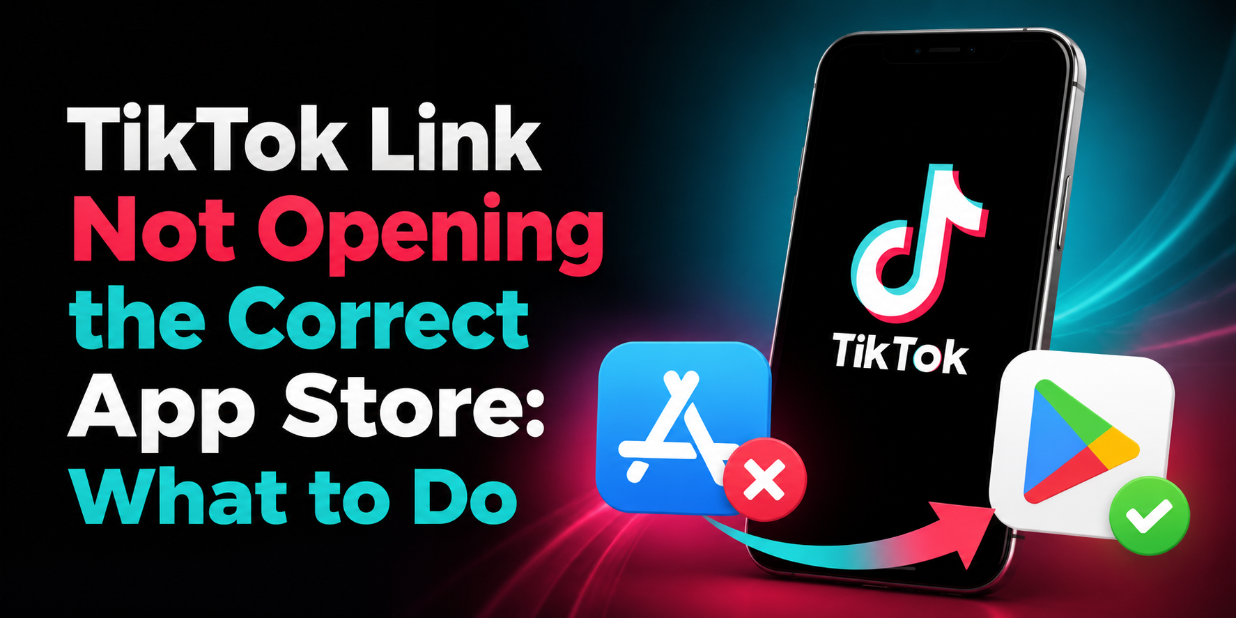
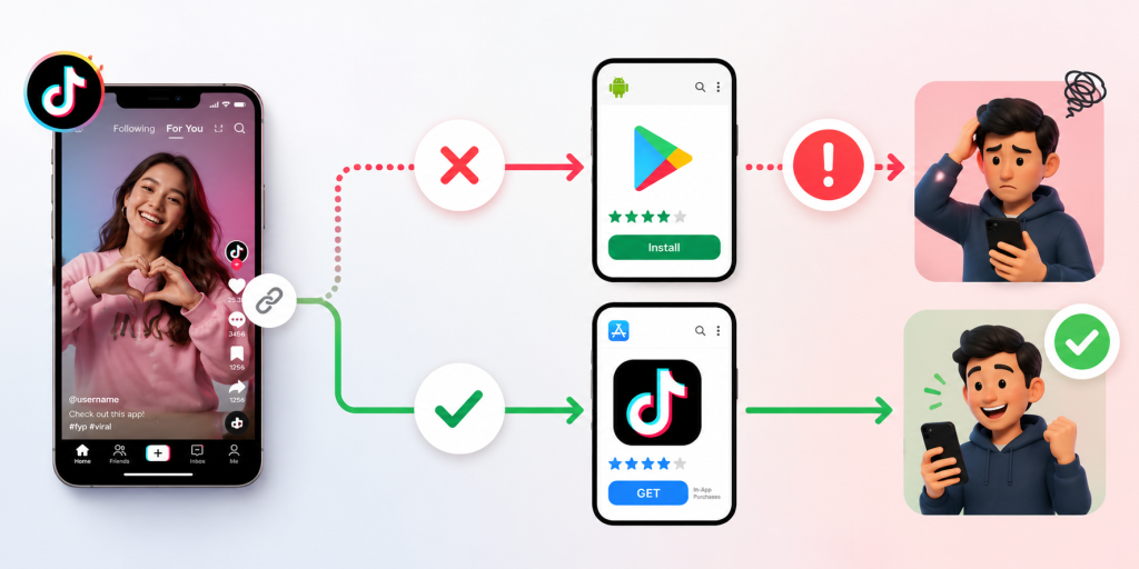
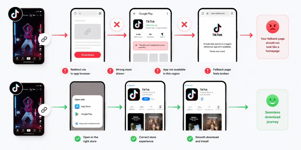
    A TikTok link not opening the correct app store is more than a small technical issue. It can break the exact moment when someone is ready to install your app. The user taps from TikTok, expects the right download page, and lands somewhere confusing instead. Maybe an iPhone user sees a Google Play page. Maybe an Android user opens an App Store preview. Maybe TikTok opens a web browser that never reaches the store at all.

    That broken click journey is expensive because TikTok traffic moves fast. People do not want to troubleshoot links. They do not want to search for your app manually. They do not want to choose between store buttons unless they have to. If the link sends them to the wrong place, many users simply leave.

    For app founders, growth teams, and mobile marketers, the fix is not just “change the link.” The real fix is to build a download path that understands where the user is coming from, what device they are using, and which destination makes sense. TikTok campaigns need links that can handle iPhone, Android, desktop, in-app browsers, and fallback pages without making the user think.

    The click is working, but the download journey is broken

    Many TikTok app campaigns look healthy at the surface. The video gets views. The call to action is clear. The link receives clicks. But installs stay low. When this happens, teams often blame the creative, audience, or offer first. Sometimes those are the problem. But often, the download journey is broken after the click.

    A TikTok click is only the first step. The user still needs to reach the correct store page, recognize the app, and install it. If the link opens the wrong destination, every step after that becomes harder. A campaign can generate real interest and still lose users because the route from TikTok to the app store is not built properly.

    This is why app download links need to be tested as full journeys, not just as URLs. A link can technically open and still fail the user. If the user lands on the wrong store, a generic homepage, a blank in-app browser, or a page with too many choices, the campaign is leaking installs.

    TikTok’s in-app browser can change how your link behaves

    TikTok often opens links inside its own in-app browser before sending users anywhere else. That browser does not always behave the same way as Safari, Chrome, or a normal device browser. This is one reason a link can work during internal testing but fail when real users tap it from TikTok.

    For example, a redirect may open smoothly in Safari but pause inside TikTok. An app store link may display as a browser preview instead of jumping directly to the store. A deep link may not trigger the expected app behavior. A tracking URL may pass through too many redirects and create friction.

    This matters because marketers often test links the wrong way. They paste the link into a desktop browser, see that it opens, and assume the campaign is ready. But TikTok users are not clicking from that environment. They are clicking from inside TikTok, usually on mobile, often with a short attention span.

    The safest test is simple: open the TikTok app on a real iPhone, tap the live link, and follow the journey. Then do the same on a real Android device. The link is only ready when both users reach the correct destination without confusion.

    One raw App Store link is not enough for a mixed-device audience

    A common mistake is placing one raw App Store link in a TikTok bio, ad, caption flow, or creator campaign. That may work for iPhone users, but it does not serve Android users well. The opposite is also true. A Google Play link may work for Android users, but it creates a poor journey for iPhone users.

    TikTok audiences are mixed. Even if your app is popular on one platform, your viewers may still include iOS users, Android users, desktop users, tablet users, and people opening shared links from other apps. One fixed store URL cannot serve all of them properly.

    This is the core reason TikTok app links often feel broken. The campaign is asking one link to do a job that requires routing. The link needs to understand the user’s device before choosing the destination.

    For a mobile app campaign, the public link should be simple. The routing behind it should be smart. iPhone users should go to the App Store. Android users should go to Google Play. Desktop users should see a useful page that helps them continue on mobile.

    The wrong store page creates silent install loss

    The worst part about a wrong app store redirect is that many users will not tell you. A few may comment that the link is broken. Some may send a message. Most will simply leave. That makes the problem quiet but costly.

    This silent loss can make campaign reporting misleading. TikTok clicks may look strong, but app installs remain weak. The team may assume the video attracted low-quality users. In reality, the link may have sent qualified users to the wrong destination.

    Wrong store pages also create trust issues. If a user taps to download your app and lands somewhere that does not match their device, the experience feels unprofessional. It suggests that the campaign was not prepared properly. For new apps, this can hurt confidence before the user even sees the product.

    A good app download path should remove doubt. The user should not need to understand the difference between platforms, redirects, browser behavior, or store URLs. They should tap once and see the right next step.

    How to check whether TikTok is the problem or your link is

    Before rewriting your TikTok content, isolate the issue. The problem may be TikTok’s in-app browser, your redirect setup, your app store URL, your tracking parameters, or your fallback page.

    Start by testing the same link in three places: inside TikTok, inside a normal mobile browser, and inside a messaging app. If it works in Safari or Chrome but fails inside TikTok, the in-app browser may be part of the issue. If it fails everywhere, the link or redirect setup is likely wrong.

    Then test by device. Use a real iPhone and a real Android phone. Do not rely only on desktop previews or screenshots from one team member. A link can behave correctly on iOS and fail on Android, or the other way around.

    Finally, check the destination itself. Make sure the App Store and Google Play URLs are current. Confirm that the app is available in the countries you are targeting. If the app is not available everywhere, your fallback page should explain what users can do next.

    Testing should answer one question clearly: when a TikTok user taps, do they reach the most useful destination for their device?

    A smarter TikTok app link should decide the destination for the user

    The best app download links do not make the user choose too early. They route users automatically when possible and provide a clear fallback when not possible. This is where smart links are useful for TikTok campaigns.

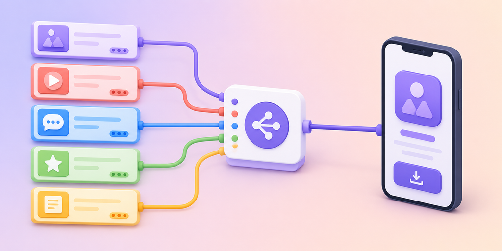
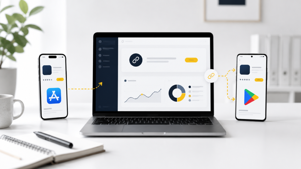
    A smart app link can send iPhone users to the App Store, Android users to Google Play, and desktop users to a landing page with QR codes or store buttons. The public link stays simple, while the routing logic handles the messy part behind the scenes.

    This is especially useful for TikTok because the same video can reach many user types. Someone may tap from an iPhone. Someone else may share the video to a friend on Android. Another person may open the link from desktop later. A raw store URL cannot handle all of these paths elegantly.

    A smart link also makes campaign management easier. Instead of changing every TikTok placement when a destination changes, you can update the final route behind the link. That matters for app launches, beta campaigns, creator promotions, and paid ads.

    Your fallback page should not look like a homepage

    When direct routing does not work, users need a fallback page. But that page should not be your generic homepage. A TikTok user who taps an app download link has a specific intent. They want the app. The fallback page should help them complete that action quickly.

    A strong fallback page should include App Store and Google Play buttons near the top. It should explain the app in one or two short lines. If the user is on desktop, it should include a QR code to continue on mobile. If the app is not available in a user’s country, the page should say so clearly and offer a waitlist or update option.

    The page should also avoid distractions. Do not send users into a long marketing site when they are already trying to install. The more steps you add, the more installs you lose.

    Think of the fallback page as a rescue path. It exists for moments when TikTok, the browser, the device, or the store redirect does not behave perfectly. Its job is to keep the user moving.

    Creator campaigns need controlled links, not copied store URLs

    If you work with TikTok creators, do not let every creator copy and paste their own app store link. This creates inconsistent user journeys and messy reporting. One creator may use the App Store URL. Another may use Google Play. Another may use your homepage. Another may paste an old campaign link.

    Give each creator a controlled smart link instead. That link should route users correctly and track performance separately. This lets you compare which creator drove clicks, which content style worked, and whether TikTok interest turned into app installs.

    This also protects the user experience. Every creator can promote the same simple action, while the link handles device routing behind the scenes. The creator does not need to explain different download paths for iPhone and Android users.

    For paid creator campaigns, this is especially important. If the link is wrong, you may pay for attention that never becomes installs. A controlled link makes the campaign easier to measure and easier to fix.

    Fix the path before you spend more on TikTok traffic

    A TikTok app campaign should be checked in this order: content, click, route, store page, install. Many teams skip the route and jump straight from content to install numbers. That is a mistake.

    If the route is broken, spending more money will only send more users into the same problem. Before increasing ad budget, boosting creator posts, or publishing more videos, make sure the download path works from TikTok on real devices.

    For teams that need one link to route TikTok users to the correct app store, itlink.to can be used as a practical smart link option for app campaigns, store redirects, and mobile-first tracking: https://itlink.to/#hub-link

    The goal is simple. A user who taps from TikTok should not have to think about which store to open. The link should take them there.

    TikTok link not opening the correct app store conclusion

    A TikTok link not opening the correct app store usually means the campaign has a routing problem. The content may be fine. The audience may be interested. The click may already be happening. But the user is being sent to the wrong destination after that click.

    The fix is to treat your app download link as part of the campaign, not as an afterthought. Test it inside TikTok. Test it on iPhone and Android. Check the fallback page. Make sure the store destination matches the user’s device. Give creators controlled links. Avoid raw single-store URLs when your audience is mixed.

    TikTok can create fast mobile attention, but attention only matters if the next step works. A better app link turns that tap into a smoother path toward install.

    References

  • What Is an App Store Redirect Link?

    What Is an App Store Redirect Link?

    An app store redirect link is one smart link that sends each visitor to the correct app download destination. iPhone users can go to the App Store. Android users can go to Google Play. Desktop visitors can go to a landing page with both download options.

    That sounds simple, but it solves one of the most common problems in app marketing. Most app campaigns use one public link, but the audience does not come from one device. People click from Instagram, TikTok, Product Hunt, email, QR codes, creator posts, paid ads, pitch decks, event booths, newsletters, and messaging apps.

    A normal App Store link only works well for iPhone users. A normal Google Play link only works well for Android users. A homepage may work for everyone, but it adds unnecessary steps before the download. An app store redirect link gives your campaign one clean public URL while routing users to the right place behind the scenes.

    One App Campaign Usually Has More Than One Type of User

    A simple app campaign rarely has one simple audience. Even if your app is mobile-first, people may discover it from many places. Someone may click from an iPhone while scrolling Instagram. Someone else may click from Android after watching a creator video. A desktop user may find the app from Product Hunt, a blog post, an email newsletter, or a pitch deck. If your campaign only uses one raw store URL, part of the audience gets the wrong experience. The link may not look broken, but the journey is still weak. The user has to figure out what to do next, and many users will not bother. A redirect link removes that decision by sending each visitor to the most relevant destination.

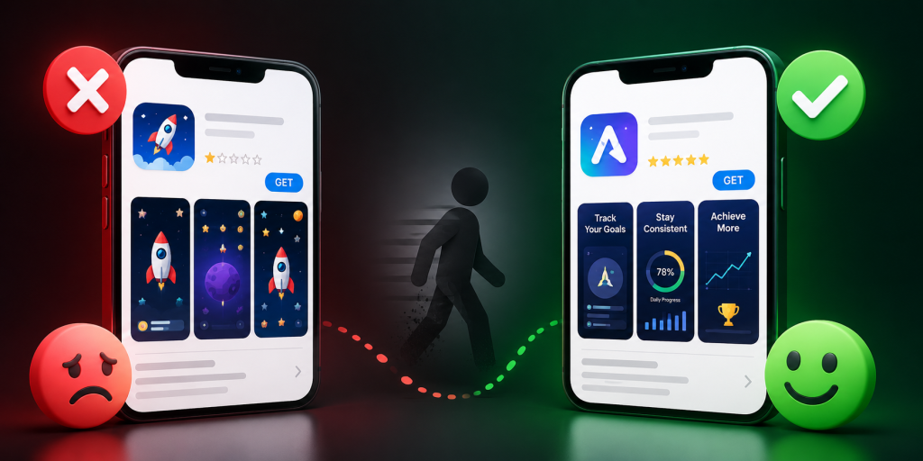
    The Wrong Store Page Is a Silent Install Killer

    The wrong store page does not always create a visible error. That is what makes it dangerous. An Android user who lands on an App Store page may simply close the tab. An iPhone user who lands on Google Play may assume the app is unavailable for them. A desktop visitor who lands on a mobile store page may not know whether to send the link to their phone, search for the app manually, or give up. These are not dramatic failures. They are silent conversion leaks. A campaign may still get clicks, but fewer people complete the install path. An app store redirect link helps fix the leak before it happens.

    A Short Link and an App Store Redirect Link Are Not the Same Thing

    A short link makes a long URL cleaner. That is useful, but it does not automatically make the link smarter. If you shorten an App Store URL, Android users still go to the wrong place. If you shorten a Google Play URL, iPhone users still go to the wrong place. The link looks nicer, but the campaign problem remains. An app store redirect link is different because it can use routing logic. The public link can still be short, readable, and easy to share, but the destination can change depending on the user’s device or context. For app campaigns, the logic behind the link matters more than the length of the link.

    The Desktop Fallback Should Not Be a Lazy Homepage

    Desktop users are often treated as an afterthought in app campaigns. Many teams send them to a homepage and hope they find the download buttons. That creates unnecessary friction. A better desktop fallback should be built for app discovery. It should explain the app quickly, show clear App Store and Google Play buttons, and include a QR code so users can continue on mobile. It should match the campaign message that brought the visitor there. If the campaign says “Download the app,” the fallback page should not feel like a general company website. It should help the user finish the download journey from desktop to mobile.

    QR Codes Make Redirect Links Even More Important

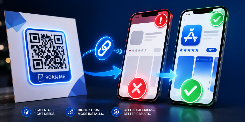
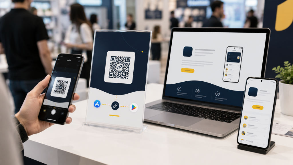
    QR codes are one of the clearest reasons to use an app store redirect link. A QR code may appear on flyers, posters, event booths, product packaging, restaurant tables, badges, slide decks, brochures, or business cards. Once printed, the code is hard to change. If it points directly to the App Store, Android users are blocked. If it points directly to Google Play, iPhone users are blocked. If it points to a landing page that changes later, the printed material may become outdated. A better setup is to make the QR code point to an editable app store redirect link. The QR code stays the same, while the destination logic can still serve the right users.

    The Link Must Work Inside Real Apps, Not Just Browsers

    Many teams test their app download link in Safari or Chrome and assume it works. That is not enough. App campaign links are often opened inside Instagram, TikTok, YouTube, Gmail, LinkedIn, X, Facebook, Messenger, WhatsApp, Telegram, and QR scanner apps. These environments can behave differently from normal browsers. A link that works perfectly in Chrome may feel awkward inside an in-app browser. Before launching, test your redirect link from the places where users will actually click. If your campaign runs on Instagram, test the link inside Instagram. If it runs through email, test it from mobile email apps. If it uses QR codes, scan the code with real phones in realistic conditions.

    Tracking Should Be Built Before the Campaign Goes Live

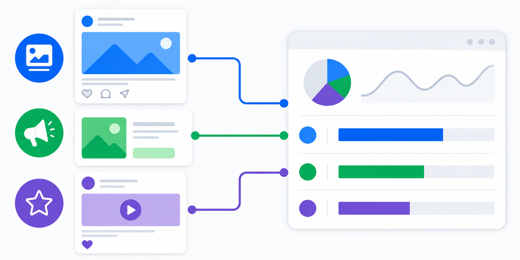
    An app store redirect link should not only send users to the correct destination. It should also help you understand which channels worked. If you use the same untracked link everywhere, you may see total clicks, but you will not know which source performed best. A stronger setup creates separate trackable links for major channels such as Instagram bio, TikTok profile, email, QR posters, event booths, creator partners, paid ads, and launch pages. The final destination may be similar, but each campaign placement should be measurable. This helps you learn from the campaign instead of only counting clicks. Without clear tracking, your team may repeat weak channels and underinvest in strong ones.

    App Store Redirect Links vs Deep Links

    An app store redirect link and a deep link are related, but they solve different problems. An app store redirect link decides where the user should go during the download journey. It can send iPhone users to the App Store, Android users to Google Play, and desktop visitors to a fallback page. A deep link usually opens a specific screen inside an installed app. For example, a deep link may open a referral page, product page, workout plan, message thread, booking screen, or saved item. Many mature app campaigns use both, but the order matters. If users are landing on the wrong store, fix redirect routing first. If users already have the app and need to land on the right screen, deep links become more important.

    When You Should Use an App Store Redirect Link

    Use an app store redirect link when your app campaign will be seen by users on different devices. This includes launch pages, Product Hunt posts, social campaigns, influencer promotions, newsletters, QR codes, paid ads, event materials, podcast notes, pitch decks, and app landing pages. It is especially useful when you do not control the user’s device or platform. If people may click from iPhone, Android, and desktop, a redirect link prevents you from choosing one store URL and hoping for the best. It also makes your campaign easier to share because everyone can use the same public link.

    Common Mistakes That Make App Download Links Weaker

    Many app teams lose installs because the link setup is treated as a last-minute task.

    • Sharing only the App Store link across every channel.
    • Sharing only the Google Play link across every channel.
    • Sending desktop visitors to a generic homepage.
    • Using QR codes that point directly to one store.
    • Using one campaign link everywhere with no source tracking.
    • Not testing links inside Instagram, TikTok, Gmail, or QR scanner apps.
    • Forgetting that the app may not be available in every country.
    • Using a random short link that looks suspicious.
    • Changing the landing page after launch without updating the link.
    • Measuring clicks without checking whether users reached the right store.

    These mistakes are easy to avoid when the link is planned before the campaign goes live.

    Final Checklist Before Sharing Your App Store Redirect Link

    Before publishing your campaign link, test the full journey from the user’s point of view.

    • iPhone users should reach the correct App Store page.
    • Android users should reach the correct Google Play page.
    • Desktop users should reach a useful fallback page.
    • The fallback page should include clear download buttons.
    • QR codes should point to an editable redirect link.
    • The public short link should look clean and trustworthy.
    • Each important channel should have its own trackable link.
    • The link should work inside the main social and email apps.
    • Store listings should be live and accurate.
    • The app should be available in your target countries.
    • The CTA should match the destination after the click.
    • Analytics should be ready before traffic starts.

    A good app store redirect link should feel invisible to users. They should not notice the routing. They should only feel that the app download path worked.

    Conclusion: One App Link Should Work for Every User

    An app store redirect link helps one campaign serve many different users. Instead of forcing everyone through one store URL, it routes iPhone users, Android users, and desktop visitors to the right destination. That makes app launches, QR campaigns, creator promotions, social posts, paid campaigns, and event marketing easier to manage. It also reduces silent friction that can cost installs. For app teams, startups, creators, and marketers, one clean redirect link can make the first click much more reliable. To create clean short links and app store redirect links for campaigns, you can use itlink.to here

    References

  • One App Download Link for App Store, Google Play, and Web

    One App Download Link for App Store, Google Play, and Web

    When someone wants to download your app, the path should feel simple. But many campaigns still use separate links for iOS, Android, and desktop users. That creates friction, confusion, and missed installs. A one app download link solves this by sending each visitor to the right destination automatically: App Store for iPhone users, Google Play for Android users, and a web page for desktop visitors.

    Why App Download Links Often Create Friction

    A normal app download campaign sounds easy at first. You create an App Store link, a Google Play link, and maybe a website link. Then you place them in ads, QR codes, email campaigns, social posts, and landing pages.

    The problem starts when users arrive from different devices. An iPhone user should not land on a Google Play page. An Android user should not be sent to the App Store. A desktop user may not be ready to install immediately, so sending them directly to a mobile store can feel broken.

    This is where many app campaigns lose momentum. The user is interested, but the link does not match their device. Instead of downloading, they close the page, search manually, or forget about the app.

    The Real Problem Is Not the Link, It Is the Click Journey

    Most teams think about the link as a URL. Users experience it as a journey. They see a post, tap a button, scan a QR code, or click an ad. After that, they expect the next page to make sense instantly.

    If the journey feels wrong, trust drops. A user may wonder if they clicked the wrong link. They may think the app is not available for their device. They may decide the process is too much work.

    A better app download link removes that decision from the user. The link should understand the visitor’s device and send them to the most useful next step.

    One App Download Link for App Store, Google Play, and Web

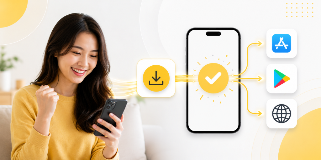
    A one app download link gives your campaign one clean URL that works across different devices. Instead of showing separate buttons everywhere, you promote one link.

    For example, the same link can send iPhone users to the App Store, Android users to Google Play, and desktop users to your website or app landing page. This makes your campaign easier to share and easier to manage.

    It is especially useful for social media bios, influencer campaigns, QR codes, printed flyers, email newsletters, and paid ads. You do not need to guess which device the user will use. The link handles the routing.

    Practical Places Where One Link Works Better

    A single app download link is useful anywhere your audience may come from mixed devices.

    • Social media bio: Use one link instead of asking users to choose between iOS and Android.
    • QR code campaign: Print one QR code on posters, packaging, menus, or event materials.
    • Paid ads: Send all mobile traffic through one clean campaign link.
    • Influencer posts: Give creators one link that works for every follower.
    • Email campaigns: Let desktop users visit a landing page while mobile users go to the right store.
    • Offline marketing: Avoid printing separate QR codes for App Store and Google Play.

    This is not only cleaner for users. It is also easier for your team because one campaign link can be reused across channels.

    Common Mistakes That Reduce App Installs

    Many app campaigns fail because the link setup is too manual. The campaign may look polished, but the download path still feels messy.

    A common mistake is placing two store buttons in every campaign. This works on a website, but it is not ideal for social bios, QR codes, short-form videos, or printed materials. Another mistake is using only one store link, which can exclude half of your mobile audience.

    Some teams also forget desktop users. A desktop visitor may not want to open a mobile app store page. A better fallback is a landing page with app details, screenshots, and store buttons.

    The goal is simple: every user should feel like the link was made for their device.

    How Smart Routing Improves the Download Experience

    Smart routing means the link checks useful signals, such as device type or operating system, before sending the user to a destination. The user does not need to choose manually.

    For app campaigns, this is powerful because the best destination depends on the visitor. iOS users need the App Store. Android users need Google Play. Desktop users often need a web page. Some campaigns may also need different pages by country, language, or campaign source.

    This helps reduce wasted clicks. It also creates a more professional experience because the link feels intentional from the first tap.

    What to Track After Someone Clicks

    A good app download link should not only redirect users. It should also help you understand performance. Click tracking can show which channels bring attention, which campaigns perform better, and where users are coming from.

    For example, you may find that Instagram brings many clicks but few serious users. You may discover that QR codes at events perform better than expected. You may also learn that desktop traffic needs a stronger landing page before users install later.

    Without tracking, every campaign feels like a guess. With tracking, you can improve the path from click to download.

    What a Better App Link Setup Should Include

    Before promoting your app, your link setup should be clear and flexible.

    • iOS destination: Send iPhone and iPad users to the App Store.
    • Android destination: Send Android users to Google Play.
    • Desktop fallback: Send laptop and desktop visitors to a web landing page.
    • Clean short URL: Make the link easy to share in bios, ads, and offline materials.
    • QR code support: Use the same routing logic for printed campaigns.
    • Analytics: Track clicks by campaign, channel, device, or location when available.

    With itlink.to, you can create a smart link for app campaigns and use it as one clean destination across App Store, Google Play, and web traffic.

    Conclusion: Make the Download Path Feel Effortless

    A one app download link makes your app campaign easier for users and easier for your team. Instead of managing separate links for iOS, Android, and desktop, you can promote one clean URL that sends people to the right place.

    This matters because app installs often depend on small moments. A user taps because they are interested. If the next step is confusing, you may lose them. If the next step is clear, they are more likely to continue.

    Create one smart app download link with itlink.to and give every user a smoother path to install your app.

    References

  • How to Create One Link for App Store and Google Play

    How to Create One Link for App Store and Google Play

    You launch an app, share the download link, and immediately run into a simple problem: iPhone users need the App Store, Android users need Google Play, and desktop users need somewhere useful to go. Posting two separate links works on a full landing page, but it gets messy fast in a social bio, QR code, email button, ad, or influencer caption. A one link for app store and google play setup fixes this by giving people one URL that sends them to the correct destination automatically. This guide shows how that setup works, where to use it, what to test before publishing, and how to avoid the small mistakes that can quietly hurt app downloads.

    The Real Problem Is the Click Path, Not the Store Link

    Most app teams think the problem is simple: “We have two store links.” But the real issue is the path between user interest and download. When someone sees your app in a TikTok bio, event poster, email campaign, or ad, they are usually making a quick decision. If they tap and land somewhere confusing, the moment is gone. If they see two links and have to choose, that is one more step. If they click from desktop and land on a page built only for mobile users, the journey breaks. A good app link should reduce thinking. The user should tap once and keep moving.

    Why Two Separate Links Work on Landing Pages but Fail in Campaigns

    Two store buttons are normal on a website because the page has space to explain them. The user can see the app name, screenshots, text, and both download options. In that context, two buttons are fine. Campaign links are different. A social bio gives you very little space. A QR code can only point to one destination. An email CTA should not ask the reader to choose between two buttons when one button is enough. Influencers also prefer one clean link because it is easier to say, paste, and remember. That is why the same link strategy does not work everywhere. On your website, two store buttons may be fine. In campaigns, one smart link is usually cleaner.

    How One App Link Decides Where Each User Should Go

    A device-based app link checks the visitor’s device when the link opens. If the user is on iPhone or iPad, the link sends them to the App Store. If the user is on Android, it sends them to Google Play. If the user is on desktop, it sends them to a fallback page you choose. This is different from a normal short link. A regular short link usually sends everyone to the same destination. A routing link sends different users to different destinations from one shared URL. That difference is what makes one link useful for real campaigns. You can promote the same URL everywhere without asking users which phone they use.

    What to Prepare Before Creating Your Smart Link

    Before setting up the link, gather the destinations and campaign details first. This makes the setup easier and helps you avoid messy redirects later.

    • Apple App Store URL: For your iPhone and iPad users.
    • Google Play Store URL: For your Android users.
    • Desktop Fallback URL: Usually your dedicated app landing page.
    • Campaign Name: Crucial if the link is being used for ads, email tracking, or influencers.
    • Short Readable Slug: Something punchy and easy to type, such as /download or /app.
    • A Quick Test Plan: A checklist to verify iPhone, Android, desktop, and QR scan behavior.

    The fallback page is not optional if you care about desktop traffic. Many people still discover apps from blog posts, press pages, LinkedIn, newsletters, and work laptops.

    What Desktop Users Should See After Clicking

    Desktop visitors should not be treated as failed mobile users. They may still be interested; they are just not on the device where they can install the app immediately. The best fallback is usually a simple app landing page. It can explain what the app does, show App Store and Google Play buttons, include a QR code, and give the visitor a reason to continue. If the app is new, the fallback page can also include screenshots, pricing, a waitlist, or a short product demo. Avoid sending desktop users directly to a mobile store page without context. It often feels awkward and gives you less control over what happens next.

    Where One Link for App Store and Google Play Works Best

    One link for app store and google play is most useful when you cannot predict the device behind the click. That includes almost every public marketing channel.

    • Social Media Bios: Perfect for Instagram, TikTok, X, LinkedIn, and Facebook where character space is limited.
    • Physical Marketing: QR codes on posters, flyers, packaging, booths, tables, and receipts.
    • Paid Ad Campaigns: Ads that receive untargeted, mixed traffic from both iOS and Android users.
    • Email Marketing: Newsletters and campaigns that are opened fluidly across phones, tablets, and desktops.
    • Influencer Partnerships: Captions where a single, clean CTA performs better than a mess of multiple links.
    • PR & Media: Blog posts, launch announcements, and press mentions.
    • Customer Support: Quick replies where the team should not need to ask, “Are you on iPhone or Android?” before sending a link.

    The more places your link appears, the more valuable a single routing link becomes.

    Common Mistakes That Quietly Reduce Downloads

    The most common mistake is using a basic short link and assuming it solves the app store problem. Shortening a URL makes it look cleaner, but it does not automatically send iPhone and Android users to different places. Another mistake is only testing in Safari or Chrome. Many users open links inside Instagram, TikTok, Facebook, Gmail, Messenger, or Line. In-app browsers can behave differently, so your real campaign environment matters. Teams also forget about old placements. If a QR code is printed on a poster or packaging, the link needs to keep working long after the campaign is created. A good app download link should be easy to update without breaking the URL people already have.

    The Easier Way Is to Avoid Building Routing Logic Yourself

    You can build this system yourself, but most small teams do not need to. Custom routing means detecting devices, handling fallbacks, testing edge cases, maintaining redirects, and updating destinations when store links change. That is time your team could spend on the app, the launch, or the campaign itself. Instead of building device-detection logic yourself, you can set this up with itlink.to One Route and use one clean app download link across your campaigns. Set the iOS destination, set the Android destination, add a desktop fallback, then test the final URL before publishing.

    Create One Clean App Download Link Before Your Next Campaign

    Creating one link for app store and google play is a small setup task that can make your app promotion feel much cleaner. It removes the need for two public links, reduces wrong clicks, and gives desktop visitors a better path. Before your next launch, ad campaign, QR code, or influencer post, create one app download link and test it from the places users will actually click. Check iPhone, Android, desktop, email, social apps, and QR scans. Create one app download link with itlink.to One Route so every campaign has one clear URL that is easier to share, easier to manage, and easier for users to click.