หมวดหมู่: HubLink

Articles about link-in-bio pages, creator profiles, social media landing pages, and managing multiple links from one page.

  • How to Create a Link in Bio for TikTok That Actually Gets Clicks

    How to Create a Link in Bio for TikTok That Actually Gets Clicks

    A Link in Bio for TikTok sounds simple. Add a link, post videos, and wait for people to click. In reality, most TikTok creators discover that getting views is easier than getting clicks.

    Someone may watch three of your videos, like your content, visit your profile, and still leave without taking action. The reason is usually not the content. The problem is often the bio link experience itself.

    A good TikTok bio link should continue the conversation your video started. It should help visitors find exactly what they expected after tapping your profile. When done well, it can turn viewers into subscribers, customers, app users, readers, or leads.

    TikTok Users Behave Differently Than Instagram Users

    Many creators copy their Instagram bio page and use it on TikTok. That often leads to disappointing results.

    TikTok traffic is driven by discovery. Most people who find your content have never heard of you before. They are not loyal followers yet. They are curious strangers.

    This means your bio page must work harder. Visitors need context. They need a clear reason to click. They need to immediately understand why your link is worth their time.

    A page built for existing followers often performs poorly for first-time visitors arriving from TikTok.

    Start With the Question Your Video Created

    Every successful TikTok creates curiosity.

    A cooking creator might make viewers want the full recipe. A travel creator might make viewers want the itinerary. A fitness coach might make viewers want the workout plan. A SaaS founder might make viewers want the tool being demonstrated.

    The biggest mistake is forcing visitors to search for that answer after they click your bio.

    If your latest viral video discusses cheap flights to Japan, the first thing visitors should see should probably be related to Japan travel, not a generic homepage full of unrelated links.

    The closer the bio page matches the video’s promise, the more likely people are to continue.

    Don’t Treat Every Link as Equal
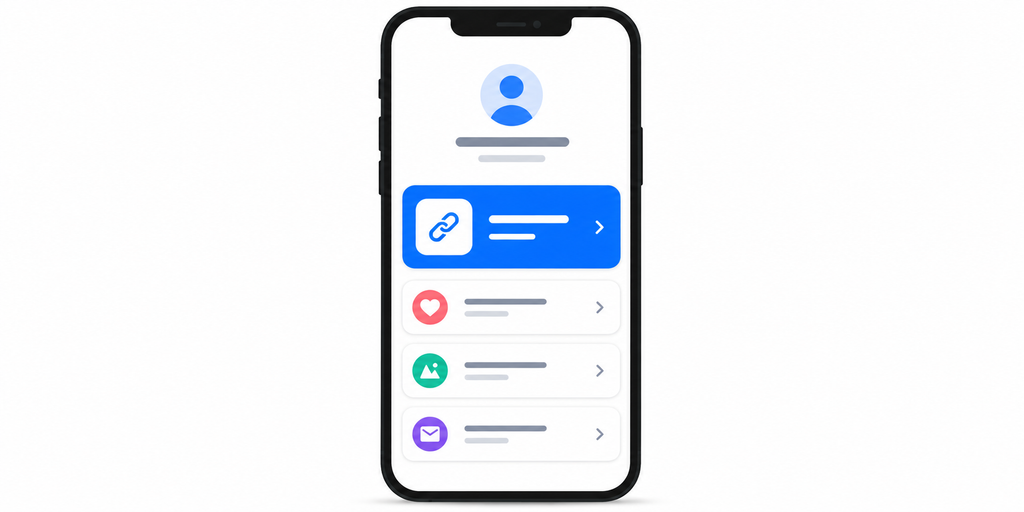
    Many TikTok bio pages suffer from a common problem: everything looks equally important.

    Visitors arrive and see ten buttons such as website, blog, newsletter, podcast, store, Instagram, YouTube, LinkedIn, contact, and resources. Nothing stands out.

    When everything is important, nothing feels important.

    Instead, think about priority. What action matters most right now? Maybe it is your latest product launch. Maybe it is a lead magnet. Maybe it is an app download.

    The primary action should be obvious within seconds.

    What to Put on Your TikTok Link in Bio Page

    A strong TikTok bio page should not include every link you own. It should include the links that match what viewers are most likely looking for after watching your content.

    Link TypeBest ForExample Button Text
    Main offerSales, bookings, launchesShop the collection
    App downloadMobile apps, SaaS, toolsDownload the app
    Free resourceEmail list growthGet the free guide
    Latest contentCreators, bloggers, educatorsWatch the full tutorial
    Booking linkCoaches, consultants, local servicesBook a call
    Product pageEcommerce and affiliate creatorsView my favorites
    Community linkDiscord, newsletter, membershipsJoin the community

    The top link should match your current TikTok content. If your latest videos are about a product launch, put that offer first. If your content is educational, lead with the most useful free resource. If your goal is app growth, make the app download link the main action.

    Why Most TikTok Traffic Never Reaches the Right Page

    There is usually a large drop-off between profile visits and meaningful clicks.

    One reason is decision fatigue. A user arrives expecting one thing but sees too many choices. Instead of deciding, they leave.

    Another reason is distraction. Some bio pages send users through unnecessary steps before reaching the final destination.

    For example:

    TikTok profile → Bio page → Homepage → Product page → Checkout

    Every additional click creates friction.

    The best bio pages remove unnecessary decisions and shorten the journey.

    Design Your Link Page for Mobile Attention Spans

    TikTok traffic is almost entirely mobile.

    Your bio page should assume people are standing in line, watching TV, commuting, or scrolling rapidly between apps.

    A mobile-friendly TikTok bio page should include:

    • A clear headline
    • One primary action near the top
    • Minimal scrolling
    • Large tap targets
    • Fast loading speed
    • Clean visual hierarchy
    • Few competing choices

    The goal is not to impress visitors with design complexity. The goal is to help them act quickly.

    TikTok Bio Link Mistakes and Better Fixes

    Even a small mistake can reduce clicks. The page may look fine, but the journey can still feel unclear to visitors.

    Common MistakeWhy It Hurts ClicksBetter Approach
    Adding too many linksVisitors do not know where to startKeep the most important links near the top
    Using vague button textPeople are unsure what they will getWrite action-based labels
    Sending everyone to a homepageThe journey feels disconnected from the videoSend users to the most relevant page
    Not tracking clicksYou cannot see what content drives actionUse a bio link tool with analytics
    Leaving old campaigns liveThe page feels outdatedUpdate links based on current TikTok content

    A good Link in Bio for TikTok should feel current. If your content changes every week but your bio page stays the same for months, visitors may not find what they came for.

    Use Your Bio Link to Support Content Series

    One-off viral videos are great. Consistent content themes are even better.

    Many successful creators build recurring content series. Examples include travel tips, startup lessons, language learning, fitness challenges, or product reviews.

    Your bio page can reinforce those themes. Instead of creating a generic link hub, organize links around the topics people already know you for.

    A travel creator could feature itineraries, destination guides, booking resources, and trip planning tools. A fitness creator could highlight programs, calculators, nutrition guides, and coaching offers.

    This creates a stronger connection between content and action.

    Track What People Actually Click
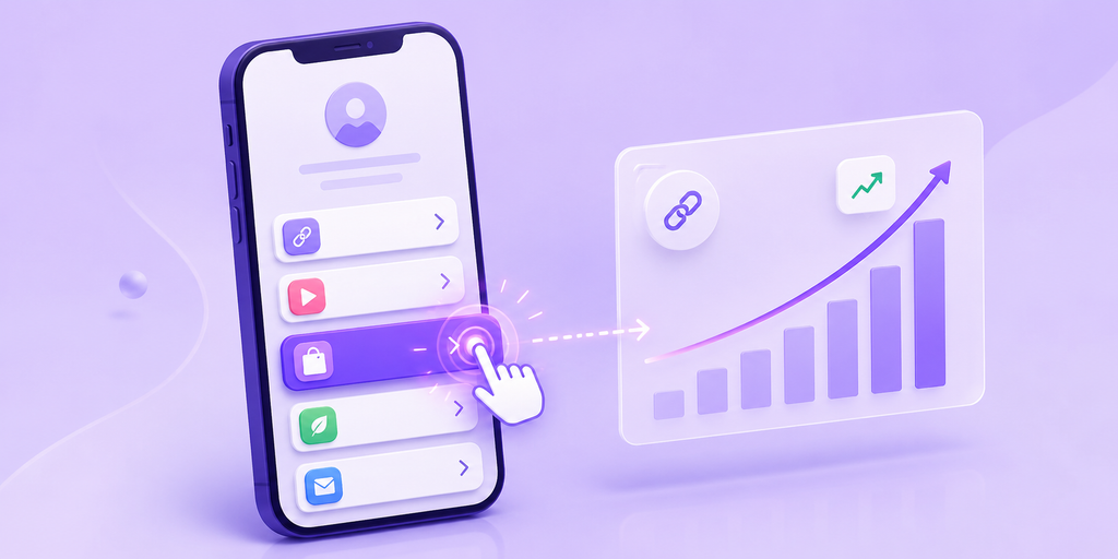
    Many creators only look at views.

    Views are important, but they do not tell the whole story.

    A video with fewer views may drive more business results if it generates higher-quality clicks. A viral post may generate traffic but very little action.

    Tracking click behavior helps reveal which content themes create intent rather than just attention.

    For example, you might discover that budget travel videos drive more clicks than luxury travel videos, tutorials outperform entertainment content, product demos outperform feature announcements, or certain destinations consistently generate interest.

    These insights can influence your future content strategy.

    Build a Better TikTok Funnel Instead of Chasing More Views

    Many creators focus entirely on growing reach.

    But sometimes the easiest growth opportunity is improving what happens after someone visits your profile.

    If 1,000 people visit your profile and only 10 click, improving that conversion rate can have a bigger impact than getting another 10,000 views.

    A strong bio link acts like a bridge between content and business goals. It helps convert attention into measurable action.

    Whether that action is an email signup, purchase, booking, app install, or consultation request, the process starts with a clear next step.

    Create a Link in Bio for TikTok That Matches Your Content

    The best Link in Bio for TikTok is not the one with the most links. It is the one that feels like a natural continuation of your content.

    Visitors should never wonder where to click next. The answer should be obvious.

    With a tool like itlink.to HubLink, creators can build a branded bio page that organizes important links, highlights current campaigns, and tracks what visitors actually click. Instead of constantly changing your TikTok bio URL, you can maintain one destination that evolves alongside your content.

    If your TikTok content is earning attention, your bio link should help turn that attention into action. Start by simplifying choices, prioritizing your main goal, and giving visitors a clear path forward.

    References

    • TikTok Business Help Center: Official platform documentation for account management, campaign setup, ad formats, and pixel integration.
    • TikTok Academy: Learning platform offering structured educational paths, certifications, and best practices for brand creative and media buying.
    • Google Analytics Campaign Tracking Documentation: Technical guide on configuring custom campaign parameters and analyzing source, medium, and channel performance data.
    • Meta Business Help Center: Resource hub detailing ad setup, audience targeting, and business asset management across Facebook and Instagram.
    • HubSpot Creator Marketing Research: Industry research report analyzing creator economy trends, monetization models, and brand-creator partnership strategies.
  • How to Track App Downloads From Social Media

    How to Track App Downloads From Social Media

    If you promote an app on Instagram, TikTok, YouTube, Facebook, LinkedIn, or X, clicks alone do not tell the full story. A post may get attention, but the real question is whether people actually download the app. That is why learning how to track app downloads from social media matters.

    The challenge is that social media traffic is messy. People click from bios, Stories, Reels, comments, DMs, ads, creator posts, and QR codes. Some click from iPhone. Some click from Android. Some open the link on desktop first. If every channel uses a different link without clear tracking, it becomes hard to know what is working.

    Why Social Media App Tracking Gets Messy

    Social platforms are built to keep people moving fast. Someone may see your Reel today, visit your profile tomorrow, and download your app three days later. Another person may click your bio link from Instagram but install later after searching your app name in the App Store.

    This makes attribution difficult. Social platforms may show profile visits, link clicks, or ad clicks. App stores may show downloads. Analytics tools may show website sessions. But those numbers do not always connect neatly.

    That is why your link setup matters. If your social links are not organized from the start, your data will always feel incomplete.

    Track App Downloads From Social Media With the Right Link Structure

    To track app downloads from social media, start by creating a clear link structure for each channel and campaign. Do not use one random store link everywhere.

    For example, your Instagram bio link, TikTok profile link, YouTube description link, influencer campaign link, and paid ad link should be easy to separate in reporting. This does not always mean showing different links to users. It means your tracking setup should know where each click came from.

    A good structure helps you compare traffic sources without guessing. You can see whether Instagram bio clicks outperform TikTok profile clicks, whether creator posts drive better traffic than your own posts, and whether short-form video brings more app interest than static content.

    Use One Landing Page Instead of Sending Everyone Straight to the Store

    Sending every social visitor directly to the App Store or Google Play can work, but it often hides useful context. A link in bio page or app landing page gives you more control.

    For social media, this is especially useful because not every visitor is ready to download immediately. Some people want to understand what the app does first. Some want to compare features. Some are on desktop. Some need the right store button.

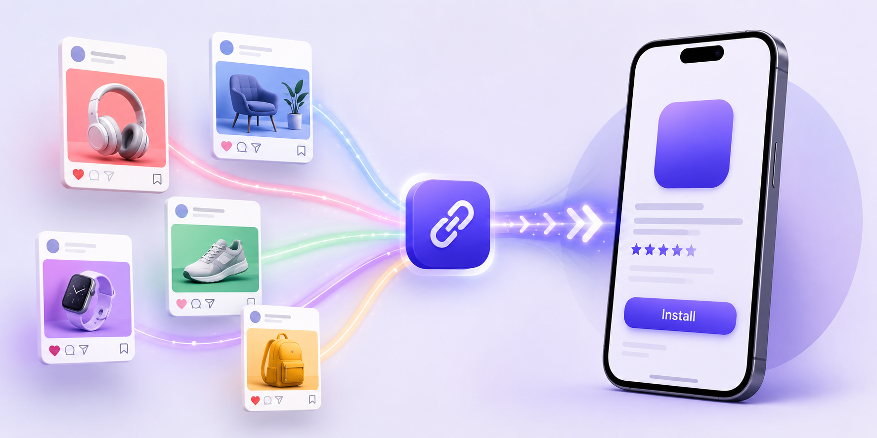
    A smart landing page can include your main app download button, store badges, campaign links, feature highlights, creator offers, support links, and tracking for each click. This gives you a cleaner bridge between social interest and app store visits.

    What You Should Track Before the App Store

    Before someone downloads your app, there are several useful signals to measure.

    You should track:

    • Which social platform the click came from
    • Which profile, post, story, ad, or creator link drove the visit
    • Whether the visitor used iPhone, Android, or desktop
    • Which button they clicked on your link page
    • How many people reached the App Store or Google Play
    • Which campaign produced the strongest download intent

    These signals help you improve your social content before waiting for store analytics alone.

    Why UTM Parameters Still Matter

    UTM parameters are simple tags added to a URL. They help analytics tools understand where traffic came from. For example, you can tag a link as Instagram, bio, app launch campaign, or influencer campaign.

    A basic UTM setup may include source, medium, and campaign. Source could be Instagram. Medium could be social. Campaign could be summer_launch or creator_partner_01.

    UTMs are not perfect for full install attribution, but they are still useful. They help you organize social traffic, compare campaigns, and avoid mixing every click into one unclear bucket.

    The Problem With Only Looking at Social Platform Analytics

    Instagram, TikTok, YouTube, and other platforms can show useful engagement data. But they usually do not show the full download journey.

    A Reel may have high views but low download intent. A smaller creator may drive fewer clicks but better-quality users. A bio link may get steady traffic even when individual posts stop performing.

    If you only look at likes, views, shares, and comments, you may invest in the wrong content. App marketing needs click and destination data too. You need to know what happens after someone leaves the social platform.

    How HubLink Helps Connect Social Clicks to App Downloads

    This is where itlink.to HubLink fits naturally. HubLink lets you create a clean link in bio page where social visitors can choose the right next step, including app download links, product pages, campaign pages, creator links, or other important destinations.

    For an app, your HubLink page can act as the central social traffic hub. Instagram, TikTok, YouTube, and other platforms can all point to one branded page. From there, you can guide iPhone users to the App Store, Android users to Google Play, and desktop users to a helpful landing page.

    The benefit is not just having a prettier bio link. It is having a more organized click journey. You can see which links people click, which campaigns get attention, and which social channels send real app download intent.

    Common Mistakes That Make Download Tracking Hard

    Many teams only think about tracking after a campaign already runs. By then, the data is already messy.

    Common mistakes include using the same app store link everywhere, changing Instagram bio links without tracking the date, sending desktop users directly to mobile store pages, forgetting UTMs, not separating organic and paid traffic, and letting influencers use untracked links.

    Another common mistake is tracking clicks but not the next step. A link click is useful, but a store visit is more valuable. If possible, separate “clicked bio link” from “clicked App Store” or “clicked Google Play.” That gives you a better view of intent.

    Build a Simple Social App Tracking System

    You do not need a complicated setup to start. Begin with one clean social traffic hub, clear campaign links, UTM parameters, and consistent naming.

    For example, use your HubLink page as the main Instagram and TikTok bio link. Add separate tracked buttons for App Store, Google Play, website, pricing, waitlist, or campaign pages. For influencer campaigns, create a unique tracked link or button. For ads, use campaign-specific URLs.

    Then review performance regularly. Which platform sends the most clicks? Which button gets tapped most? Are people clicking the app download link or getting distracted by other links? Should your main CTA be higher on the page?

    This kind of tracking helps you make better marketing decisions without overcomplicating the system.

    Turn Social Attention Into Measurable App Growth

    To track app downloads from social media, you need more than a store link. You need a clear path from social content to app download, plus enough data to understand what happened along the way.

    A strong setup helps you answer practical questions. Which social platform drives the most app interest? Which campaign deserves more budget? Which creator brings real users? Which CTA gets people closer to downloading?

    With itlink.to HubLink, you can turn your social bio into a cleaner app marketing hub. Instead of sending everyone through scattered links, you can guide visitors to the right destination and track the clicks that matter.

    Create your HubLink page, connect your app download links, add campaign tracking, and start turning social media traffic into measurable app growth.

    References

  • How to Create a Link in Bio Page for Instagram

    How to Create a Link in Bio Page for Instagram

    A link in bio page for Instagram should do more than hold a few buttons. It should help followers understand where to go next after they see your Reel, Story, product, offer, service, event, or latest post. The problem is that many bio pages feel like a messy drawer. Everything is there, but nothing feels clear.

    Instagram gives you limited space to move people from interest to action. Someone may like your post, visit your profile, tap your bio link, and decide within seconds whether to continue. That small journey matters. A good link in bio page makes the next step obvious without making the visitor think too hard.

    Start With the Click Your Followers Already Want to Make

    The best link in bio page starts with intent. Before adding links, ask what your follower is most likely looking for after visiting your profile.

    If you are a creator, they may want your latest video, newsletter, product, or booking link. If you are a local business, they may want your menu, location, reservation page, or WhatsApp contact. If you are an app, they may want to download the app, join a waitlist, or read more about a feature.

    This is where many Instagram pages go wrong. They treat all links as equal. But your latest campaign, strongest offer, or most requested action should usually be easier to find than everything else.

    Keep the First Screen Focused

    Most people will not study your bio page carefully. They scan. The first screen should quickly answer: “Where should I click?”

    Your top section should include your name, a short description, and one main action. Do not fill the top of the page with five competing buttons. That creates hesitation.

    For example, a travel creator could lead with “Get my Japan itinerary” instead of showing every platform link first. A fitness coach could lead with “Book a free consultation” instead of hiding it under social links. A SaaS company could lead with “Start free” or “View pricing” instead of pushing visitors through a generic homepage.

    The top of your page should match the reason people came from Instagram.

    Choose Links Based on Real Instagram Moments

    Your Instagram content should shape your bio page. If your latest Reel promotes a guide, that guide should be easy to find. If your Story mentions a discount, the discount should be near the top. If your pinned post explains your app, your app download link should not be buried.

    Useful links often include:

    • Latest product, offer, guide, or campaign
    • Booking, contact, WhatsApp, or inquiry form
    • App download link or signup page
    • Featured content mentioned in recent posts
    • Store, pricing, menu, or service page
    • Newsletter, community, or lead magnet

    This keeps your link page connected to what followers are seeing today, not what you added six months ago.

    Write Button Text Like a Human

    Button text matters more than people think. Generic labels like “Website,” “Shop,” or “Learn More” can work, but they often miss the chance to explain the value of the click.

    Good button text tells people what they will get. “Download the app” is clearer than “App.” “Book a table” is better than “Reservations.” “Get the free checklist” is stronger than “Resources.”

    The goal is not to be clever. The goal is to reduce doubt. A visitor should understand each button before tapping it.

    Avoid Turning Your Bio Page Into a Link Dump

    A messy link in bio page can hurt clicks even if the design looks nice. Too many buttons make visitors slow down. They may leave because the page feels like work.

    This does not mean you can only have one link. It means every link should earn its place. Remove old campaigns, outdated announcements, expired offers, duplicate social links, and pages that do not support your current goal.

    A clean page feels more trustworthy. It also helps your most important links get more attention.

    Make the Page Feel Like Your Brand

    Your link in bio page is part of your customer experience. It should not feel disconnected from your Instagram profile, website, or product.

    Use your brand colors carefully, keep the layout clean, and make sure the page looks good on mobile. Avoid using too many colors, oversized icons, or buttons that compete with each other. The design should support the action, not distract from it.

    For brands, this is especially important. A follower who clicks from Instagram is already interested. A polished link page helps that interest feel more real.

    Track Clicks So You Know What Actually Works

    Without click tracking, you are guessing. You may think your audience wants your shop link, but your booking link gets more clicks. You may assume Reels drive the most traffic, but Stories may convert better.

    A good link in bio page should help you see which links people click, where traffic comes from, and which campaigns deserve more attention. This can guide your Instagram strategy.

    For example, if your “Download the app” button gets strong clicks after product demo Reels, you can create more demo content. If your newsletter link performs poorly, you can change the offer or move it lower.

    A Simple Link in Bio Page Structure That Works

    A practical Instagram bio page does not need to be complicated. It just needs a clear order.

    Start with your profile identity, then one main CTA, then supporting links, then secondary links. The most important action should appear near the top. Social links, old content, and less urgent pages can go lower.

    For example, an app brand might structure the page like this: app download link first, current campaign second, feature page third, support or contact fourth, then social links at the bottom. A creator might use: latest offer first, featured content second, newsletter third, shop fourth, then other channels.

    The order should reflect priority, not convenience.

    Build a Link in Bio Page for Instagram That Keeps the Journey Clear

    The main job of a link in bio page for Instagram is to continue the journey your content started. If someone watched your Reel, read your caption, or saw your Story, the bio page should help them take the next step without confusion.

    Tools like itlink.to can help you create a clean, branded link in bio page with trackable links, so you can guide followers to the right destination without sending them through a cluttered page.

    Start with your most important action, remove anything outdated, write clear button text, and keep the page focused. Your Instagram bio link should not just hold links. It should help people click with confidence.

    References

  • How Smart Links Work for App Marketing

    How Smart Links Work for App Marketing

    Smart links for app marketing solve a simple but important problem: not every user should go to the same place after clicking. An iPhone user may need the App Store. An Android user may need Google Play. A desktop visitor may need a landing page, a QR code, or a web version of your product. If one normal link sends everyone to the same page, some users will have to work harder than they should.

    That extra friction can quietly hurt an app campaign. People may click with interest, but lose momentum when they land on the wrong destination. They may see the wrong app store, a generic homepage, or a page that asks them to choose manually. Smart links help remove that gap between the click and the next best step.

    For app marketers, the value is not only that the link looks cleaner. The value is that one link can behave differently depending on who clicks it, where they click from, and what device they use.

    Smart Links for App Marketing: Quick Answer

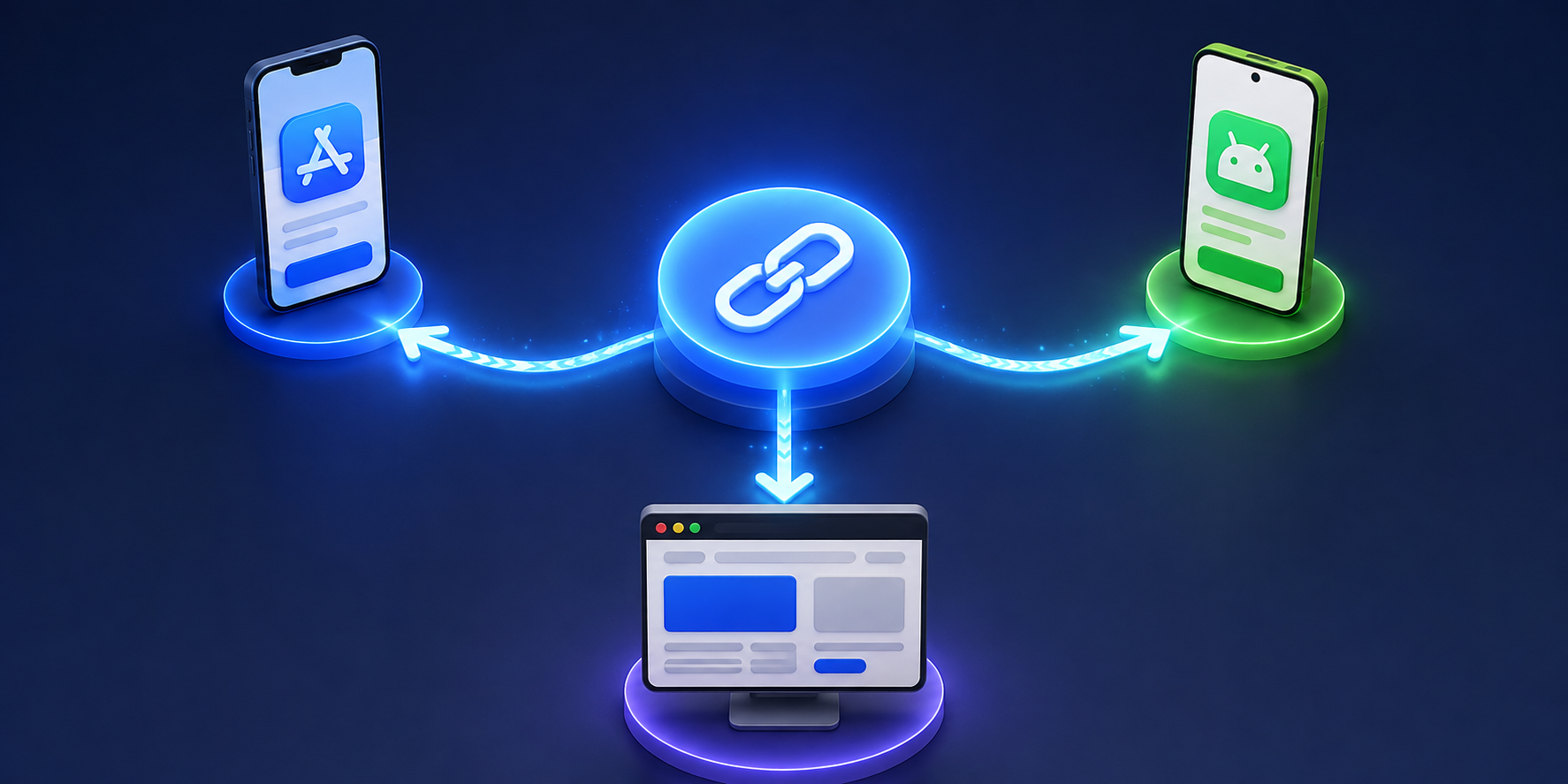
    A smart link is a campaign link that can route users to different destinations based on context. For app marketing, that usually means sending iOS users to the App Store, Android users to Google Play, and desktop users to a web page.

    A normal link has one destination. A smart link has routing logic behind it.

    For example, one smart link could work like this:

    User typeDestination
    iPhone userApp Store
    Android userGoogle Play
    Desktop visitorLanding page
    Tablet userBest matching app store or web page
    QR code scannerMobile download route
    Social bio visitorApp download page or hub link

    This is why smart links are useful for app install campaigns, social media, QR codes, influencer promotions, email campaigns, and offline marketing.

    Instead of asking users to choose the right path, the link does the work for them.

    Why Normal App Links Often Lose Users

    A normal app campaign usually starts with good intentions. The team creates an App Store link, a Google Play link, and maybe a website link. Then the problem begins.

    Instagram only gives you one bio link. A QR code can only point to one URL. A printed flyer should not show three different links. A TikTok caption needs something short. An email button needs one clean destination.

    So the team chooses one link. Usually it is a landing page with buttons for App Store and Google Play.

    That works, but it adds an extra step. A user clicks because they are interested. Then they must stop, look at the page, choose the correct store, and tap again. Some users will do it. Others will leave.

    This is especially painful on mobile. If someone is already on an iPhone, they should not need to choose the App Store. If someone is on Android, they should not need to scroll past an iOS button. The link should already know what to do.

    How Smart Links Decide Where to Send Users

    Smart links use information from the click to decide the best destination. The most common signal is device type. The link checks whether the visitor is using iOS, Android, desktop, or another environment.

    Some smart links can also use other signals, such as country, language, browser, campaign source, or custom rules. This helps marketers create different experiences without creating a messy list of separate links.

    A simple app campaign might use these rules:

    • iOS visitors go to the App Store
    • Android visitors go to Google Play
    • Desktop visitors go to a web landing page
    • Unknown devices go to a fallback page
    • QR code traffic goes to the mobile download route

    The user does not see this logic. They only click one link and land in the most useful place.

    This is what makes smart links feel simple on the outside, even though they are doing more behind the scenes.

    Where Smart Links Fit in the App Marketing Funnel

    Smart links are most useful near the top and middle of the app marketing funnel. They help people move from awareness to download without unnecessary steps.

    For example, a creator mentions your app in a video. The audience is mixed. Some use iPhone, some use Android, and some watch from desktop. A smart link lets the creator share one URL, while each viewer gets a destination that fits their device.

    A smart link is also useful after someone scans a QR code at an event, restaurant, hotel, gym, or retail location. The printed QR code does not need separate versions for each platform. One code can route people correctly.

    For email campaigns, smart links help when your subscribers open the same email on different devices. A desktop user may need a web page. A mobile user may be ready to install immediately.

    In all these cases, smart links reduce the gap between interest and action.

    Smart Links vs App Store Links

    App Store and Google Play links are still important. Smart links do not replace them. They organize them.

    An App Store link is useful when you know the user is on iOS. A Google Play link is useful when you know the user is on Android. But public campaigns rarely give you that certainty.

    Smart links sit above those destinations. They act like a single front door.

    Instead of sharing:

    App Store link

    Google Play link

    Website link

    You share one smart link. Behind that link, each destination is still there. The user simply does not need to choose manually.

    This makes smart links especially useful for campaigns where space is limited, such as Instagram bios, TikTok profiles, QR codes, SMS messages, posters, and creator captions.

    Smart Links and QR Code Campaigns

    QR codes are one of the best use cases for smart links because QR codes are often used in physical places. Once printed, they are hard to change.

    A restaurant app may place QR codes on table cards. A travel app may put QR codes on event banners. A fitness app may add QR codes to gym posters. A retail app may print them on packaging.

    If the QR code points directly to one fixed URL, you have less flexibility. If the destination changes, the printed material becomes outdated.

    A smart link gives the QR code more control. You can route users by device, update the destination later, and track how many people scanned the code.

    This is useful because offline campaigns are often harder to measure than digital campaigns. A smart link turns a simple QR code into a trackable campaign touchpoint.

    Smart Links and Campaign Analytics

    Smart links are not only about routing. They also help marketers understand what happened after the link was shared.

    At a basic level, smart link analytics may show clicks, devices, locations, referrers, and campaign performance. This helps answer practical questions:

    Which channel got the most clicks?
    Did more users come from iOS or Android?
    Did the QR code work?
    Which country or city showed the most interest?
    Did the Instagram bio link perform better than the email button?

    This data may not replace full mobile attribution, but it gives app teams useful visibility. For many campaigns, that is enough to make better decisions.

    For example, if most QR scans come from Android users, your next campaign may highlight the Google Play route more clearly. If desktop traffic is high, you may improve the desktop fallback page instead of ignoring it.

    Common Mistakes With Smart Links

    One mistake is using a smart link but sending everyone to the same landing page. That removes the main advantage. If the link can detect device type, use that routing to reduce steps.

    Another mistake is forgetting the desktop fallback. App marketers often think only about mobile users, but desktop clicks still happen. A good fallback page can show app benefits, store buttons, a QR code, or a sign-up form.

    Teams also forget to test the link before launch. A smart link should be tested on iPhone, Android, desktop, and QR code scan before being published. One wrong destination can break the campaign.

    A final mistake is creating too many smart links without a naming system. If your dashboard has links called test, newlink, and campaign2, reporting becomes confusing later. Use clear names like summer_launch_instagram, event_qr_bangkok, or creator_campaign_tiktok.

    When Smart Links Are Not Enough

    Smart links are great for routing users to the right destination, but they do not solve every app marketing problem.

    If you need to track installs, in-app purchases, subscriptions, retention, or post-install events, you may need mobile attribution tools or deeper app analytics. Smart links can show click behavior, but they may not show everything that happens after installation.

    If you need to open a specific screen inside the app, you may need deep links. For example, a booking app may want to open a specific hotel page. A shopping app may want to open a product page. A travel app may want to open a saved itinerary.

    In many cases, smart links and deep links work together. The smart link routes the user to the right platform. The deep link opens the right content inside the app when possible.

    For early app campaigns, smart links are often the simpler first step. As the app grows, deep linking and attribution can be added later.

    Final Answer: How Smart Links Work for App Marketing

    Smart links for app marketing work by turning one campaign URL into a smarter path. Instead of sending every visitor to the same page, the link checks the user’s context and sends them to the most relevant destination.

    That can mean App Store for iPhone users, Google Play for Android users, and a desktop landing page for people on computers. It can also help with QR codes, influencer campaigns, email links, social bios, and offline promotions.

    The biggest benefit is less friction. Users do not need to choose the right store or search for the correct page. The link guides them there.

    For app marketers, smart links also make campaigns easier to manage and measure. One link can support multiple destinations, cleaner sharing, editable routing, and useful click analytics.

    If you want a simple way to create smart app campaign links, itlink.to OneRoute helps you send iOS, Android, and desktop visitors to the right destination from one clean link.

    References

    • Apple App Store & Google Play Guidelines: Official platform documentation detailing branding, asset standards, and developer compliance rules for store listings.
    • Google Analytics Campaign Builder: Web utility for adding UTM parameters to URLs to track custom marketing campaign performance.
    • Firebase Dynamic Links Documentation: Technical guide covering the legacy deep-linking service and migration requirements following its 2025 sunset.
    • itlink.to OneRoute & Short Link Pages: Product overviews detailing features for smart path routing, custom domains, and shortened URLs.

  • Link in Bio Checklist Before Posting on Instagram

    Link in Bio Checklist Before Posting on Instagram

    A link in bio checklist can save you from wasting attention after a post goes live. You may have a great Reel, carousel, Story, or caption, but if the link in your Instagram bio is outdated, confusing, or broken, people will leave before taking action.

    Instagram lets users add links through the profile Links section, and professional accounts can use Insights to understand account and content performance. That makes the bio link one of the most important conversion points on your profile.

    Before you publish your next Instagram post, check the link experience from the visitor’s point of view.

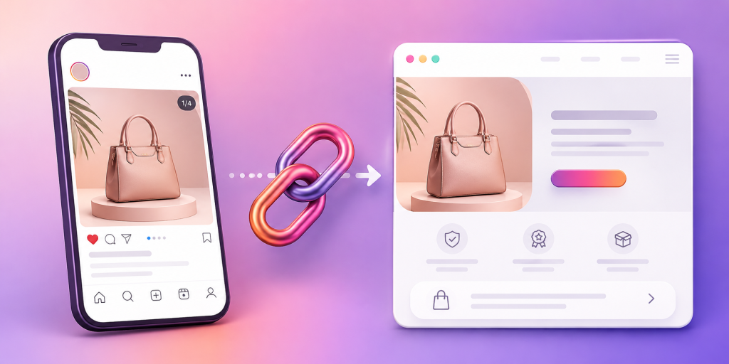
    The Post and the Link Must Tell the Same Story

    The most common link in bio mistake is a mismatch.

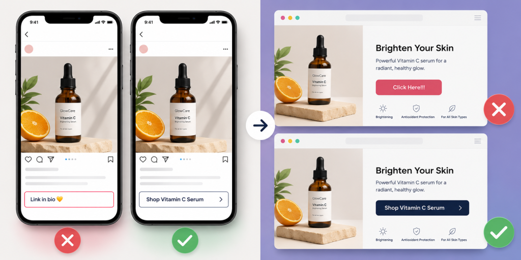
    Your post talks about a new product, but your bio link opens a general homepage. Your Reel promotes a free guide, but the first button on your link page says “Book a Call.” Your Story says “grab the template,” but the link page makes people search for it.

    That mismatch kills intent.

    Before posting, ask one question: if someone clicks your profile link because of this post, will they instantly see the thing they came for?

    If the answer is no, fix the link before publishing.

    Put the Most Important Link First

    People do not study link pages. They scan.

    The first visible link should match your current campaign. If your latest post promotes a new offer, that offer should be the first thing people see after tapping your bio link.

    Do not make visitors scroll past old links, secondary offers, or random social buttons before reaching the main action.

    A good rule is simple: the top link should match the CTA in your latest post.

    Make the Button Text Specific, Not Cute

    Generic button text creates hesitation.

    “Click here,” “Learn more,” and “Check this out” are weak because they do not tell people what happens next.

    Use clear action labels instead:

    • Download the Free Checklist
    • Shop the New Collection
    • Book a Demo
    • Join the Newsletter
    • Watch the Full Video
    • Get the Instagram Template
    • Try the Free Tool

    Specific button text improves clarity. It also makes your link page easier to understand in two seconds.

    Test the Link Like a Real Follower

    Do not only preview the link from your laptop.

    Most Instagram clicks happen on mobile, often inside Instagram’s in-app browser. That means your link should be tested from the Instagram app before the post goes live.

    Open your profile. Tap the bio link. Check the page speed, layout, buttons, images, and checkout or signup flow.

    If the page feels slow, crowded, or confusing on your phone, it will feel worse for followers who are less patient.

    Check the Destination After Every Campaign Change

    A bio link is easy to forget because it sits in the same place for weeks or months.

    But campaigns change. Products sell out. Booking pages close. Free downloads move. Launch pages get replaced. Old offers expire.

    Before every important post, check that the destination is still correct.

    This is especially important if your caption says “link in bio.” That phrase creates a promise. The bio link should fulfill it immediately.

    Do Not Send Warm Traffic to a Cold Homepage

    Your Instagram followers already have context. They saw your post, watched your Reel, or read your caption.

    Sending them to a general homepage often resets the conversation.

    A better link sends them closer to the action. If the post promotes a product, send them to the product page. If it promotes a newsletter, send them to the signup page. If it promotes an app, send them to the correct app download path.

    A homepage is fine when the goal is broad discovery. But for campaigns, specific pages usually perform better.

    Track the Clicks You Actually Care About

    Instagram Insights can help professional accounts understand performance trends, but your link page or URL tool should also help you see which links people click after they leave Instagram.

    Do not only ask, “Did this post get likes?”

    Ask, “Did this post drive profile visits, bio link taps, and meaningful clicks?”

    For campaigns, create separate links when needed. For example, you may want different links for Instagram bio, Instagram Story, email, and QR codes.

    That helps you see which channel is actually moving people to action.

    Remove Anything That Distracts From the Current Goal

    A link page with too many options can feel like a menu with no recommendation.

    If your current goal is to sell a product, do not surround that product link with ten unrelated buttons. If your goal is newsletter signups, do not bury the signup under social links and old campaigns.

    Before posting, remove or move anything that competes with the main CTA.

    This does not mean your link page must have only one link. It means the current campaign should be obvious.

    Make Sure the Link Looks Trustworthy

    A link in bio should feel like part of your brand.

    Check the URL, title, preview, button labels, colors, and page layout. If the page looks messy or unrelated to your Instagram profile, people may hesitate.

    Trust matters more when you are asking for money, email addresses, bookings, downloads, or app installs.

    A clean link page makes the next step feel safer.

    Final Link in Bio Checklist Before You Post

    Before publishing your Instagram post, run through this quick checklist:

    • Does the first link match the post CTA?
    • Is the destination still active?
    • Does the page load well on mobile?
    • Is the button text clear?
    • Is the main offer visible without scrolling?
    • Are old or expired links removed?
    • Does the page look trustworthy?
    • Are clicks trackable?
    • Did you test the link inside Instagram?
    • Is the next action obvious?

    A good Instagram post earns attention. A good link in bio turns that attention into action.

    Before your next post goes live, make sure your bio link matches the promise you made in the content. Keep the destination clear, the first button relevant, and the next step easy to understand.

    For creators, startups, and brands, the goal is not just to have a link in bio. The goal is to create a simple path from interest to action.

    References

  • Linktree vs HubLink: Which Link in Bio Tool Has Better Analytics?

    Linktree vs HubLink: Which Link in Bio Tool Has Better Analytics?

    When comparing Linktree vs HubLink, most people are not only asking which tool looks better. They want to know which one helps them understand what happens after someone clicks their bio link. A clean link in bio page is useful, but analytics decide whether that page becomes a real marketing asset or just another list of buttons.

    For creators, small businesses, agencies, and app marketers, the problem is simple. Social platforms send traffic, but that traffic is often hard to measure. You may know a post performed well, but you may not know which link people clicked, which campaign brought them in, or whether your page is helping visitors take action. This is where the difference between a simple link page and an analytics-focused link in bio tool becomes important.

    Linktree vs HubLink: Start With the Real Analytics Problem

    The main analytics problem is not collecting numbers. It is understanding which numbers actually help you make decisions. A link in bio page can show visits and clicks, but those metrics alone do not always explain user intent.

    For example, imagine your Instagram Reel gets 20,000 views and your bio link gets 800 visits. That looks good at first. But if only 20 people click your product page, you need to know why. Was the offer unclear? Was the product link buried too low? Did visitors click your YouTube link instead? Did the traffic come from Instagram, TikTok, email, or a QR code?

    This is why comparing Linktree vs HubLink should begin with analytics clarity. Linktree is widely known and easy to set up. It works well for creators who need a simple page with multiple links. HubLink is better suited for users who care more about campaign performance, cleaner tracking, and understanding which links deserve more attention.

    Why Basic Click Counts Are Not Enough

    Basic click counts can tell you that people clicked something, but they rarely tell you what to improve next. A link with 500 clicks may look successful, but that number can hide many important details.

    Maybe the link is popular because it sits at the top of the page. Maybe it gets clicks because the button text is vague. Maybe people click it and immediately leave because the destination does not match what they expected. Without deeper analytics, it is easy to make the wrong decision.

    For a personal creator page, basic analytics may be enough. But for business pages, app campaigns, lead generation, affiliate marketing, event promotion, and product launches, you need more context. You need to know which source, campaign, or content format is driving meaningful traffic.

    That is where analytics should become practical. The goal is not to make dashboards look impressive. The goal is to help you decide what to change, remove, promote, or test next.

    What Linktree Does Well for Link in Bio Pages

    Linktree is popular because it makes the link in bio problem easy. You can create a page quickly, add links, customize the look, and place one URL in your social profile. For many creators, that is enough.

    It works especially well when your main need is organization. If you want to share your latest video, store, newsletter, booking page, podcast, and other profiles in one place, Linktree gives you a familiar structure. Visitors understand it immediately.

    Linktree also benefits from strong brand recognition. Many users already know what a Linktree page is, so the experience feels familiar. That can reduce confusion for audiences who only need a simple list of links.

    The limitation appears when the page becomes part of a serious marketing funnel. If you are running campaigns across different channels, testing offers, or trying to improve conversion paths, you may need analytics that are easier to connect with real business decisions.

    Where HubLink Fits Better for Analytics-Focused Users

    HubLink is a better fit when your link in bio page needs to do more than hold links. It is useful when you want to understand which destinations are getting attention and how your social traffic behaves across campaigns.

    For example, a small travel business might use one bio link for tour packages, WhatsApp inquiries, blog guides, seasonal offers, and app downloads. A creator might use one page for affiliate links, a newsletter, digital products, and brand collaborations. An agency might manage multiple client campaigns and need clear reporting.

    In those cases, the question is not “Can I add multiple links?” The better question is “Can I see what is working clearly enough to improve results?”

    HubLink is designed for users who want cleaner link experiences, easier campaign tracking, and practical analytics. If you want to explore this type of link in bio page, you can use HubLink from itlink.to as a smarter way to organize and measure your important destinations.

    Key Analytics Features to Compare Before Choosing

    When comparing link in bio tools, do not judge analytics only by whether a dashboard exists. Look at whether the data helps you answer useful questions.

    • Page views: How many people opened your link in bio page?
    • Link clicks: Which buttons or destinations received the most attention?
    • Click-through rate: What percentage of visitors clicked after landing on the page?
    • Traffic source: Where did visitors come from?
    • Device data: Are users mostly on mobile, desktop, iOS, or Android?
    • Campaign tracking: Can you separate Instagram, TikTok, QR code, email, and ads?
    • Time-based trends: Which days or campaigns performed better?
    • Export or reporting options: Can you review results clearly with a team or client?

    These features matter because they turn your bio link from a static page into a performance tool. Without them, you may keep guessing why some links work and others do not.

    Practical Example: Creator, Brand, and Agency Use Cases

    A creator may need a link in bio page for content, affiliate links, and a newsletter. In this case, analytics should show which content drives the most clicks. If the newsletter link gets more clicks after educational posts, the creator can make more of that content.

    A brand may use a bio link for product launches, campaigns, store pages, and customer support. Analytics should help the team see which campaign gets attention and which link should be moved higher. If visitors keep clicking support instead of the product offer, the page may need clearer messaging.

    An agency may manage several client pages. The agency needs analytics that are easy to explain. Clients usually do not want raw numbers without meaning. They want to know what changed, what worked, and what should happen next.

    In each case, the best tool is not always the one with the most design options. It is the one that makes performance easier to understand.

    Common Mistakes When Reading Link in Bio Analytics

    Many users collect analytics but still make poor decisions because they read the data too quickly. A high number is not always a good number, and a low number is not always a bad number.

    • Judging only by total clicks instead of click quality.
    • Keeping too many links on the page, which spreads attention too thin.
    • Placing the most important link too low.
    • Using vague button text like “Learn More” for every link.
    • Mixing personal, business, and campaign links without priority.
    • Ignoring mobile experience even though most visitors come from phones.
    • Not separating organic social traffic from paid ads, QR codes, or email campaigns.

    A good analytics setup should reduce these mistakes. It should help you see which links deserve more visibility and which ones are only creating noise.

    Which Tool Is Better for Different Types of Users?

    Linktree is a strong choice for creators who want a fast, familiar, and simple link in bio page. If your goal is to organize several links and make them easy to access, it can work well.

    HubLink is a stronger choice if analytics and campaign clarity matter more. If you are using your bio link to drive leads, app installs, bookings, product sales, affiliate traffic, or client campaigns, you need more than a nice page. You need data that helps you improve the click journey.

    The best choice depends on your goal. If you need a simple profile landing page, Linktree may be enough. If you want a link in bio tool that feels more connected to marketing performance, HubLink is the better direction.

    Final Verdict on Linktree vs HubLink

    The Linktree vs HubLink comparison comes down to how seriously you use your bio link. Linktree is easy, familiar, and useful for basic link organization. HubLink is better for users who want clearer analytics, smarter campaign tracking, and a more practical view of what happens after the click.

    If your bio link is only a place to list links, a simple tool can work. But if your bio link supports your business, content strategy, campaigns, or client reporting, analytics should be a priority from the beginning.

    Create a HubLink page for your most important links, track what people actually click, and use those insights to improve your next campaign.

    References

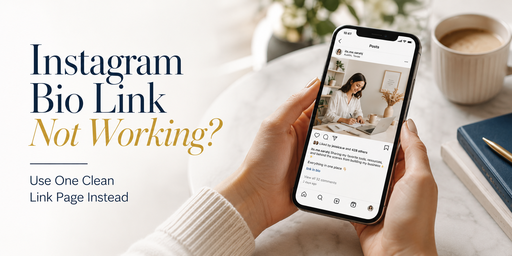
  • Instagram Bio Link Not Working? Use One Clean Link Page Instead

    Instagram Bio Link Not Working? Use One Clean Link Page Instead

    Your Instagram bio link can look fine and still fail. The link opens. The page loads. Nothing is technically broken. But your followers still cannot find the thing they came for.

    That is the real problem.

    Someone watches your Reel about a product, taps your profile, opens your link, and lands on a page that does not show that product clearly. Someone sees your post about booking a session, taps the same link, and finds your shop instead. Another person wants to contact you, but the contact option is hidden somewhere else.

    When this happens, your Instagram bio link is not working as a marketing tool. It is not guiding people from interest to action. It is making them search, guess, or send you a DM.

    For creators, coaches, shops, influencers, restaurants, salons, and small businesses, one direct link is rarely enough. Instagram brings people to your profile from many different posts, Stories, Reels, and ads. Those people do not all want the same thing. A clean link page gives them one simple place to choose the right next step.

    Your Latest Post and Your Bio Link Are Telling Different Stories

    This is one of the most common reasons an Instagram bio link feels broken.

    You publish a post about a new offer. In the caption, you say “link in bio.” But your bio link still opens your homepage, old campaign, booking page, or general shop. The follower expects to find the offer from the post, but the page does not match the promise.

    That mismatch creates friction.

    Instagram content usually creates a very specific kind of intent. A Reel about a product creates buying intent. A Story about available appointments creates booking intent. A carousel about a free guide creates download intent. A post about a collaboration creates contact intent.

    If your bio link does not support that intent, the user journey breaks after the tap. The follower may not be angry, but they may stop trying. Most people will not search your whole website just because one Instagram post interested them.

    This is why the bio link should not be treated as a random destination. It should act like a bridge between what the follower just saw and what they want to do next.

    The Hidden Cost of Replacing Your Bio Link Every Week

    Many people try to solve the problem by constantly changing the link in their Instagram bio. Today it points to a product. Tomorrow it points to a booking page. Next week it points to a YouTube video or a new promotion.

    At first, this feels flexible. But over time, it creates confusion.

    Older posts still say “link in bio,” but the link has changed. A follower who saved a post may return later and land on something completely different. A potential customer may remember seeing a service, visit your profile, and find a campaign that has nothing to do with what they wanted.

    Changing the bio link too often also makes your marketing harder to manage. Every campaign depends on one slot. You have to decide which link deserves attention today, even when several links matter at the same time.

    A better approach is to keep one stable Instagram bio link and update the page behind it. The bio link stays the same, but the page can change as your offers change. This gives you flexibility without breaking older content.

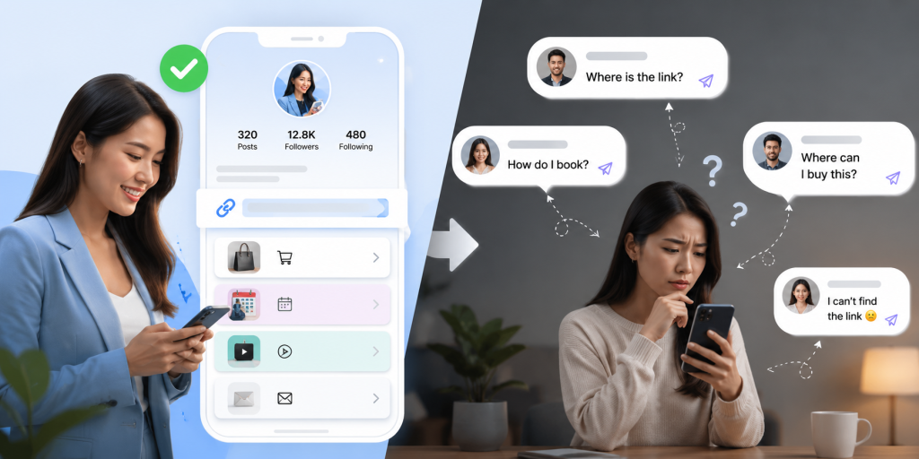
    Why Followers End Up Sending You DMs Instead of Clicking

    DMs can be valuable, but not every DM is a good sign. If people keep asking “where is the link?” or “how do I book?” or “where can I buy this?” it may mean your bio link page is not clear enough.

    Followers usually send these messages when they cannot find the answer quickly. They may be interested, but the path is not obvious.

    For example, a salon may get repeated DMs asking for the price list. A fitness coach may get messages asking where to join the program. A creator may receive questions about products already mentioned in recent content. A restaurant may get messages asking for the menu or location.

    These are all signals. They show that people are interested, but your link system is making them work too hard.

    A clean link page reduces unnecessary DMs by placing common actions in one easy place. People who want to book can book. People who want to shop can shop. People who want to contact you can still contact you, but they do not need to ask basic questions first.

    One Instagram Bio Link Cannot Explain Your Entire Business

    The problem is not that your business is messy. The problem is that your audience has different needs.

    A creator may have brand collaborations, product recommendations, a newsletter, a YouTube channel, a free resource, and a contact email. A local business may need to show booking, menu, location, reviews, promotions, and chat options. An online shop may need to share new arrivals, best sellers, order tracking, customer support, and seasonal campaigns.

    One direct link cannot explain all of that well.

    If you send everyone to your homepage, they may not know where to go next. If you send everyone to your shop, people who want to book or contact you may get lost. If you send everyone to your latest campaign, new followers may not understand your full offer.

    A link page gives your Instagram bio link structure. It lets you turn one limited profile link into a clear menu of actions. Instead of forcing every visitor into the same path, you help each person choose the path that fits them.

    What Happens When Someone Visits Your Profile for the First Time

    A first-time visitor does not know your business the way you do. They may arrive from a Reel, a tagged post, a recommendation, an ad, or a search result. They scan your profile quickly and decide whether to take another step.

    At that moment, your bio link has a job. It should make the next step feel obvious.

    If the page behind the link is confusing, the visitor has to think. They have to figure out what you sell, where to click, which offer is current, and whether the page is trustworthy. That extra thinking can kill the click.

    A clean link page helps by giving the visitor simple choices. The top button should match your most important current action. The next few buttons should answer the most common reasons people visit your profile. The page should feel current, organized, and easy to scan.

    For first-time visitors, clarity is more important than showing everything. They need a clean path, not a full archive of every link you have ever shared.

    The Most Important Click Is Usually the Second One

    The first click is when someone taps your Instagram bio link. But the second click is often the one that matters most. That is the click to buy, book, subscribe, message, download, watch, or learn more.

    A strong bio link setup should make that second click easy.

    Think about the journey like this:

    • The follower sees a specific post, Reel, Story, or profile.
    • They tap your Instagram bio link because they want the next step.
    • They land on a clean page with clear button labels.
    • They choose the link that matches their intent.
    • They complete the action on the final destination.

    If the second click is unclear, the first click is wasted. This is why button order, button labels, and page focus matter. “Click here” is weak. “Book a Trial Session” is stronger. “Shop the New Collection” is stronger than “Products.” “Message Us on WhatsApp” is clearer than “Contact.”

    Your link page should not just collect links. It should guide decisions.

    Four Types of Visitors Looking at the Same Instagram Profile

    One reason a single direct link fails is that your Instagram audience is not one group. Different visitors arrive with different intentions.

    A useful bio link page should support the most important visitor types without becoming cluttered.

    • Buyers want products, pricing, offers, or a way to purchase quickly.
    • New followers want to understand who you are and what you offer.
    • Existing customers may need support, order tracking, location, or contact options.
    • Collaborators may look for your portfolio, media kit, email, or brand information.

    If your bio link only serves one group, the others may leave. For example, if your link only opens your shop, collaborators may not find your contact details. If it only opens your portfolio, buyers may not find your product page. If it only opens your latest promotion, new followers may not understand your main business.

    A clean link page lets you serve these groups from one place. The key is to prioritize. Put the most valuable action first, then include only the links that help real visitors take the next step.

    A Better Way to Organize Everything Behind One Instagram Bio Link

    The best Instagram bio link pages feel simple because they are organized around user intent.

    Start with the action you care about most right now. That might be a booking link, product launch, free resource, menu, promotion, or latest content. Then add supporting links that answer common questions. This could include contact, location, pricing, reviews, YouTube, newsletter, or other social profiles.

    Keep the page short enough to scan. If every link looks equally important, nothing stands out. If the labels are vague, people hesitate. If old campaigns stay on the page too long, the page feels neglected.

    A good structure might look like this: current offer first, main business action second, contact option third, supporting content after that. For a creator, that could mean latest recommendation, newsletter, YouTube, and business inquiries. For a local business, it could mean book now, price list, location, and chat. For a shop, it could mean new arrivals, best sellers, order help, and customer support.

    With itlink.to, you can create a clean hub page for your important links and place that one page in your Instagram bio: https://itlink.to/#hub-link

    The goal is not to make a complicated mini website. The goal is to give followers one clean place to find what your Instagram content already made them want.

    Make Your Instagram Bio Link Useful Again

    Your Instagram bio link should not make followers guess. It should connect your content to the next useful action.

    If people tap your profile after seeing a post, they should not land on a page that feels unrelated. If you promote different offers, you should not have to replace your bio link every week. If followers keep asking where to buy, book, download, or contact you, your link page should answer that before they need to ask.

    A clean link page makes your Instagram bio link easier to manage and easier for followers to use. It gives every visitor a clearer path, whether they want to shop, book, contact, subscribe, or explore more of your content.

    If your current Instagram bio link is not helping people find the right next step, replace the confusion with one clean link page. Keep your profile link stable, organize your most important destinations, and make every tap more useful.

    References

  • Free Link in Bio Page Without Ads

    Free Link in Bio Page Without Ads

    A free link in bio without ads sounds simple, but many creators and small businesses only notice the problem after their page starts looking messy. At first, the tool feels useful. You add your Instagram link, TikTok link, booking page, product page, WhatsApp contact, or newsletter. Then over time, the page starts showing branding, upgrade prompts, banners, recommendations, or visual clutter that does not belong to your business.

    That matters because your bio link is not just a list of links. It is often the first serious step between someone discovering you and taking action. A person may watch your Reel, visit your Instagram profile, tap your bio link, and decide within seconds whether to book, buy, message, subscribe, or leave.

    If that page feels crowded, cheap, or distracted by someone else’s promotion, it can damage trust. A clean bio page should keep the attention on your business, not on ads, platform branding, or upgrade messages. This guide explains how to think about an ad-free link in bio page in a practical way, especially if you use Instagram, TikTok, LINE, WhatsApp, YouTube, or offline QR codes to get visitors.

    Your Bio Link Should Promote Your Business, Not Someone Else’s Ads

    The main job of your bio link is to move people from interest to action. When someone taps your link, they are already giving you attention. That moment is valuable. You should not waste it by showing distractions that do not help the visitor.

    For example, if you are a Pilates studio promoting a free trial class, the visitor should immediately see where to claim the trial, check the schedule, or contact the studio. They should not have to scroll past unrelated messages, platform banners, or links that compete with your offer.

    The same is true for creators. If you recommend a product in a TikTok video, your audience expects the bio link to help them find that product quickly. If the page feels overloaded, some people will leave before they click anything.

    An ad-free page protects the visitor’s focus. It makes the page feel more like your own official landing page, even if it is simple. The cleaner the page feels, the easier it is for people to trust the next step.

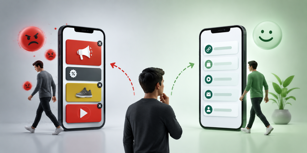
    Why Many “Free” Bio Link Pages Stop Feeling Free

    Many tools start with a free plan, but the experience may come with trade-offs. Some show platform branding. Some limit customization. Some push upgrade banners. Some place extra elements on the page. Some make the free page feel less professional so users feel pressure to upgrade.

    This is not always a problem for casual users. If someone only wants to share a few personal links, small branding may not matter. But for business use, it matters more.

    A small business bio page is not only about sharing links. It is part of the sales journey. If your page is connected to paid ads, influencer campaigns, QR codes, event posters, or product launches, every distraction can reduce performance.

    A “free” tool becomes less useful when the page no longer feels fully focused on your brand. The real cost is not only money. The cost may be lost clicks, lower trust, and visitors who never reach your booking form, product page, or contact button.

    The Moment Ads Start Costing You Clicks

    Ads on a bio page may seem harmless, but the timing is the issue. People usually tap a bio link because they want something specific. They want the product from the video. They want the booking form. They want the restaurant menu. They want the class schedule. They want the app download. They want your contact link.

    If the page adds another message at that moment, it creates friction. The visitor has to decide what to ignore before they decide what to click.

    This is especially risky on mobile. Most people open bio links on a phone. The screen is small. Attention is short. A banner, logo, or unrelated promotion can take up space that should belong to your main call to action.

    For businesses, the question is not only “Does the page work?” The better question is “Does the page make the next action obvious?” If the answer is no, the page may be costing you clicks even if it technically loads correctly.

    When reviewing your bio page, do not look at it like the owner. Look at it like a visitor who knows very little about you. They may be seeing your business for the first time.

    Ask yourself:

    • Is the most important action visible immediately?
    • Does the page feel like my brand or someone else’s platform?
    • Are old campaigns, unused links, or weak buttons still there?
    • Is there anything on the page that could distract from booking, buying, or contacting?
    • Would a new visitor understand what to do in less than five seconds?

    This is where many bio pages fail. The owner keeps adding links, but rarely removes old ones. After a few months, the page becomes a pile of buttons instead of a useful path.

    A strong link in bio page should feel intentional. The top link should match your current priority. The rest of the page should support that priority, not compete with it.

    The Hidden Problem With Upgrade Banners and Platform Branding

    Even when a page does not show traditional ads, it may still include platform branding or upgrade messages. These can create a similar problem because they shift attention away from your business.

    A visitor may not consciously think, “This page has too much branding.” But they can feel that the page is less professional. That feeling matters. Trust is often built through small details: clean layout, clear labels, consistent branding, and no unnecessary noise.

    For example, a beauty salon using a bio link for appointment bookings should look polished. A coach selling a paid program should look credible. A creator sharing affiliate links should make the product path easy. A local studio running a free trial campaign should make the offer feel official.

    When the page looks like a free tool first and your business second, the visitor experience becomes weaker.

    Real Example: A Pilates Studio Free Trial Campaign

    Imagine a boutique Pilates studio running a free trial campaign on Instagram and TikTok. The owner posts short videos of reformer classes, beginner exercises, studio tours, and client transformations. At the end of each post, the caption says, “Tap the link in bio to claim your free trial.”

    A weak bio page might include too many links: old promotions, every social profile, a generic website link, outdated class packages, a random YouTube video, and a contact form nobody checks. If ads or branding appear on top of that, the page feels even more crowded.

    A better page would be direct. The first button says “Claim Free Trial Class.” The second button says “View Weekly Schedule.” The third button says “Chat With Us on LINE.” The fourth button says “Find Studio Location.” The fifth button says “See Class Packages.”

    This page works because it matches the visitor’s intent. Someone who came from a Pilates video probably wants to know how to try a class, when classes are available, where the studio is, and how to ask questions.

    No ads are needed. No extra banners are needed. The page should help the visitor move from curiosity to action.

    What to Remove Before Adding More Links

    Many people try to improve their bio page by adding more. In reality, the fastest improvement is often removing what no longer helps.

    Remove links to expired campaigns. Remove buttons that are too vague. Remove duplicate contact options if one is clearly better. Remove old product pages that are no longer active. Remove links that exist only because you added them months ago and forgot about them.

    A good link in bio page is not a storage space. It is a decision page. Every button should help the visitor make progress.

    For example, if your main campaign this month is a free trial, do not bury it under general links. If your main goal is WhatsApp messages, do not make visitors choose between five different contact buttons. If your main offer is a course, do not distract people with unrelated content before they see the course link.

    The cleaner the page, the easier the decision.

    What to Look For in a Linktree Alternative With No Ads

    If you are comparing tools, do not only look at whether the page can hold multiple links. Most tools can do that. Look at whether the final page feels clean enough for real business use.

    A good linktree alternative no ads should help you create a page that feels simple, direct, and easy to update. You should be able to use it across Instagram, TikTok, WhatsApp, LINE, YouTube, Facebook, QR codes, and printed materials without feeling like the page is fighting your brand.

    It should also be easy to manage. If your campaign changes, you should be able to update the destination quickly. If a link is no longer useful, you should remove it. If your main offer changes, the first button should change with it.

    This is where a simple hub link can be useful. With itlink.to, you can create a free bio link page for your important destinations and use one clean URL across your profiles and campaigns: https://itlink.to/#hub-link

    The goal is not to make a complicated mini website. The goal is to give people one clear place to choose the right next step.

    Build a Free Link in Bio Without Ads Around One Clear Action

    A free link in bio without ads works best when it is built around one main action. Before you create the page, decide what you want most visitors to do.

    For a creator, that action may be viewing a product list, subscribing to a channel, joining a newsletter, or contacting for collaboration. For a small business, it may be booking an appointment, claiming a free trial, viewing a menu, downloading an app, or sending a message.

    Once you know the main action, make it the first button. Then add only the links that support it. Think of the page as a simple path, not a collection of everything you own.

    This approach makes your page easier to understand and more professional. It also helps you avoid the common mistake of turning a bio link into a messy directory.

    If your current page has ads, branding, upgrade banners, outdated buttons, or too many choices, rebuild it with a cleaner structure. Keep the focus on your visitor, your offer, and the next action.

    Create your free link in bio without ads and give your audience one clean path from discovery to action.

    References

  • How to Share Many Links With One Simple URL

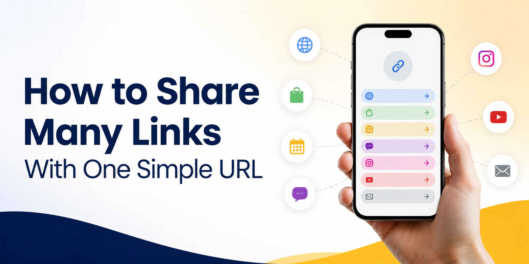
    How to Share Many Links With One Simple URL

    When you need to share multiple links, sending them one by one can quickly look messy. A customer may need your booking page, price list, WhatsApp contact, Instagram profile, latest offer, and website. A follower may want your product link, YouTube video, newsletter, and course page. If you send every URL separately, the message becomes hard to read and easy to ignore.

    A better way is to use one simple URL that opens a clean page containing all your important links. Instead of asking people to choose from a long list of raw URLs, you give them one easy link and let them pick the next step from a simple menu.

    This is useful for small businesses, creators, coaches, salons, restaurants, freelancers, app owners, and anyone who promotes different links across social media, chat apps, QR codes, or printed materials.

    Why Too Many Separate Links Create Friction

    Every extra link adds a small decision for the reader. If you send five different URLs in one message, people must stop and think: Which one should I open first? Is this the booking link or the product link? Is this the latest offer or an old page?

    That small confusion can reduce clicks. It can also make your brand look less organized, even if your service is good. People are busy, especially on mobile. They often open links while scrolling, chatting, walking, or comparing options quickly.

    A long block of links also looks less trustworthy. Raw URLs can feel random, especially if they are long or come from different platforms. One clean URL feels easier to understand and easier to share.

    How to Share Multiple Links With One Simple URL

    The easiest way to share multiple links is to create a link hub. A link hub is a simple page that contains your most important destinations in one place. You share one URL, and visitors can choose where they want to go next.

    For example, instead of sharing your website, booking form, LINE contact, Instagram, and promotion link separately, you place them all on one page. Then you use that one page in your Instagram bio, TikTok bio, WhatsApp messages, QR code, email signature, and printed flyer.

    The main benefit is control. You can keep the same main URL while updating the links behind it. If your promotion changes, you update the link hub. If your booking page changes, you update the button. Your public URL can stay the same.

    Practical Examples for Small Businesses and Creators

    A beauty salon can use one URL to show appointment booking, service prices, Google Maps location, customer reviews, and LINE contact. Instead of putting all of these links in a social caption, the salon can simply say, “Book or contact us here,” followed by one clean URL.

    A fitness coach can use one URL for class booking, personal training packages, free workout guides, Instagram, and WhatsApp. This is easier than sending a different link every time someone asks for information.

    A restaurant can place one QR code on a table or poster. That one URL can include the menu, delivery app links, reservation page, location, and social media profile.

    A creator can use one URL in their bio to share product recommendations, affiliate links, latest videos, paid resources, and newsletter signup. When a new campaign starts, they only need to update the link hub, not every old post.

    What Your One URL Should Include

    A good link hub should not contain every link you have. It should contain the links that help people take action. The goal is not to create a storage page. The goal is to guide visitors clearly.

    Useful links may include:

    • Booking or appointment page
    • Product or service page
    • WhatsApp, LINE, or contact link
    • Current promotion or campaign
    • Website or landing page
    • App Store or Google Play link
    • Social media profiles
    • Newsletter signup
    • Customer reviews or portfolio

    Put the most important action near the top. If your goal is bookings, make booking the first button. If your goal is sales, place your product or offer first. If people usually ask questions before buying, make your contact link easy to find.

    Common Mistakes When Sharing Multiple Links

    One common mistake is adding too many buttons. When visitors see too many choices, they may not click anything. A simple page with five strong links is often better than a crowded page with twenty weak links.

    Another mistake is using unclear labels. “Click here” does not tell people what will happen. Use direct labels such as “Book an Appointment,” “View Menu,” “Contact on WhatsApp,” “Download the App,” or “See Pricing.”

    Some people also forget to remove old campaign links. If visitors click an expired offer, broken page, or outdated promotion, trust drops quickly. Your link hub should stay current.

    A final mistake is treating the page like a technical dashboard. Most visitors do not care about the tool behind the link. They only care whether they can quickly find what they need.

    Where to Use Your Simple URL

    Once you create one clean URL, use it across the places where people already discover you. This makes your marketing easier to manage and more consistent.

    Good places to use it include:

    • Instagram bio
    • TikTok bio
    • Facebook page
    • YouTube description
    • WhatsApp messages
    • LINE profile
    • Email signature
    • QR code
    • Business card
    • Event poster
    • Product packaging
    • Printed flyer

    Using the same URL across channels also reduces maintenance. You do not need to change every old post, poster, or message when one destination changes. You only update the links inside the hub.

    Why This Works Better Than Sending a Long Message

    Long messages often fail because people scan instead of reading carefully. When someone receives a message full of links, they may postpone the decision or ignore it completely.

    One simple URL reduces that problem. It gives the reader a clear first step. They do not need to understand everything immediately. They only need to click one link.

    After they open the page, the options are easier to read because each destination has a clear label. This creates a better mobile experience, especially for people coming from Instagram, TikTok, WhatsApp, LINE, or a QR code scan.

    It also helps your brand look more professional. A clean link hub feels intentional. It shows that you have organized the customer journey instead of pushing random links at people.

    How to Keep Your Link Hub Simple and Effective

    Start with your main goal. Do you want more bookings, more sales, more downloads, more followers, or more messages? Your first button should support that goal.

    Then think about what people need before taking action. If they need trust, add reviews or examples. If they need details, add pricing or service information. If they need quick help, add a chat link.

    Keep the page short. Use clear wording. Review it regularly. Remove links that no longer matter. Move seasonal campaigns up when they are active, then replace them when the campaign ends.

    You can also use different versions for different use cases. For example, one page for your main profile, one page for an event campaign, and one page for a product launch. But each page should still feel focused.

    Start With a Free Link Hub

    If you want to share multiple links without making your audience deal with a messy list of URLs, a simple link hub is the easiest place to start. You can use it for social media bios, QR codes, WhatsApp messages, LINE, email signatures, posters, and small business campaigns.

    itlink.to lets you create a free link hub so you can place your important links behind one clean URL. Add your booking page, product link, contact link, social profiles, or campaign links, then share one simple URL everywhere.

    The goal is simple: make it easier for people to find the right next step. When your links are organized, your audience does not need to guess. They can click once, choose what they need, and move forward.

    Create your free link hub today and start sharing multiple links with one simple URL.

    References

  • How to Create a Free Link in Bio Page for Your Small Business

    How to Create a Free Link in Bio Page for Your Small Business

    A free link in bio page is one of the simplest ways for a small business to turn social media attention into real action. Instead of changing your Instagram, TikTok, Facebook, or Google Business Profile link every time you have a new offer, you can send customers to one clean page that contains your most important links.

    For small businesses, this matters because customers rarely follow a perfect path. One person may want to book an appointment. Another may want to see your menu. Someone else may want WhatsApp, LINE, a product catalog, directions, or a discount page. If your bio only points to one destination, you may lose people who were ready to take the next step.

    A good link in bio page does not need to be complicated. It should help people quickly understand what to do, where to click, and how to contact your business.

    Why Small Businesses Need One Clear Bio Link

    Most small businesses promote more than one thing at the same time. A café may want to share its menu, delivery link, location, and seasonal promotion. A beauty salon may need booking, price list, Instagram portfolio, and WhatsApp contact. A coach may want to share a course, consultation form, YouTube channel, and testimonials.

    The problem is that many social profiles give you limited space for links. Even when a platform allows multiple links, the experience can still feel messy if the customer has to guess which link matters most.

    One clear bio link gives your business a small landing page that works like a front desk. It does not replace your website. It organizes the most useful actions in one place. When someone taps your bio, they should immediately know whether to buy, book, message, visit, or learn more.

    This is especially useful for businesses that do not have a full website yet. Instead of waiting until everything is perfect, you can create a simple page today and update it whenever your offers change.

    Choose the Right Focus Before You Add Links

    Before creating your page, decide what the page is supposed to help people do. Many small businesses make the mistake of adding every possible link because the tool allows it. More links do not always mean better results.

    Your link in bio page should support your main business goal. If your goal is bookings, the booking button should be near the top. If your goal is product sales, your shop or best-selling product should be easy to find. If your goal is local visits, your map, opening hours, and contact button should be obvious.

    Think of your page like a shop window. You do not need to show every item you have. You need to show the right next step for the person who just discovered you.

    A simple rule is to start with one primary action, then add a few supporting links. For example, a bakery may put “Order Cakes” first, then add “View Menu,” “Find Us on Maps,” and “Message Us.” A fitness coach may put “Book Free Consultation” first, then add “Programs,” “Client Results,” and “Instagram.”

    What to Include on a Free Link in Bio Page

    Your page should be short enough to scan, but complete enough to answer the customer’s next question. The best structure depends on your business, but most small businesses can start with these essentials:

    • Your main offer, such as booking, ordering, signup, or product catalog
    • A direct contact link, such as WhatsApp, LINE, Messenger, or email
    • Your location or Google Business Profile if you serve local customers
    • Your latest promotion, campaign, menu, event, or limited-time offer
    • Social proof, such as reviews, testimonials, portfolio, or before-and-after examples
    • Your main social channels if customers may want to follow you elsewhere

    Do not treat every link as equally important. Put the highest-value action first. Customers are often distracted when they tap your bio link. They may be standing in a store, watching a Reel, checking your profile after an ad, or comparing you with another business. The faster they find the right action, the better.

    How to Create a Free Link in Bio Page

    Start by collecting the links your customers actually need. Do not begin with design. Begin with customer intent. Ask yourself: “If someone discovers my business today, what are the top three things they may want to do?”

    Next, create your link in bio page and add those links in order of importance. Use clear button labels. Instead of “Click Here,” write “Book a Table,” “View Price List,” “Order on LINE,” “See Cake Menu,” or “Get a Quote.” Clear labels reduce confusion and make the page feel more trustworthy.

    Then add your page URL to your social profiles. Instagram lets users add links through the profile editing flow, and TikTok Business Accounts can add a website link to the profile. For local businesses, you can also add your website or main customer link to your Google Business Profile.

    After publishing, test the page on your phone. Open it from Instagram, TikTok, and any other platform where customers will find you. Check that the buttons are easy to tap, the order makes sense, and the page loads correctly.

    Practical Small Business Examples

    A link in bio page becomes more useful when it is built around a real business situation, not just a generic list of links.

    For a restaurant, the page may include menu, reservation, delivery app, Google Maps, opening hours, and private event inquiry. The most important link may change depending on the season. During lunch hours, the delivery link may be most important. During holidays, the reservation or catering link may deserve the top position.

    For a salon, the page may include appointment booking, service menu, stylist portfolio, location, WhatsApp, and current promotion. The top link should usually be booking, because people who visit a salon’s profile often want to check availability or prices.

    For a coach, consultant, or service provider, the page may include a consultation form, service packages, client results, free resource, calendar booking, and contact link. Here, the page should build trust before asking for a commitment.

    For a small online shop, the page may include best sellers, new arrivals, shipping policy, customer reviews, size guide, and support contact. Instead of sending people to a large homepage, the page can guide them toward the products they are most likely to buy.

    Common Mistakes That Make Bio Links Perform Poorly

    A free link in bio page can work well, but only if it is easy for customers to use. Many pages fail because they feel like a random collection of links rather than a clear path.

    Common mistakes include:

    • Adding too many buttons with no priority
    • Using vague labels like “Website,” “More,” or “Info”
    • Sending people to outdated promotions or broken pages
    • Placing the most important action too low on the page
    • Forgetting mobile users and making links hard to tap
    • Using inconsistent branding that makes customers wonder if they are in the right place
    • Not checking whether people are clicking the page after you publish it

    The biggest mistake is thinking the page is finished after you create it. A link in bio page should change as your business changes. If your promotion ends, remove it. If a new service becomes your priority, move it higher. If customers keep asking the same question, add a link that answers it.

    Make the Page Feel Trustworthy

    Customers are careful before they click, buy, book, or send a message. Your link in bio page should feel like it belongs to your business.

    Use the same business name, tone, and visual style that people already see on your social profiles. If your Instagram is clean and premium, your page should not feel messy. If your business is friendly and casual, your labels can sound warm and direct.

    Trust also comes from clarity. A button that says “Book a Free Consultation” is stronger than “Learn More.” A button that says “Message Us on WhatsApp” is stronger than “Contact.” The clearer the action, the easier it is for customers to feel confident.

    For local businesses, location details are important. People may want to know whether you are nearby before they contact you. For service businesses, proof matters. Add reviews, case studies, client examples, or portfolio links when they help customers make a decision.

    Where to Share Your Link in Bio Page

    Your bio link should not live only on Instagram. Once you have one clean page, you can use it across many customer touchpoints.

    Add it to Instagram, TikTok, Facebook, YouTube, Threads, Google Business Profile, email signature, WhatsApp auto-reply, LINE profile, business cards, flyers, QR codes, and event materials. This makes your marketing easier because you do not need to promote different links everywhere.

    This is also why a free linktree alternative can be useful for small businesses. The goal is not just to copy Linktree. The goal is to have one simple page that you control, update, and use across campaigns.

    For example, if you run a weekend pop-up event, you can update your page with event location, menu, booking form, and promotion. After the event, you can replace those links with your regular ordering or contact links without changing the link on every social profile.

    Why a Free Link in Bio Page Is a Smart First Step

    A free link in bio page is not just a convenience. It is a practical marketing tool for small businesses that need to move faster.

    You may not have time to build a full website, write many landing pages, or manage complex campaigns. But you still need one place where customers can find what matters. A good bio link page helps you organize your offers, reduce customer confusion, and make your social traffic more useful.

    This is where HubLink by itlink.to can help. You can create a simple link in bio page for your business, add your important links, and share one clean URL across your social profiles and campaigns. It is a practical option if you want a free linktree alternative without making the setup feel complicated.

    Start simple. Add the links customers need most. Put your strongest action first. Test everything on mobile. Then improve the page over time based on what your customers actually click.

    Create your free link in bio page with itlink.to HubLink and give your small business one clean place to send customers from every social profile.

    References